

BETTERPLAYER • 2025Launching a landing page to market and grow an adult soccer training program
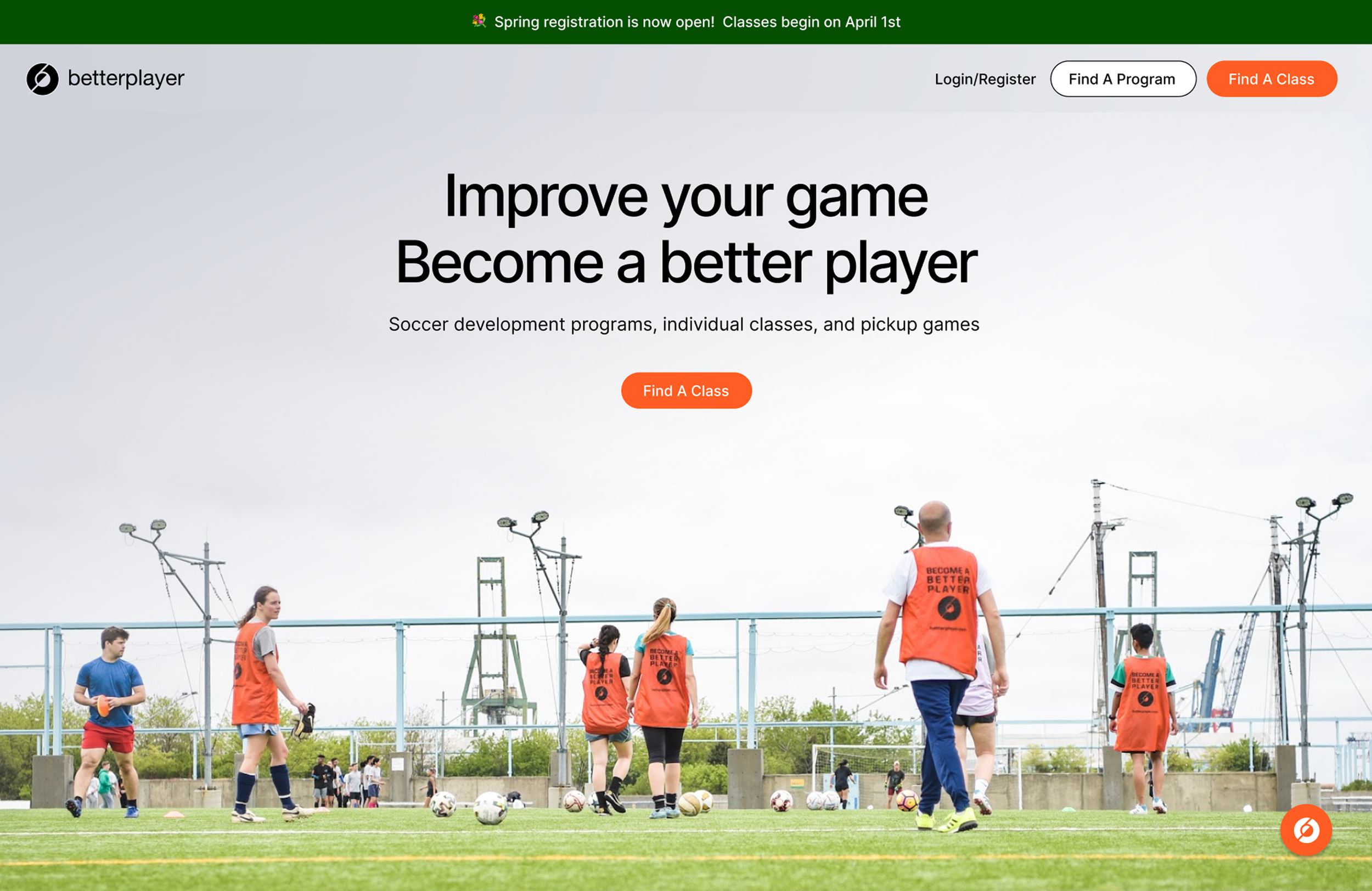
Interviewed players, built personas, and designed a web presence for multiple audiences. The site grew the program to hundreds of players and brought in new coaching talent.
My Role
UX & Visual Designer
Tools
Figma
Duration
6 weeks
Key Themes
UX/UI Design, Consumer, User Research, Market Research, Usability Testing, Design Systems
Overview
Me + BetterPlayer
I started going to BetterPlayer classes after a few rough seasons getting back into soccer as an adult in my late 20s/early 30s. I noticed that even though I was playing a lot, I wasn’t performing nearly as well as my other teammates. I realized what I needed was more practice and I quickly became addicted.
BetterPlayer offered me everything that leagues didn’t, a friendly, non-competitive environment where I could focus on development rather than just ‘winning’ games.
What is BetterPlayer?
BetterPlayer is a group athletic training program for adult recreational soccer players. The creator and CEO came up with the idea after witnessing a professional team in Europe going through a series of drills with a coach.
He noted that the only people in this country who have regular, structured access to sports development are either children or professional athletes.
The philosophy of BetterPlayer is that adult players of all levels should have the opportunity to develop their athletic skills.
The program offers daily classes across the city that focus on specific technical skills, organized by a coach that leads a group of players through a series of drills with the purpose of making them perform better in league games.
Opportunity Areas
When I started with BetterPlayer, it was a small, semi-organized program that coordinated practices via WhatsApp and had a small marketing program over email targeted towards current NYC Footy players.
I believed that the true quality of the program wasn’t communicated clearly enough, nor was it cast to the right demographics.
I reached out to the team to help conduct some research and improve the website to attract more players.
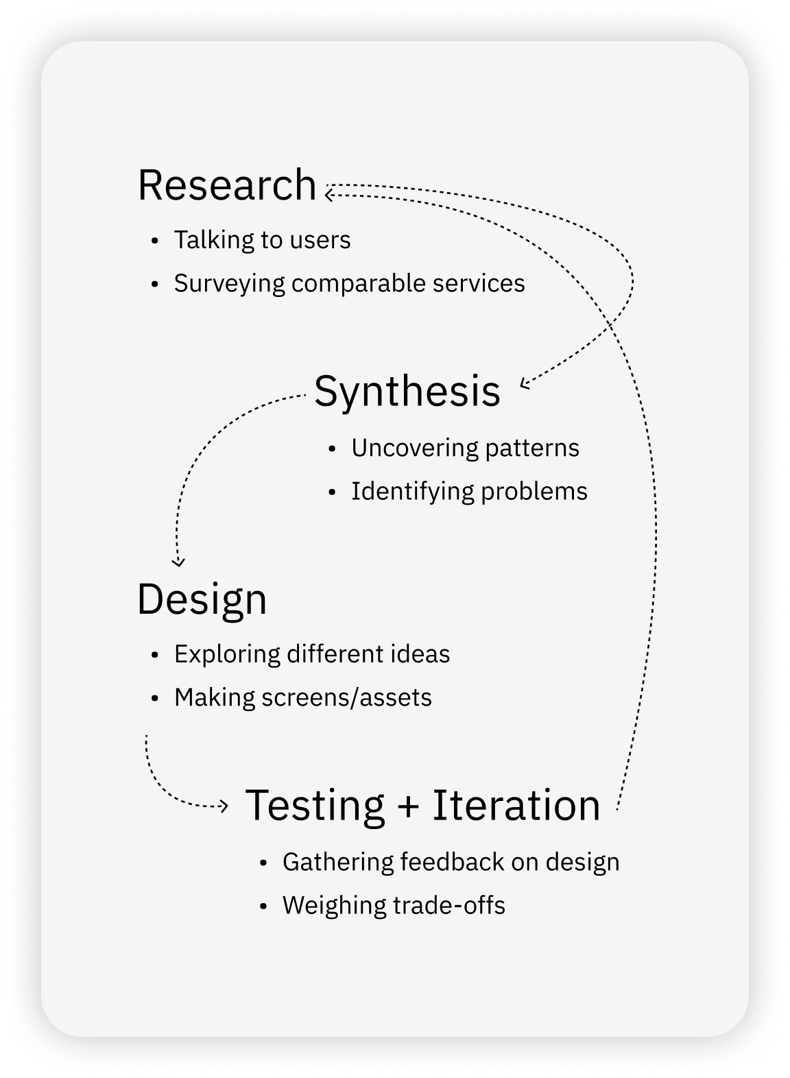
Scope & Process
I followed an iterative process informed by immersive research.
I started this project by talking to various players both in BetterPlayer classes and NYC Footy leagues to better understand their needs.
From there, I crafted and refined designs of the landing page to better meet their needs and expectations
Research
Understanding users
The goal was to redesign the landing page to better showcase the value of the program, for prospective players.
In order to do this successfully, I needed to talk to current BetterPlayers to understand the value that the classes bring to them.
Methods
• Talk to BetterPlayers to understand their experience and needs
• Define player “personas”
• Audit current home page to see how it measures up to player expectations
• Modify the home page to better speak to all personas
Desired Outcome
More people will find and see value in the BetterPlayer program, leading to an increase in registrations
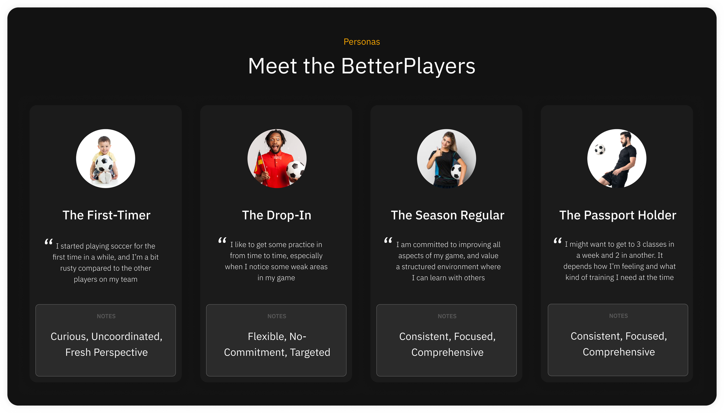
Personas
Based on my user research, I crafted 4 key personas that capture different player types along with their motivations and behaviors within the current program
Persona Detail: First-Timer
Persona Detail: The Drop-In
Persona Detail: Season Regular
Summary
Persona Detail: Passport Holder
• In a weekly recreational league, or planning to sign up
Found BetterPlayer through NYC Footy / Advertisements
• Don’t feel like they’re doing well enough in games
Touch doesn’t feel accurate / Not making goals / Losing the ball / Poor fitness
• Want to learn strategies from professionals
Correct positioning / Mechanics / Tactics
• Want a non-competitive environment to practice
Touches / Passing / Dribbling / Shooting
• Meet other people to play with
Form teams / Build community
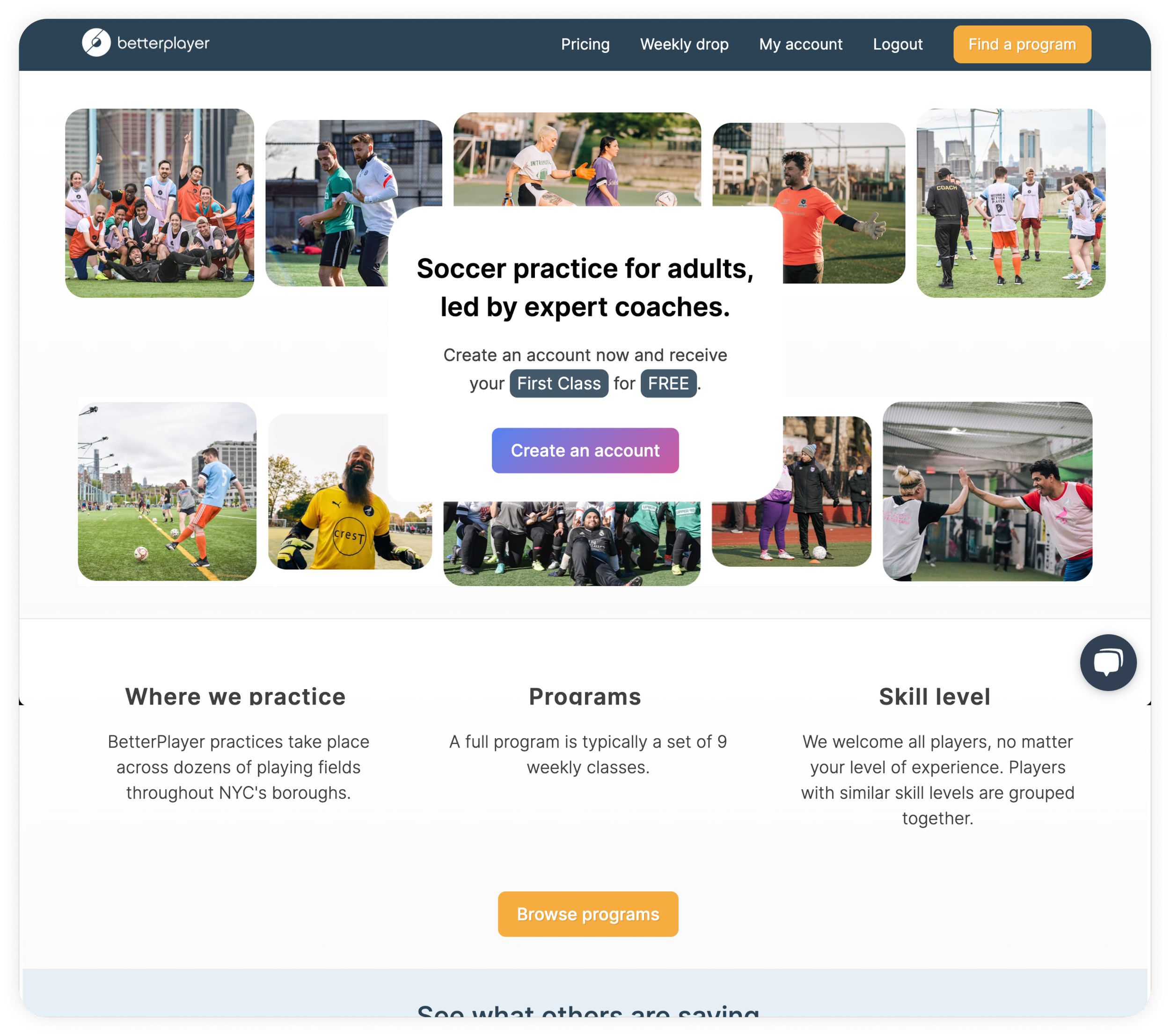
Current landing page
After defining personas and synthesizing commonalities, I used this information as a way to evaluate the efficacy of the existing page
Improvement Areas
• Landing/Splash screen
Currently too simple “Is what it is, just sigh up & check it out”. Needs more text that speaks to different value propositions
• Pricing
Add a section that describes new pricing section, different membership types, first class free..
• Locations
Could use a little more “fluff” that showcases the different pitches, maybe include nearby bars/restaurants
• Order of content
Instagram, Reviews, etc, should be moved down to the bottom
Design
Design goals
1. Set expectations for newcomers
2. Content should emphasize:
• Improving your game
• Skill development
• Practice for adults
• Professional coaches
• Community
3. Advertise different class types to speak to different personas
4. Include information on pricing
Process/Deliverables
• Low-Fidelity Diagram
To give stakeholders an idea of the ideal order of content, in addition to an idea of what content will be in each section in order to gain approval from the business side
• Visual concepts
Once the initial wireframe gains approval, I would come up with various visual concepts that use color, photography, typography and composition to give a specific brand identity to the website
• Final landing page
I would then test the different concepts with both stakeholders and players to determine which concept is the best. From there, I would make minor tweaks to copy/content and finalize the page for delivery
Low Fidelity Concept
My first draft aimed to give my stakeholders an idea of a better structure, newly proposed “sections,” and a general idea about how the program would be messaged

Lorem Ipsum
Current page improvement
Once my stakeholders and I were in agreement about improvements, I reflected the changes to the current landing page, staying true to the current look/feel

New landing page using existing design system
Feedback
After presenting the initial design to my stakeholders, the feedback around the new sections and copy was generally positive, however, the CEO wasn’t as impressed with the visual look and feel
He expected to see something a bit more “Flashy”
Next steps
I offered to do some exploration and put together a few ideas of different "themes” that we could adopt as a new look and feel for the BetterPlayer site
• Survey comparable sites/services and understand their visual identity
• 3-4 concepts with different look/feel
• Categorize each concept with different descriptions to help stakeholders understand the difference
Process/Deliverables
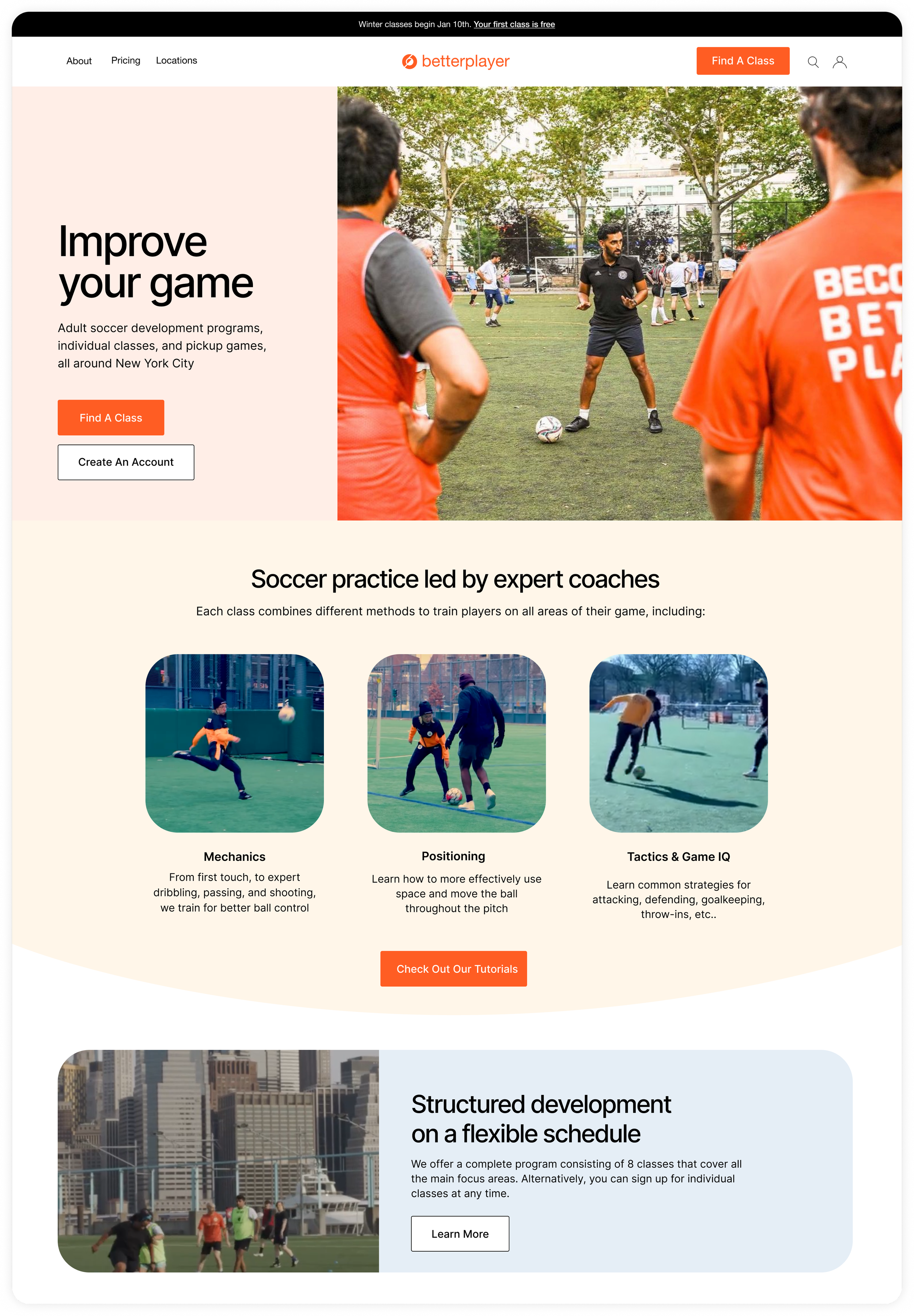
“Bright, Bubbly, Focused”
Inspired by the current site. Uses existing “light” color palette, and separates content with distinct containers
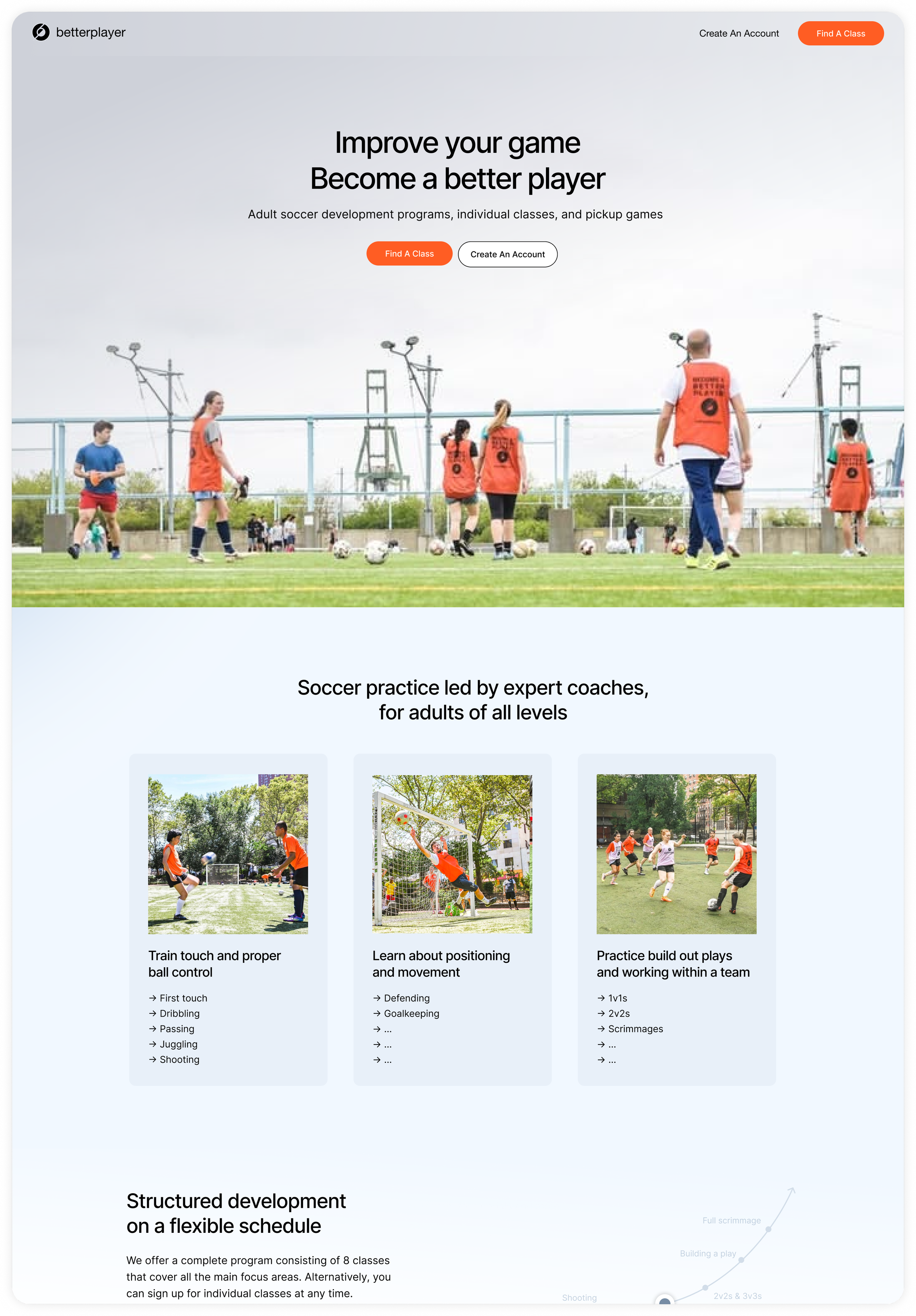
“Airy, Clean, Practical”
Inspired by financial lifestyle/credit card websites. Uses space to clearly outline details of the service through elements that seamlessly flow together
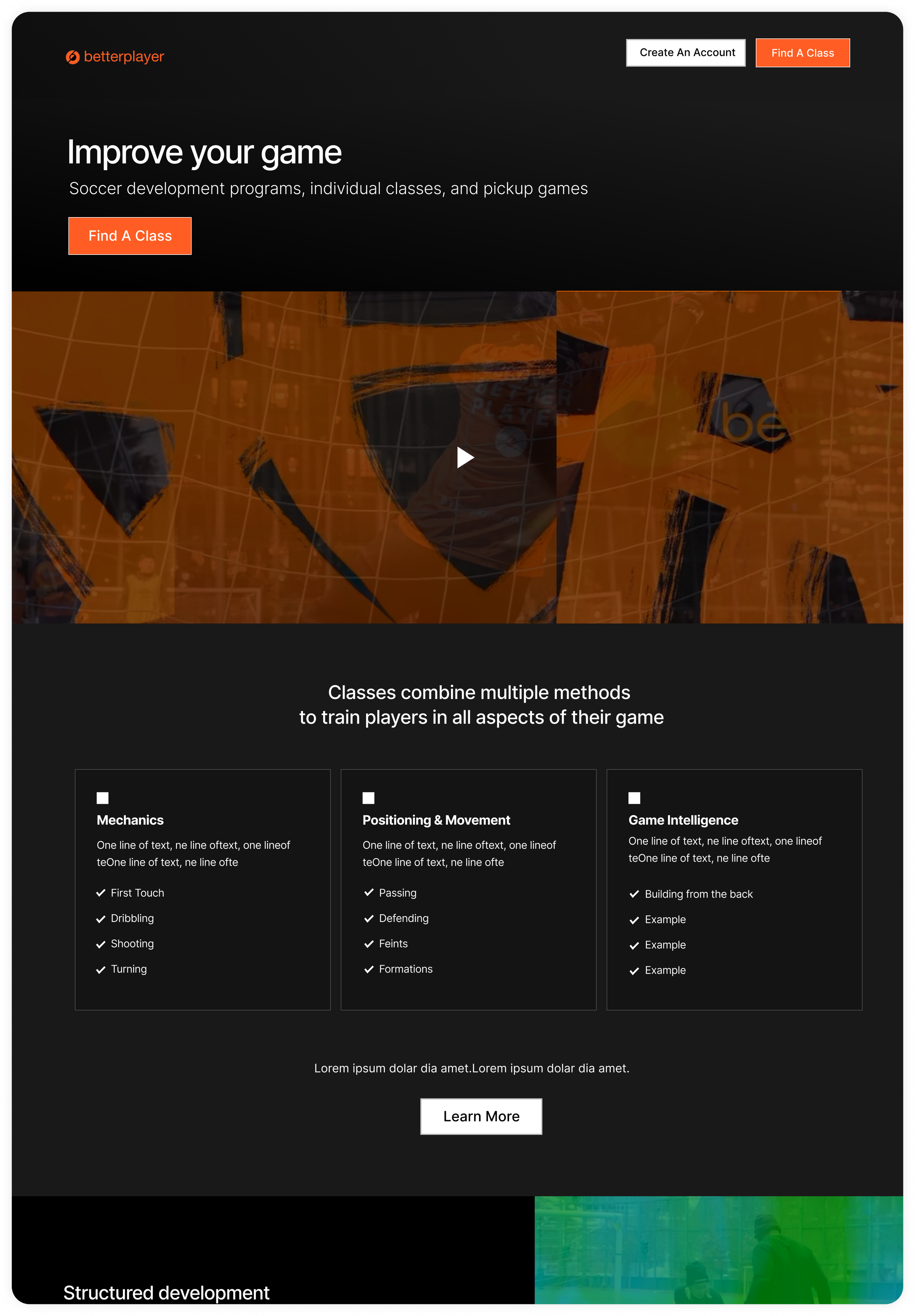
“Alternative, Stylistic, Serious”
Inspired by the BetterPlayer Instagram account. Brings in the graphics, visual branding, and videography from our social media content
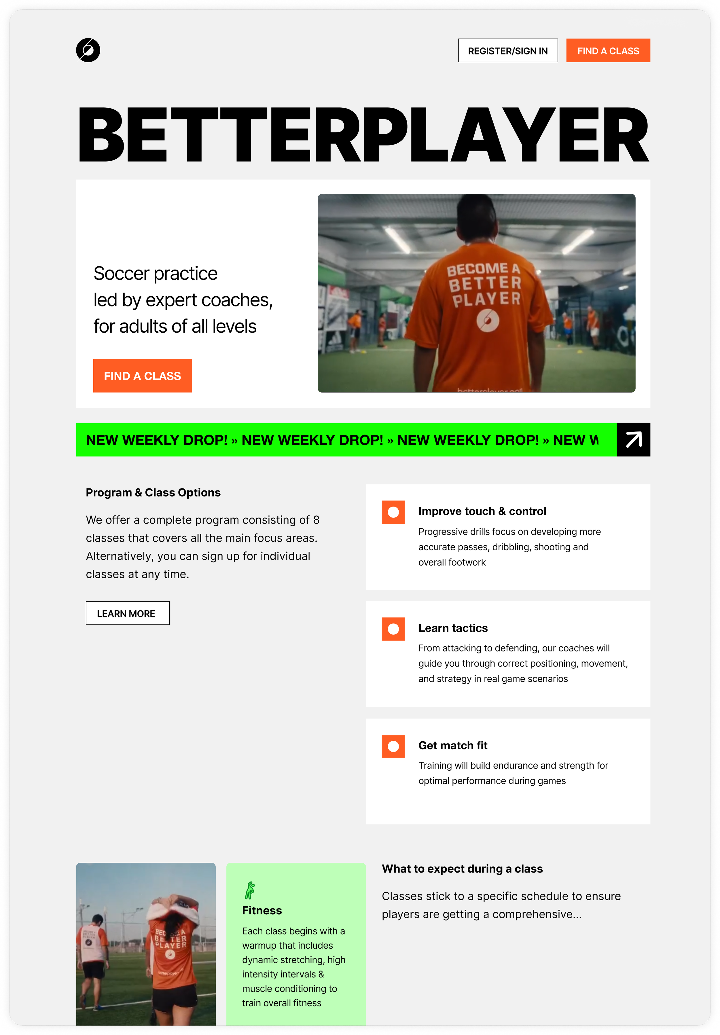
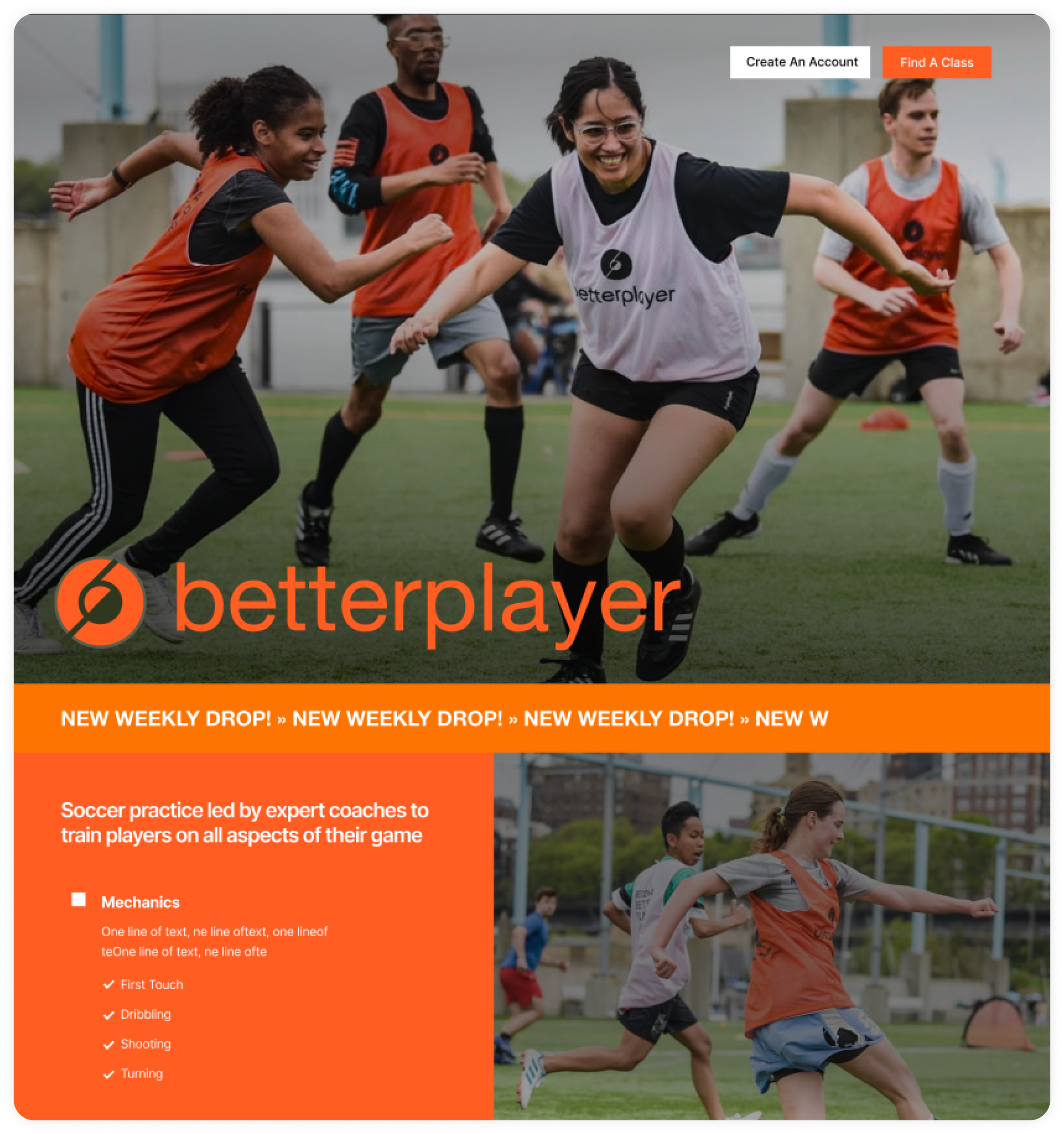
“Bold, Fun, Direct”
Inspired by the BetterPlayer jerseys/merchandise. Keeps content concise while making all UI elements clear and highly visible
“Minimal, Expressive, Active”
Inspired by active sports apparel brands. Combines different elements from the other concepts but keeps the emphasis on imagery
Testing
• I presented the designs to BetterPlayer HQ and 3 active BetterPlayer users to determine which design best spoke to their needs and expectations
Feedback
• Concept 2 / “Airy, Clean, Practical” was the most positively received by internal stakeholders and players
• Test participants liked solid colors instead of gradients
• Participants also preferred content to be free floating instead of confined to cards (cards came off as “too boxy”)
• The CEO wanted to bring some of the content from the Instagram onto the landing page, including some of the “how-to” videos and coach bios
Next steps
Build out Concept #2 and refine content sections to feel more airy, and include video content from the company Instagram
Iteration
I went through 2 rounds of iteration focusing mostly on the visual design of the page and the copy/context
Delivery
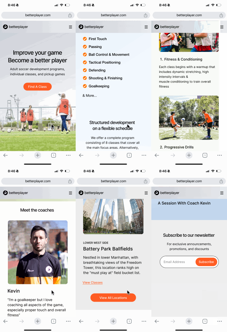
The final version of the page included minor changes to the content sections as well as proposed interactions for: Coach carousels, Location maps, and a video content section

Mobile responsive
I also provided mobile breakpoints for the developer, to accounts for the 24% of users who access the page on mobile
Rollout
The landing page was built and launched in March 2025. We instrumented the page and saw immediate engagement with the page, including:
• Increase in users scrolling from top to bottom
• Engagement with coach profile carousel
• Users funelling into class list/pages from different sections, such as
“What to expect during a practice”
• 11 more 9-week program signups the following season
• 40 more first-class signups
Next Steps
After the launch and success of the landing page, I have since partnered with the BetterPlayer HQ team to improve and scale the site further.
• BetterPlayer Plus: An unlimited class offering, advertised on the home page and within the user profile
• User dashboard: A web tool to help BetterPlayers track upcoming classes
Conclusion
Since working on the site I’ve had the opportunity to meet and chat with new players at different BetterPlayer classes across the city who have expressed the same satisfaction with the program as I did when I found it.
Overall, I’m happy to say that my work has at least partially been responsible for helping players like myself discover this amazing program. I’m proud that for the first time in my career I was able to use my design skills to help grow a major passion in my life, and to help others with their own development as well
Future Iteration