A landing page to market and grow an adult soccer training program, built from interviews with its players. It grew the program to hundreds of players and drew in new coaches.
Role
Freelance Product Designer
Team
Me, the CEO, and 1 developer
Timeline
4 months, launched March 2025
Platform
Web, desktop and mobile
betterplayer.com
40more first-class signups the season after launch
11more signups for the 9-week program the same season
5visual directions tested with the team and players before building
The problem
A great program nobody could see
Betterplayer runs coached group classes for adult rec players: the structured practice that usually only kids and pros get. I joined as a player after a few rough seasons, and got hooked.
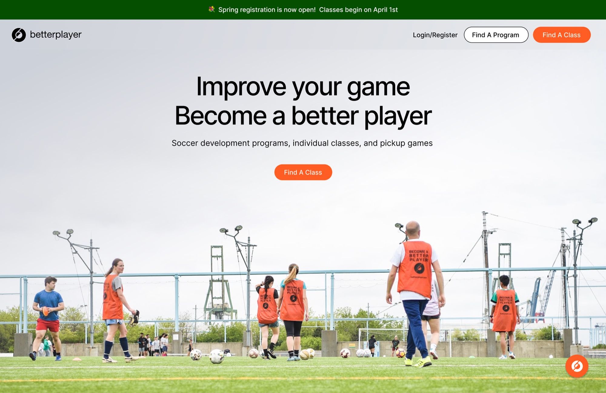
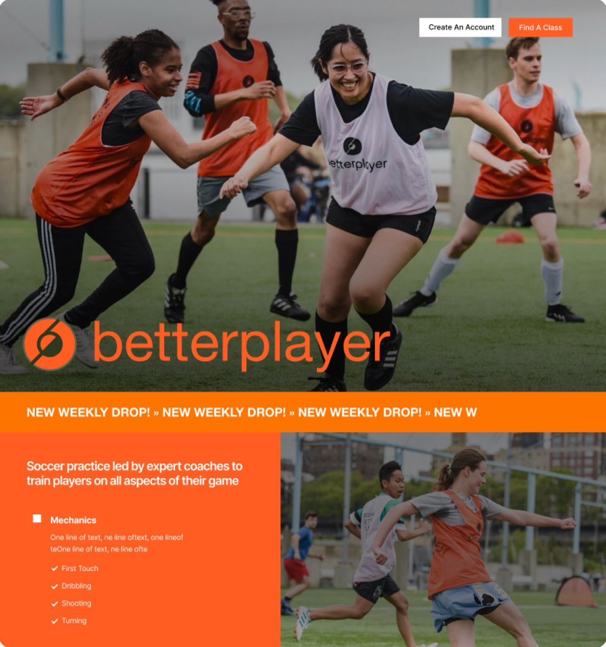
But it was small and loosely run, organized over WhatsApp and marketed by email to NYC Footy players. The site didn’t say what made the classes good, or who they were for. Its pitch amounted to “sign up and check it out”, with no pricing, thin locations, and Instagram and reviews up top.
betterplayer.com
Before: the old landing page
Key decisions
The story first, then the style
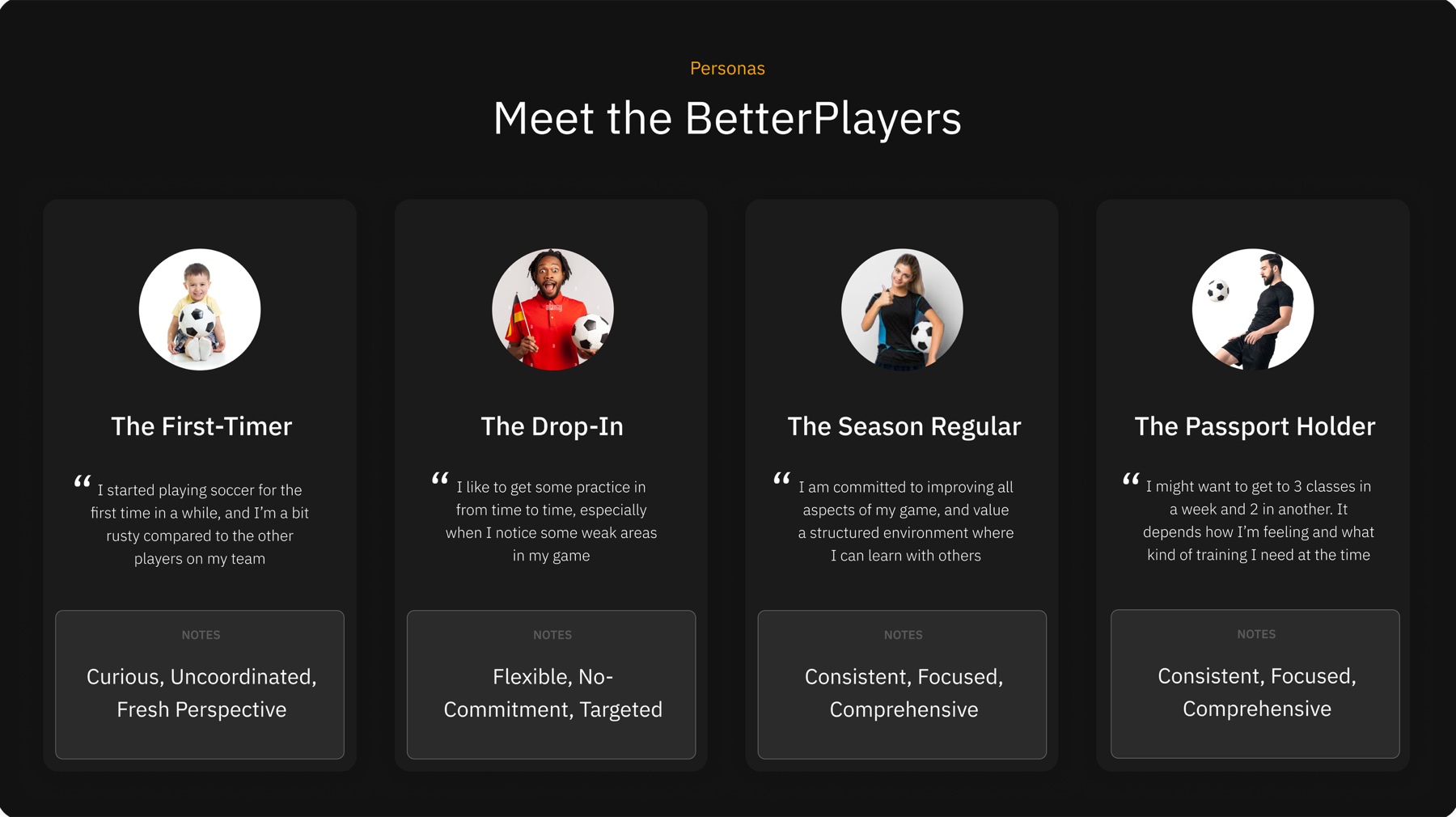
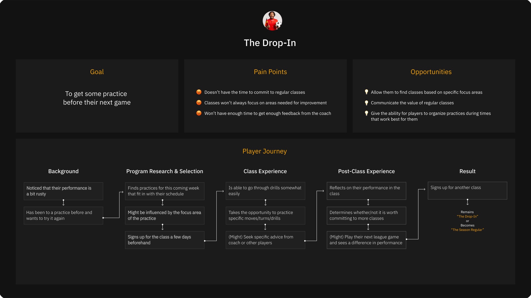
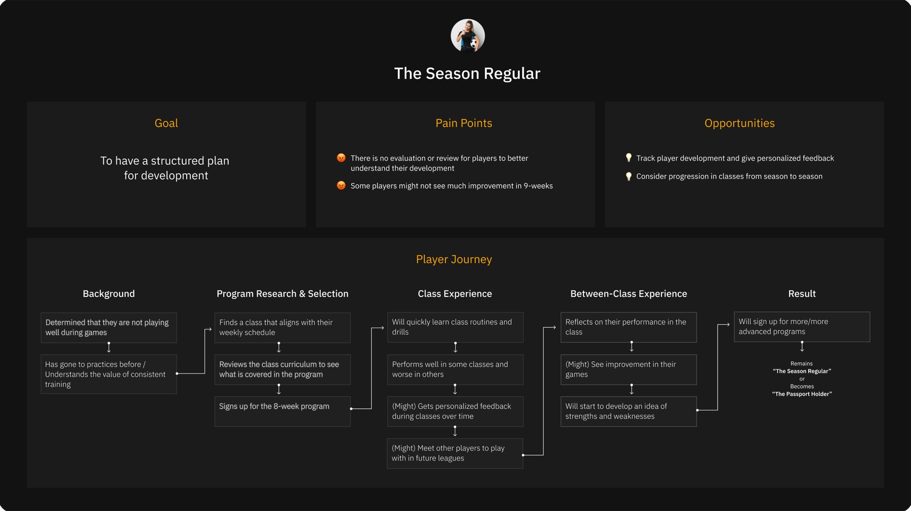
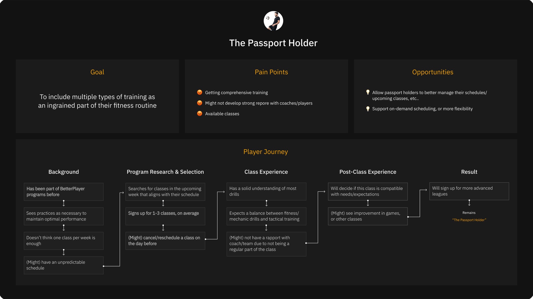
Write for four kinds of player
What we learned
Talking to players in classes and in Footy leagues, most were in a weekly league, felt they weren’t doing well enough, and wanted pro coaching somewhere non-competitive, plus people to play with.
What I did
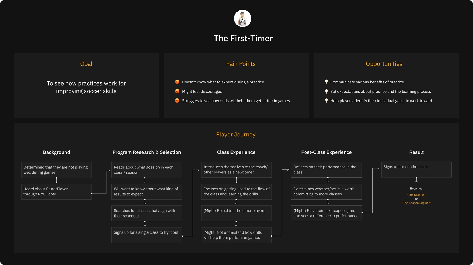
Four personas, then content goals from them: set expectations for newcomers, lead with improving your game and pro coaches, show each class type, and add pricing.
Agree on the story before the style
What we learned
The business side needed to sign off on what the page said, and in what order, before anyone debated how it looked.
What I did
A low-fidelity diagram of every section and its message, then the approved structure applied in the site’s existing look, so the content could be judged on its own.
Low fidelity
Existing look
The structure in low fidelity, then in the existing look. Scroll either one
Make it flashier, and let players choose
What we learned
The CEO liked the new sections and copy, but wanted something “flashier” than the existing look.
What I did
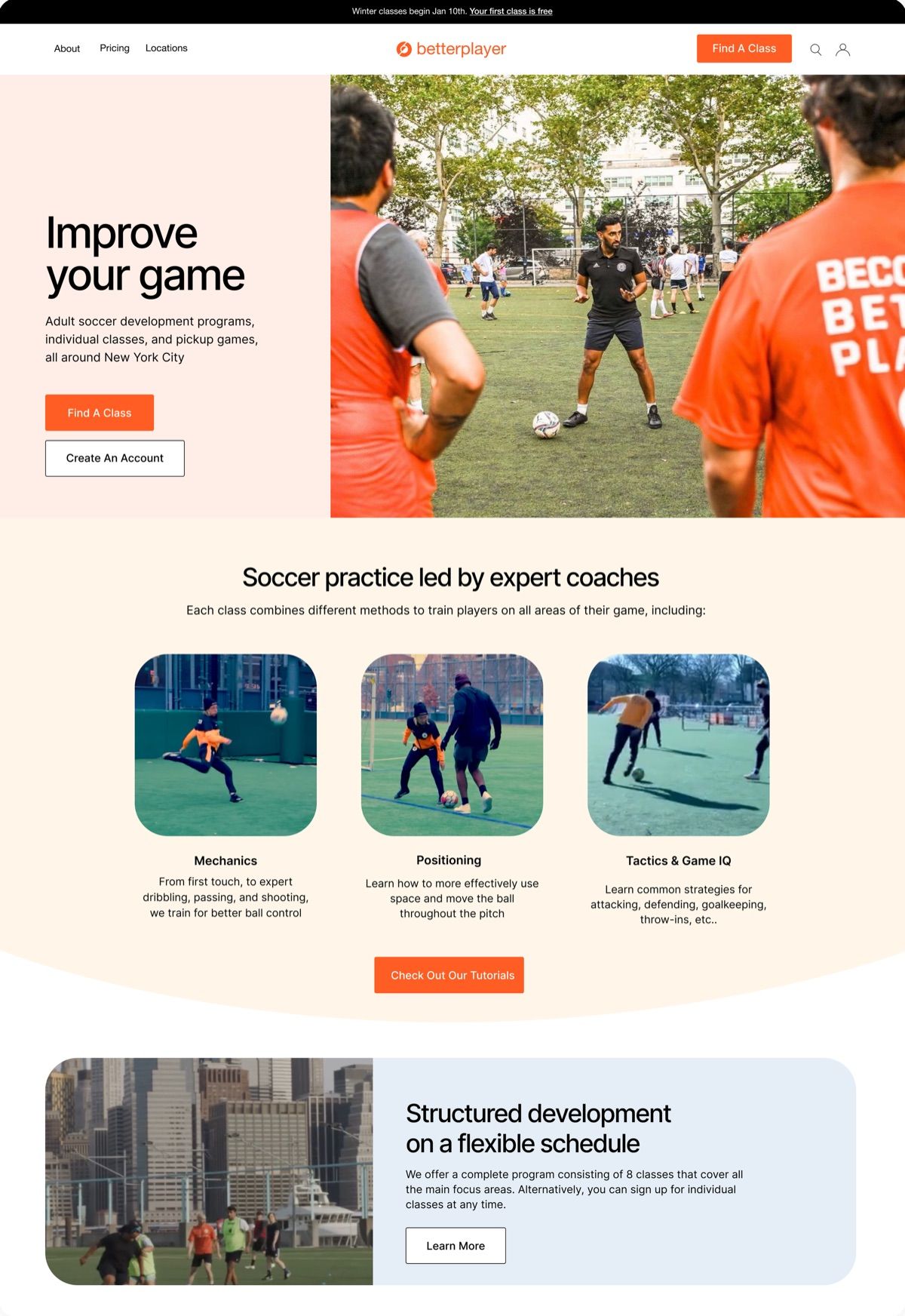
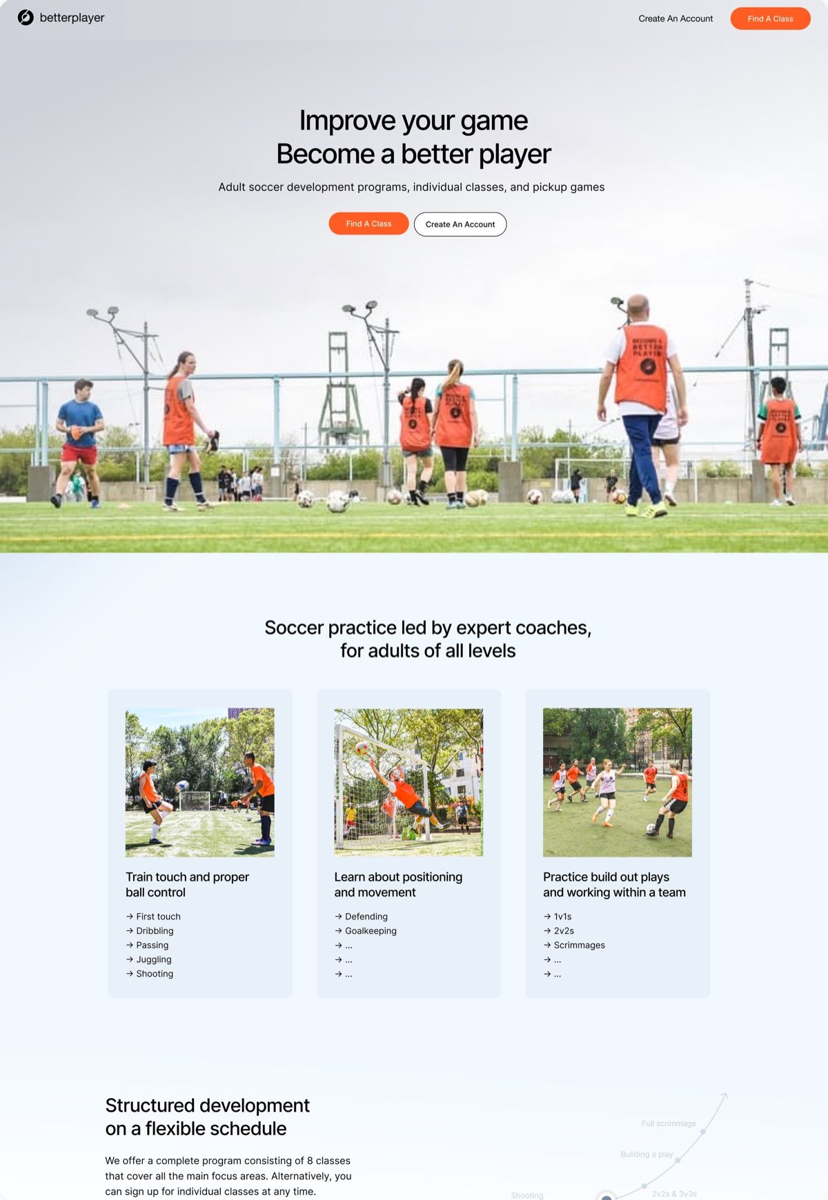
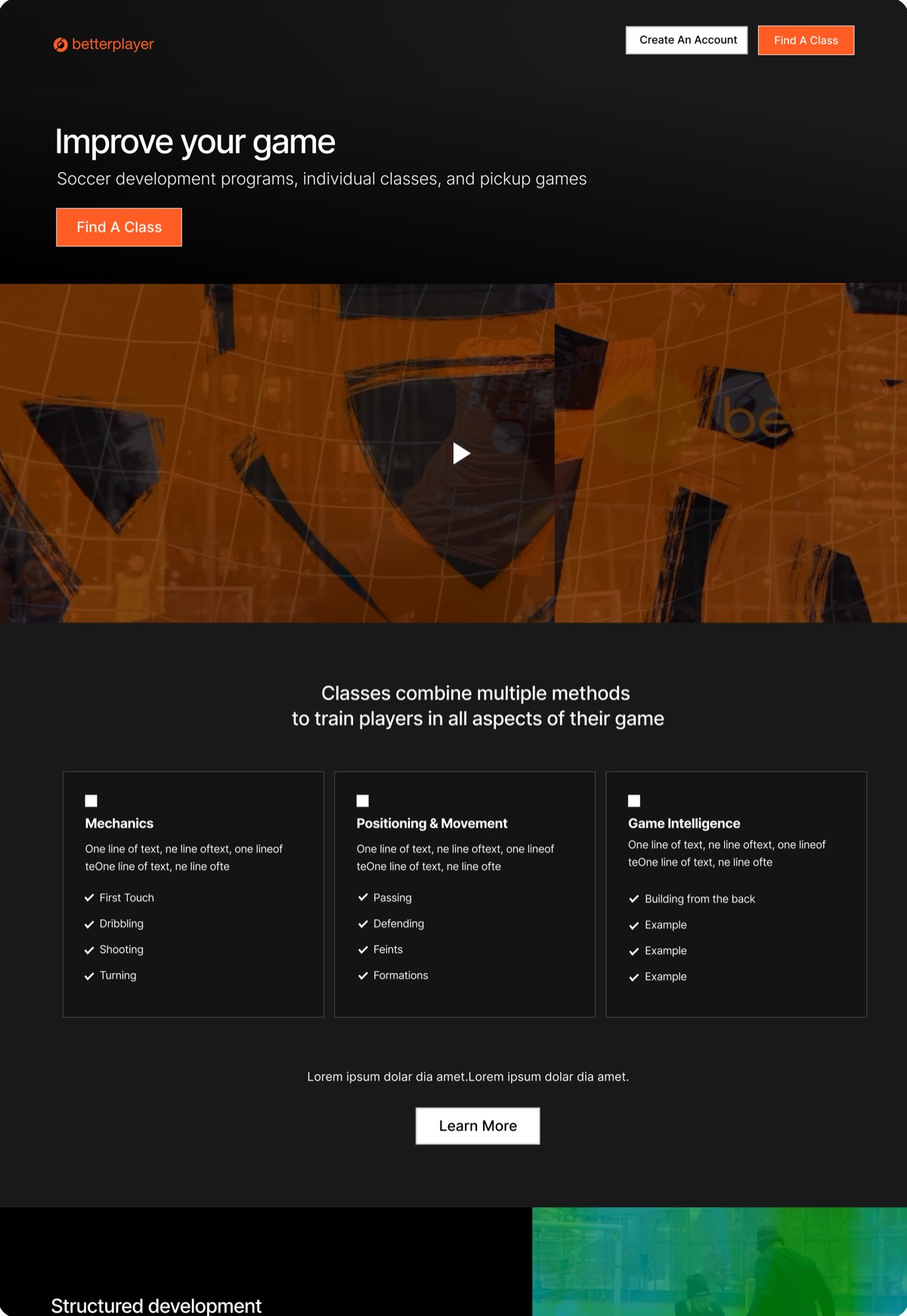
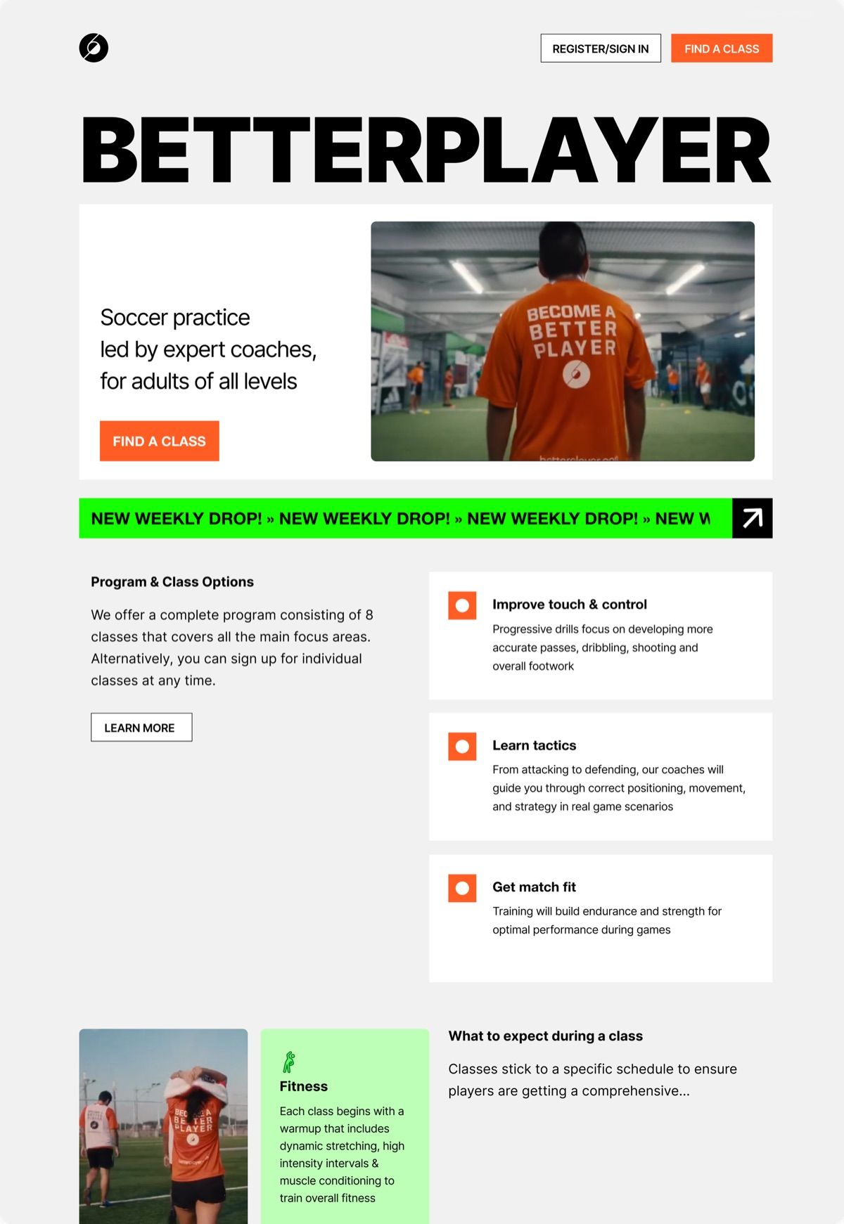
Five directions drawn from comparable brands, tested with Betterplayer HQ and 3 players. “Airy, Clean, Practical” won: solid colors over gradients, and content floating free instead of in “boxy” cards.
Bright, Bubbly, Focused. From the current site: its light palette, with content in distinct containers.
Bright, Bubbly, Focused
Airy, Clean, Practical. From financial and credit card sites: space to lay out the service plainly, with sections that flow into each other.
Airy, Clean, Practical
Alternative, Stylistic, Serious. From the Instagram account: its graphics, branding and video.
Alternative, Stylistic, Serious
Bold, Fun, Direct. From the jerseys and merch: concise content and loud, unmissable UI.
Bold, Fun, Direct
Minimal, Expressive, Active. From sports apparel brands: a mix of the others, led by big photography.
Minimal, Expressive, Active
The solution
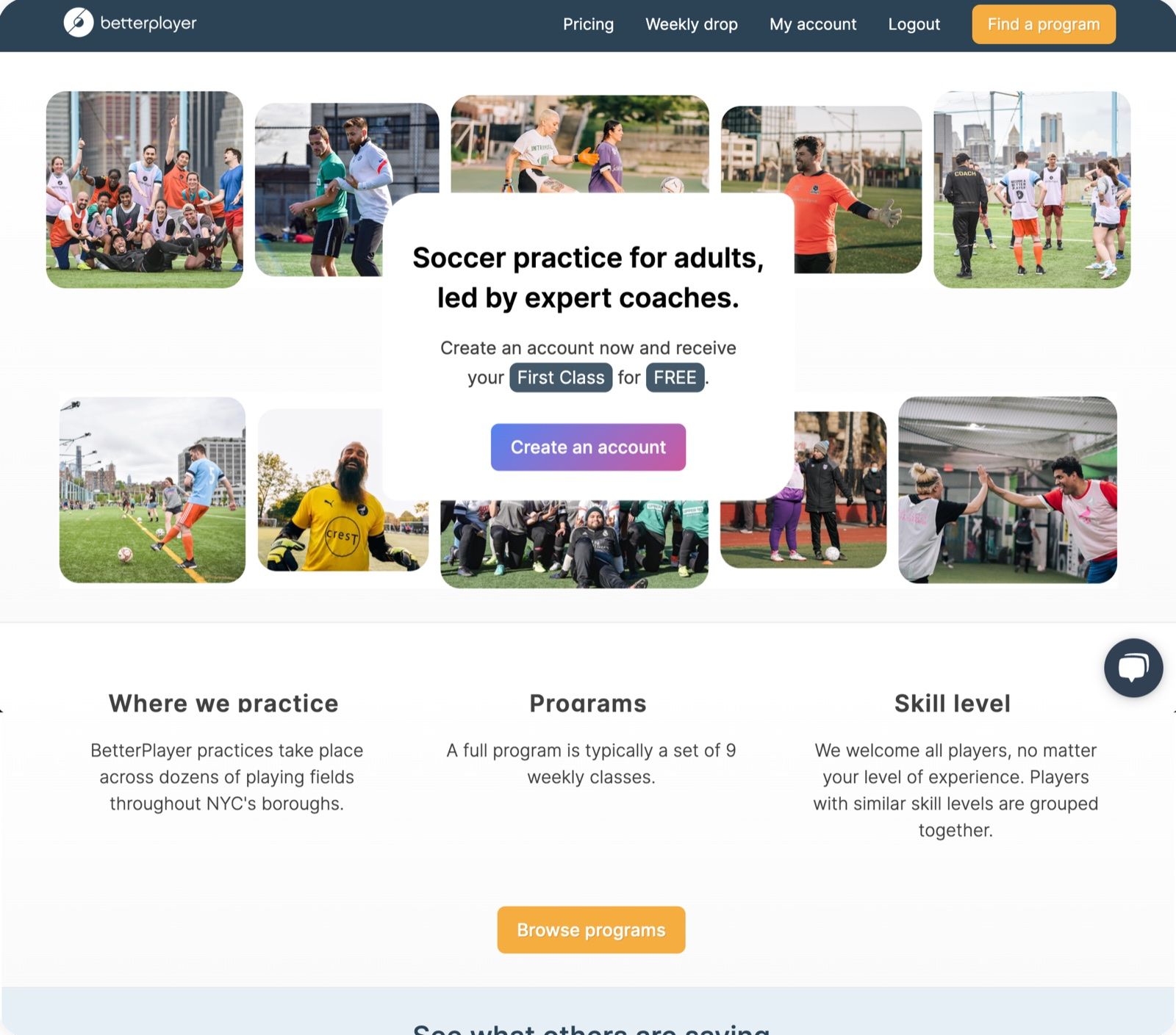
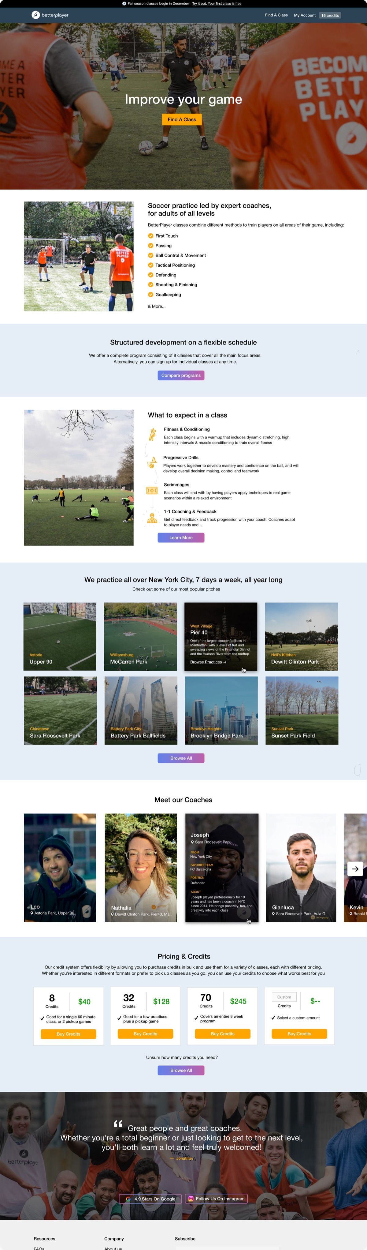
Practice for adults, led by expert coaches
Two rounds of iteration on the winning direction, mostly visual design and copy, with video from the Instagram and coach bios added at the CEO’s request.
betterplayer.com
The final page. Hover or scroll to read it top to bottom
Sections answer each persona: what to expect at a first class, programs and pricing, and skill levels.
A coach carousel, location maps, and a video section, with interactions specified for the developer.
Mobile breakpoints for the 24% of visitors on phones.
Impact & reflection
More players through the door
The page launched in March 2025. More visitors scrolled to the bottom, used the coach carousel, and went from sections like “What to expect” straight to class pages. The next season brought 40 more first-class signups and 11 more 9-week program signups.
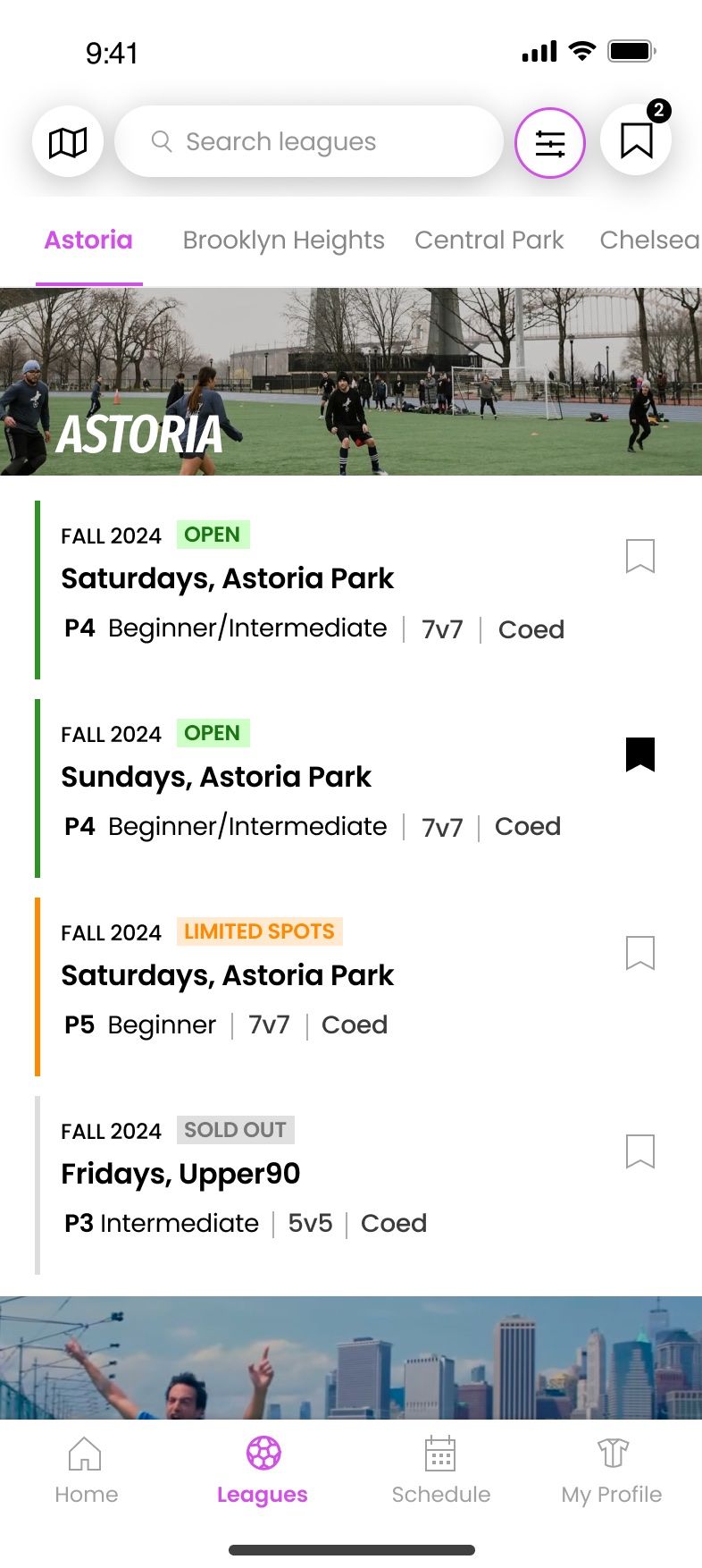
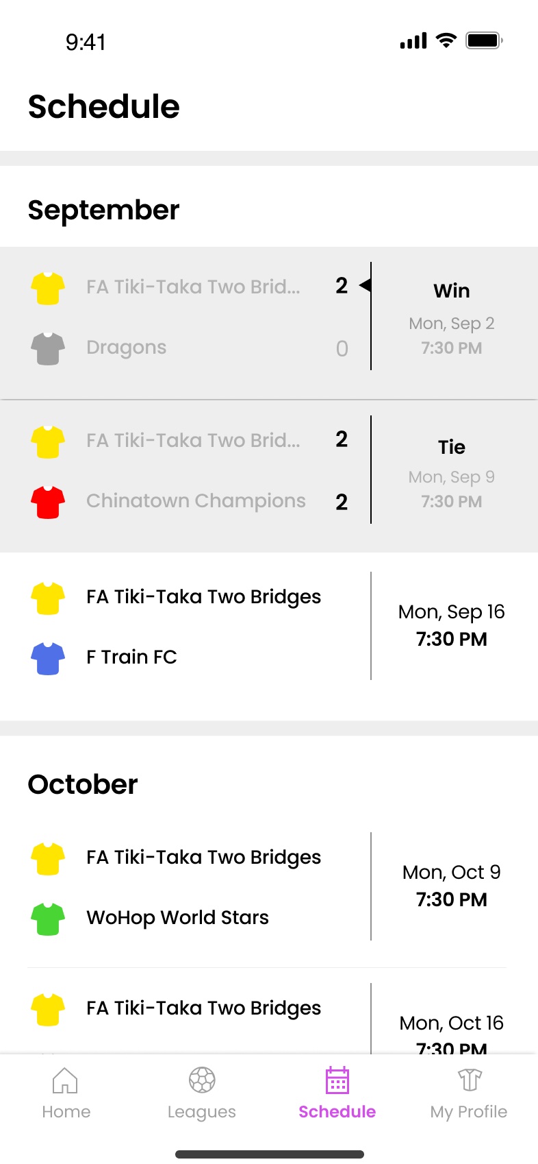
I’ve kept working with Betterplayer HQ since: Betterplayer Plus, an unlimited class membership, and a dashboard for players to track their classes. It’s the first time my design work has grown something I love, and I meet new players at classes who found it the way I did.