Back to work

NYC Footy · Case study

Mobile App Design

The first app for the world’s largest rec soccer club: one home for 50,000+ players to find leagues, follow their games, and rate them.

Role
Freelance Product Designer
Team
Me, the CEO, and 1 engineer
Timeline
Under a month to design, 2025
Platform
iOS
50,000+players across New York City, with one app for their leagues and games
100+leagues a season to search, filter and bookmark by neighborhood, level and day
40%of players moved from LeagueApps to the app within 6 months of launch

The problem

A growing club, running on someone else’s app

Rec soccer takes admin: players find a league, register, keep track of games and follow the standings. NYC Footy ran all of it through LeagueApps, but the club had grown enough to want an app of its own.

As a Footy player and LeagueApps user myself, I reached out to help it feel like the brand and work better. A freelance developer had already built a first version: a list of leagues, and a link out to LeagueApps to register.

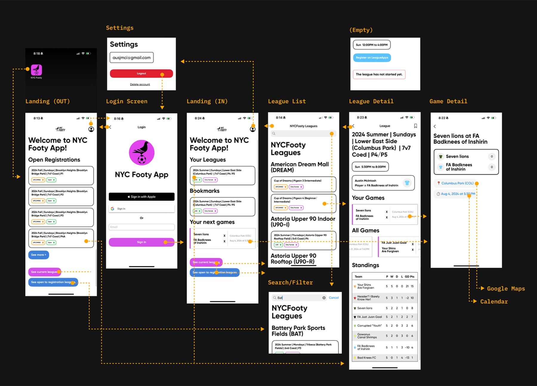
An audit of every screen in the first build: landing, login, leagues, league detail, game detail and settings, with the paths between them
Before: my audit of every screen in the first build

Key decisions

Familiar patterns, unmistakable brand

Map the two jobs before designing a screen

What we learned
The first build already had accounts, a filterable league list and game schedules, but no clear path from finding a league to playing in one.
What I did
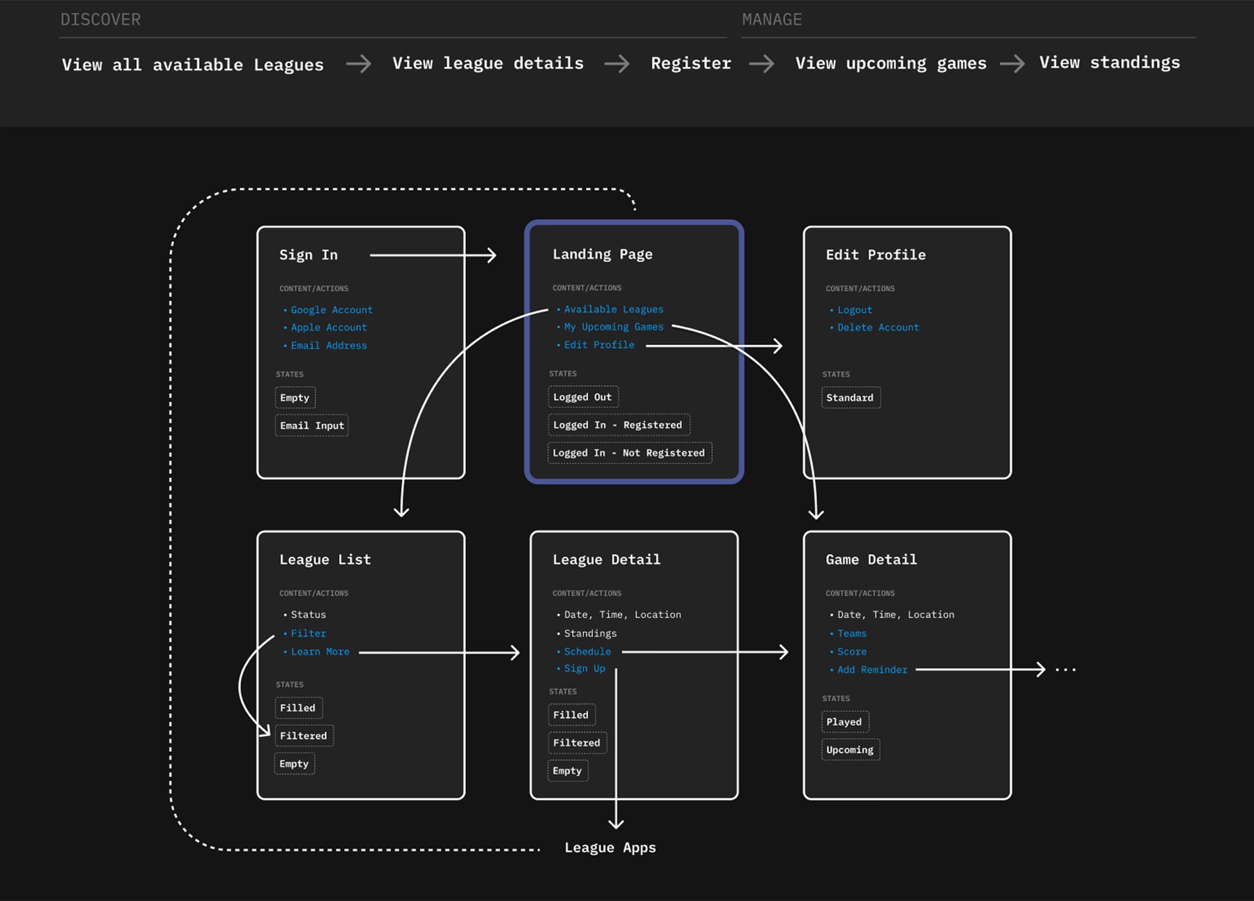
Inventoried every screen and state, and built the app around two jobs: discover a league and register, then manage your games and standings.
The core flow, from viewing leagues to registering, then upcoming games and standings, with each screen's content, actions and states
Discover, then manage: each screen with its content, actions and states

Use the patterns players already know

What we learned
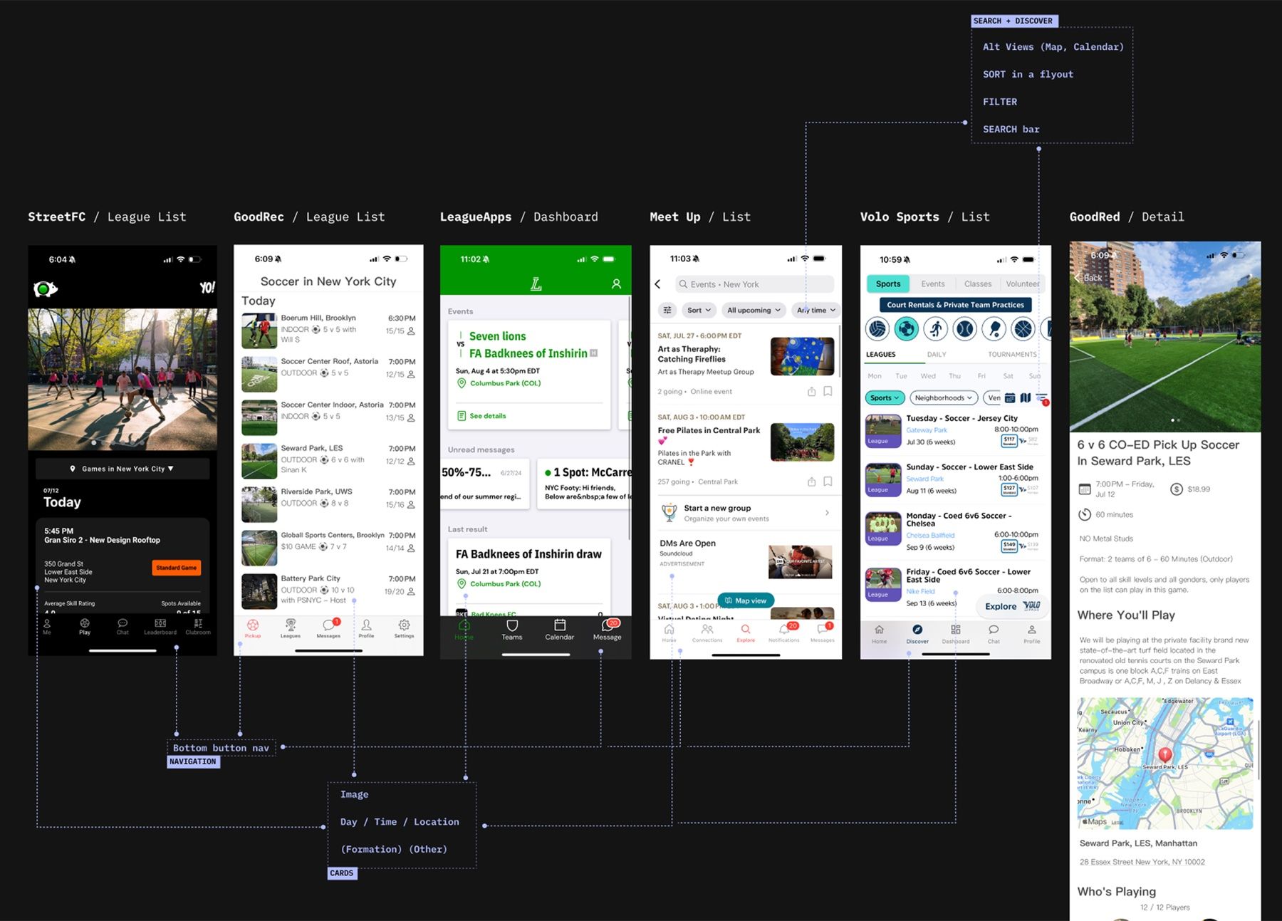
Volo, GoodRec, StreetFC and others share the same moves: a bottom tab bar, league cards with a photo, day, time and location, and search with filters.
What I did
Kept those conventions, with four tabs, photo-led league cards and a filter sheet, so the app felt familiar, and saved the originality for the brand.
League lists and details from StreetFC, GoodRec, LeagueApps, Meetup and Volo, annotated for navigation, cards and search
How six apps handle discovery, cards and filtering

Make it unmistakably Footy

What we learned
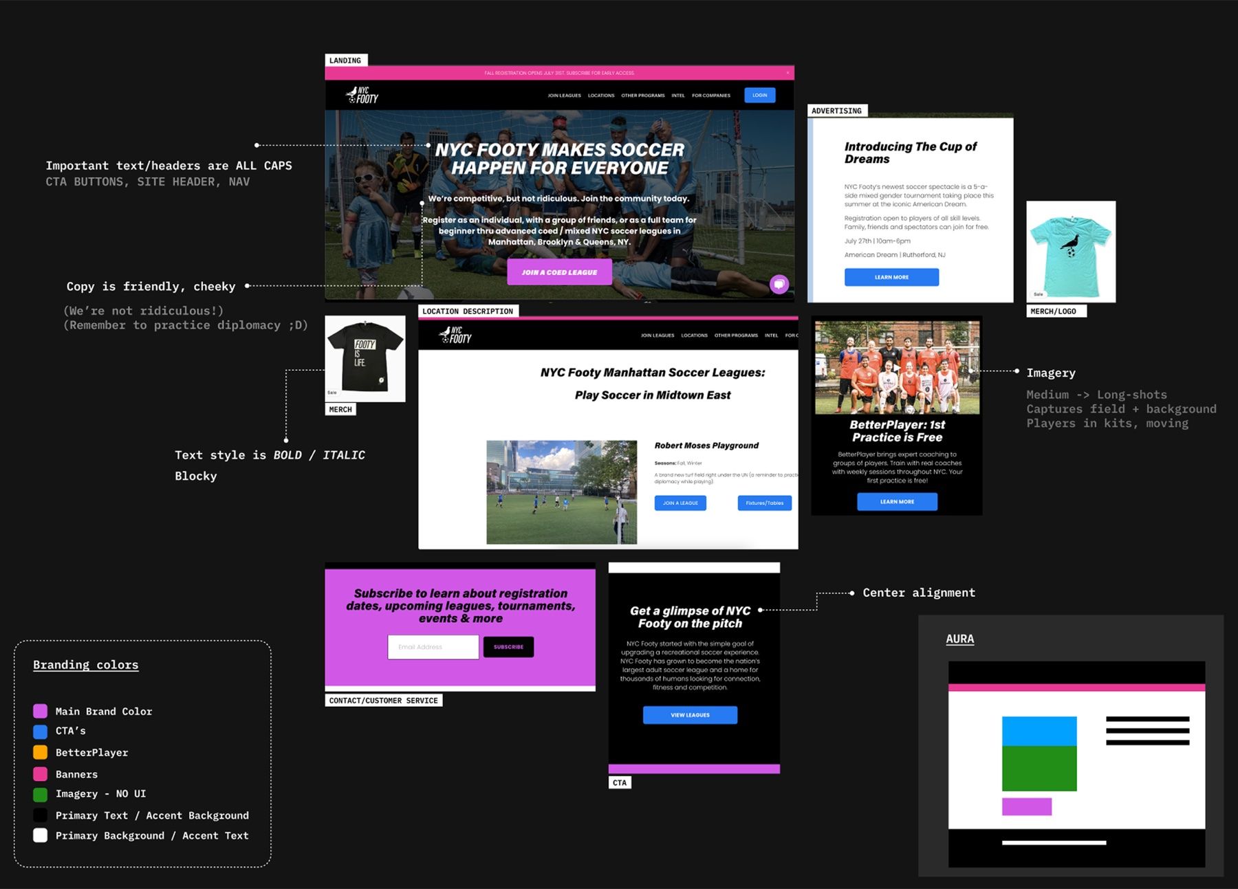
Footy’s site, Instagram, emails and merch are bold, italic and cheeky, led by purple, with photos of players in kits on city pitches.
What I did
Signature purple for actions and banners, big skyline photography to win new players, and a new icon and pictogram library, down to the loading pigeon.
An audit of the NYC Footy brand across its website, ads, merch and emails, with notes on type, copy, imagery and colors
The brand audit: type, tone, imagery and colors

The solution

One home for leagues, games and standings

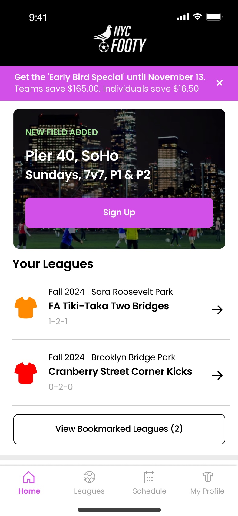
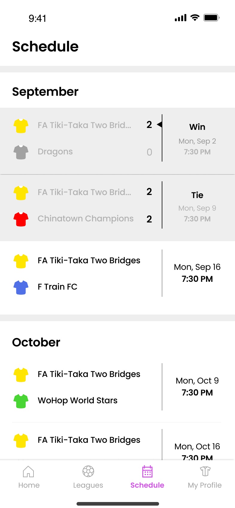
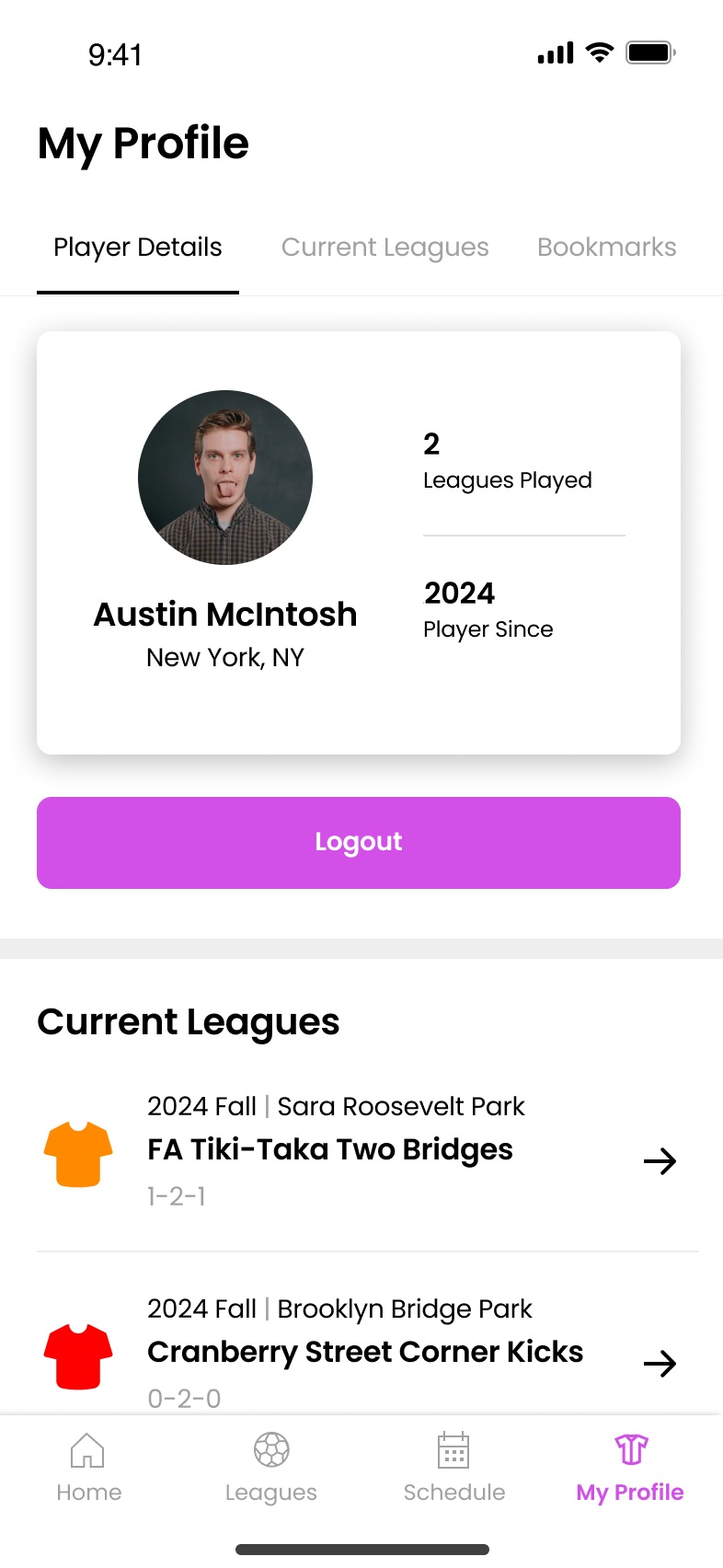
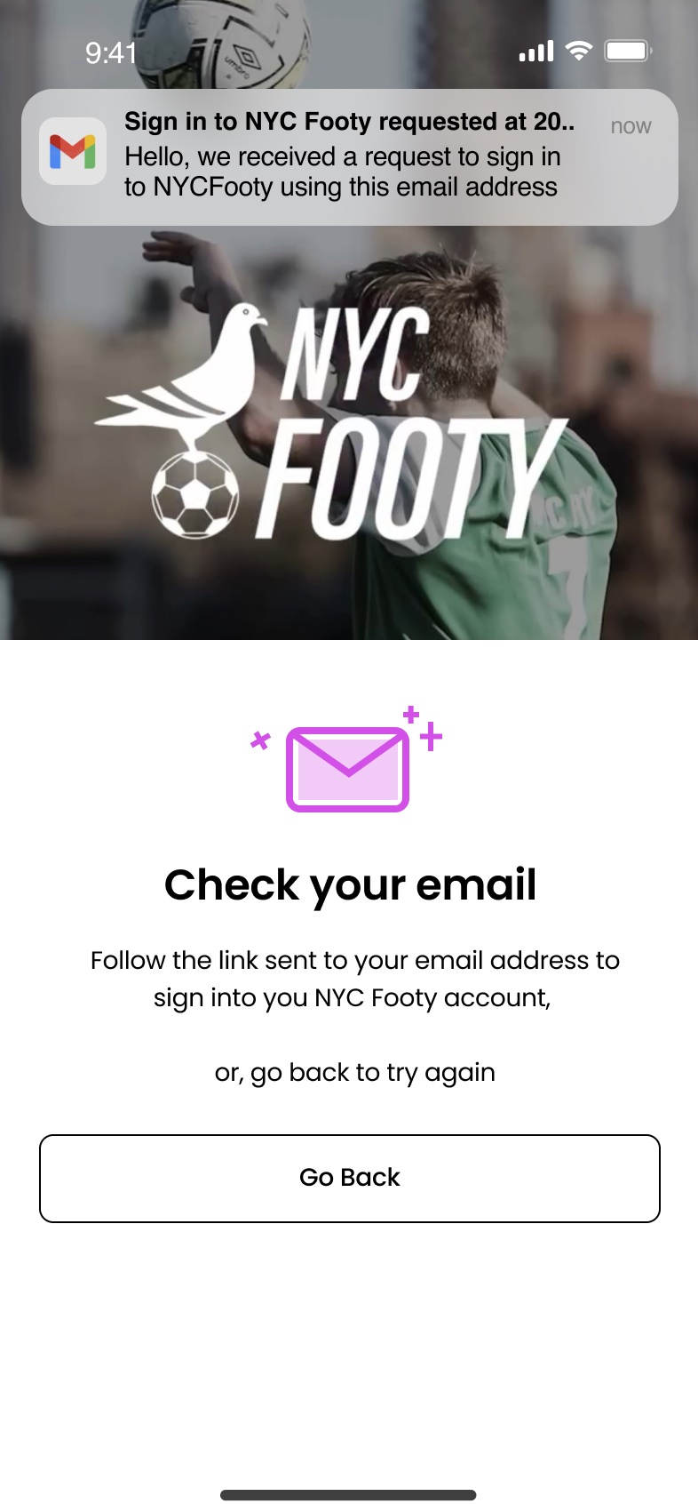
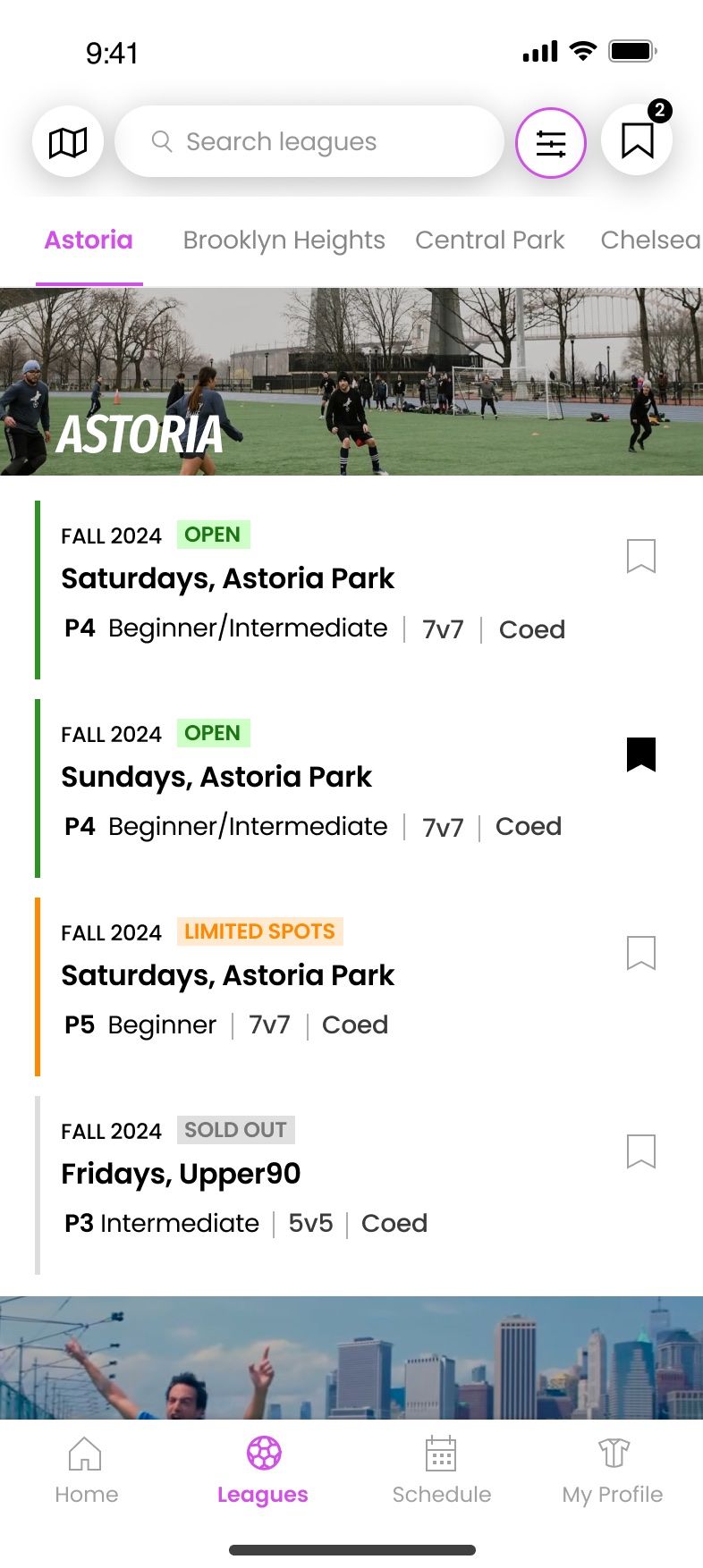
Four tabs: Home for what’s next, Leagues to find and bookmark a league, Schedule for every game and score, and Profile for your record. Signing up takes an email and a confirmation link, not a form.

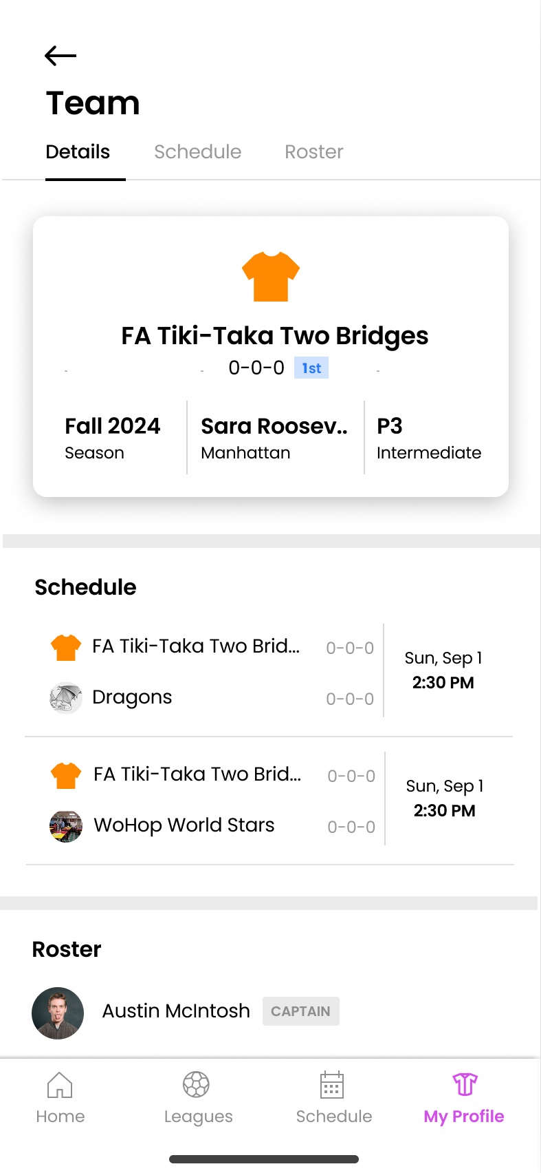
  • Team avatars are T-shirts, set to each team’s real jersey color.
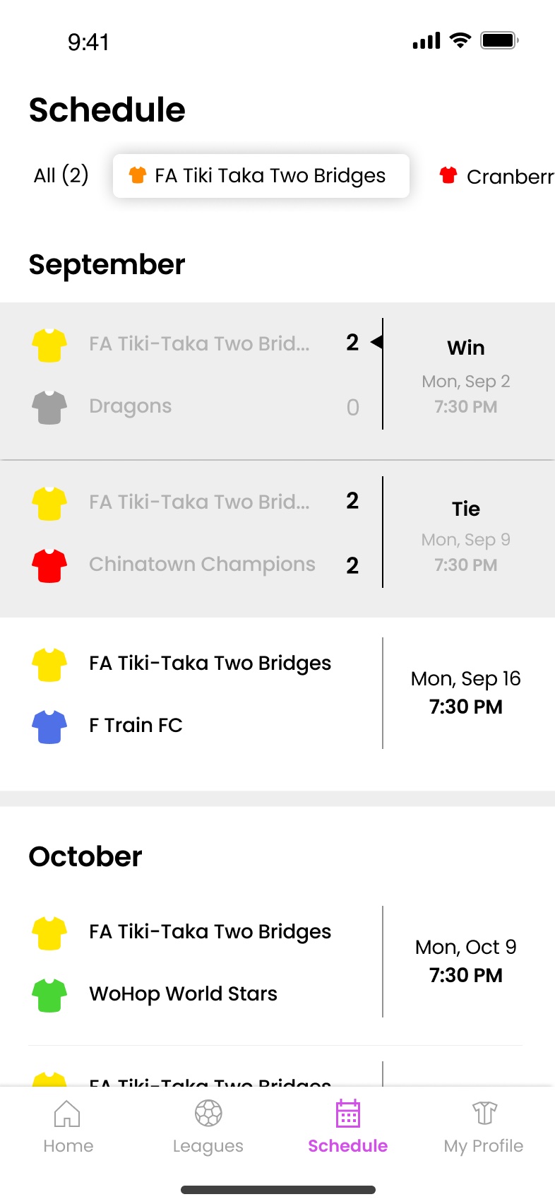
  • Results read like a pro sports app: wins, losses and ties at a glance.
  • After a game, captains get a push to rate it: a quick yay or nay, with more detail only if it’s needed.
  • Profiles count your leagues and seasons, because players are proud of their time on the pitch.
  • Try it: tap the tabs, open a league, then the notification to rate a game
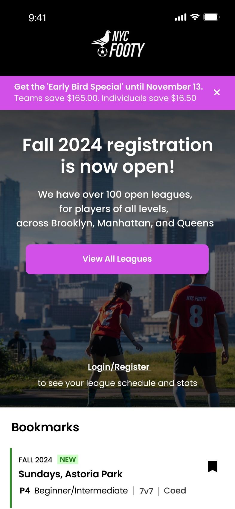
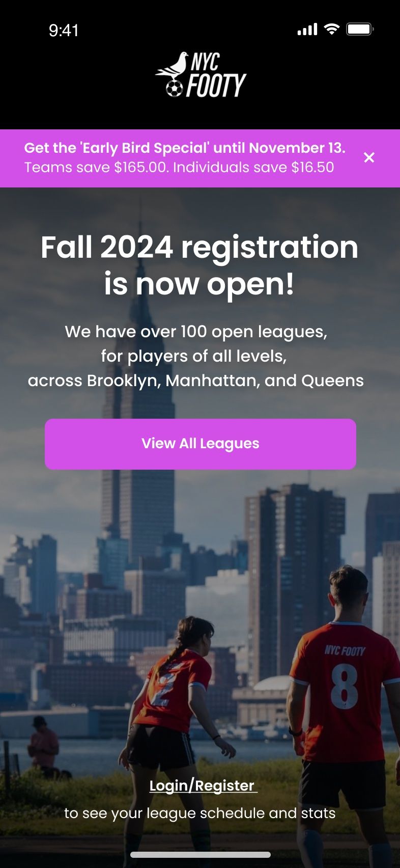
The signed-out home, with Fall registration open over a skyline photo
Signed out
The signed-out home with bookmarked leagues below
Signed out, with bookmarks
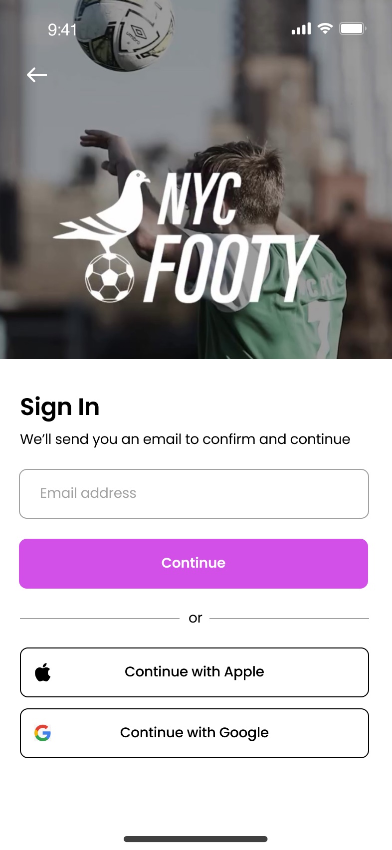
Sign in with an email, Apple or Google
Sign in
Check your email for a sign-in link
Check your email
The loading screen, with the pigeon pictogram
Loading pigeon
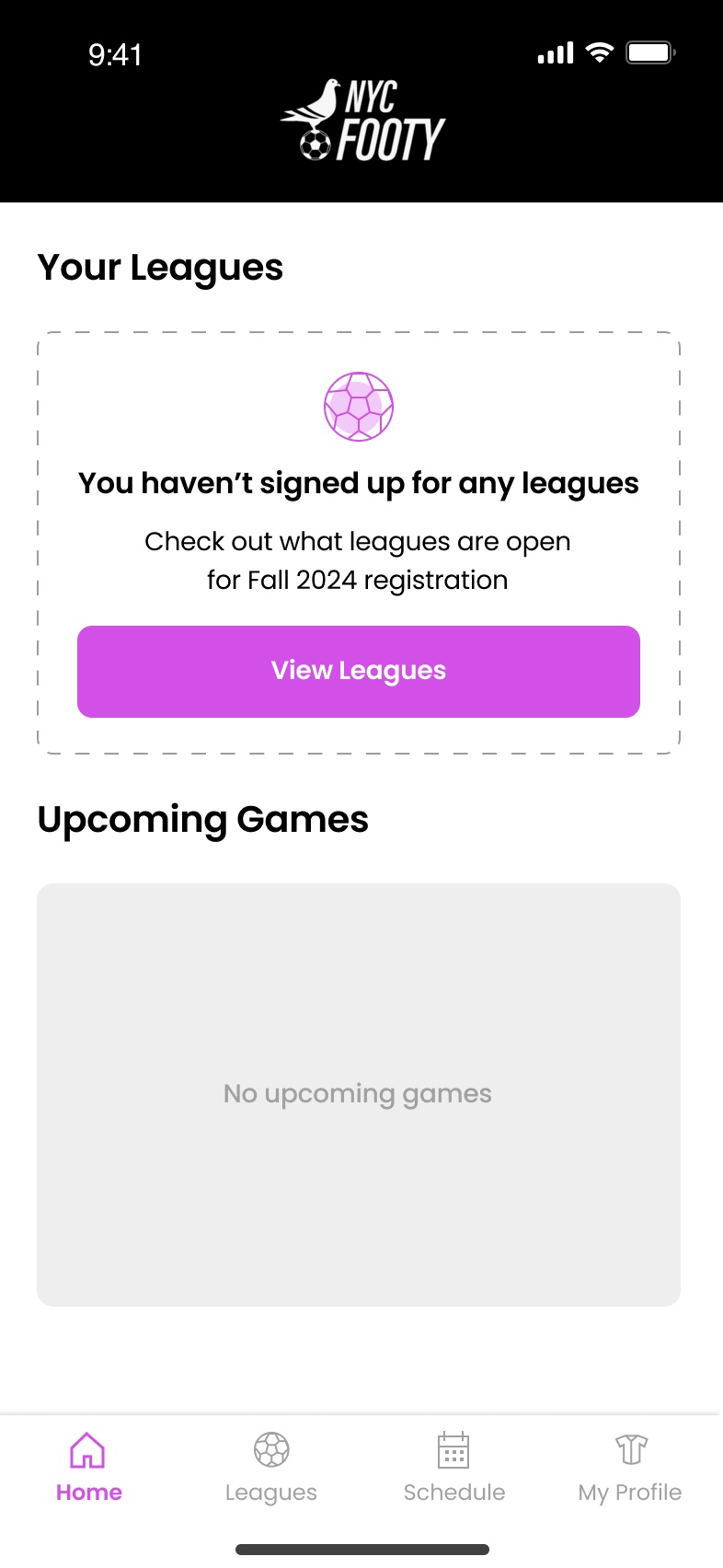
Home before joining a league, pointing to open leagues
Home, no leagues yet
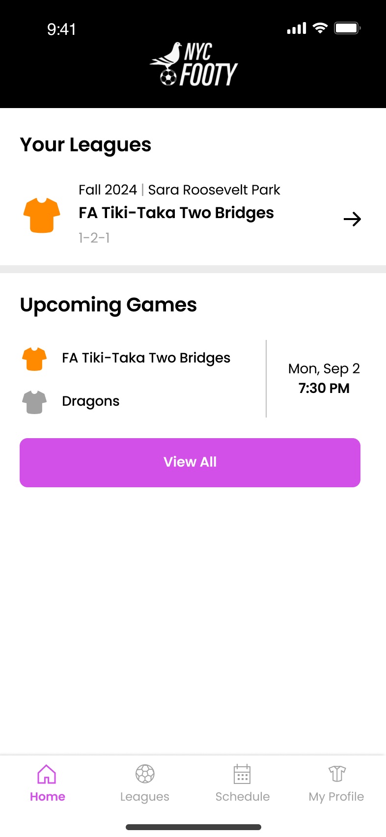
Home with one league and the next game
Home, one league
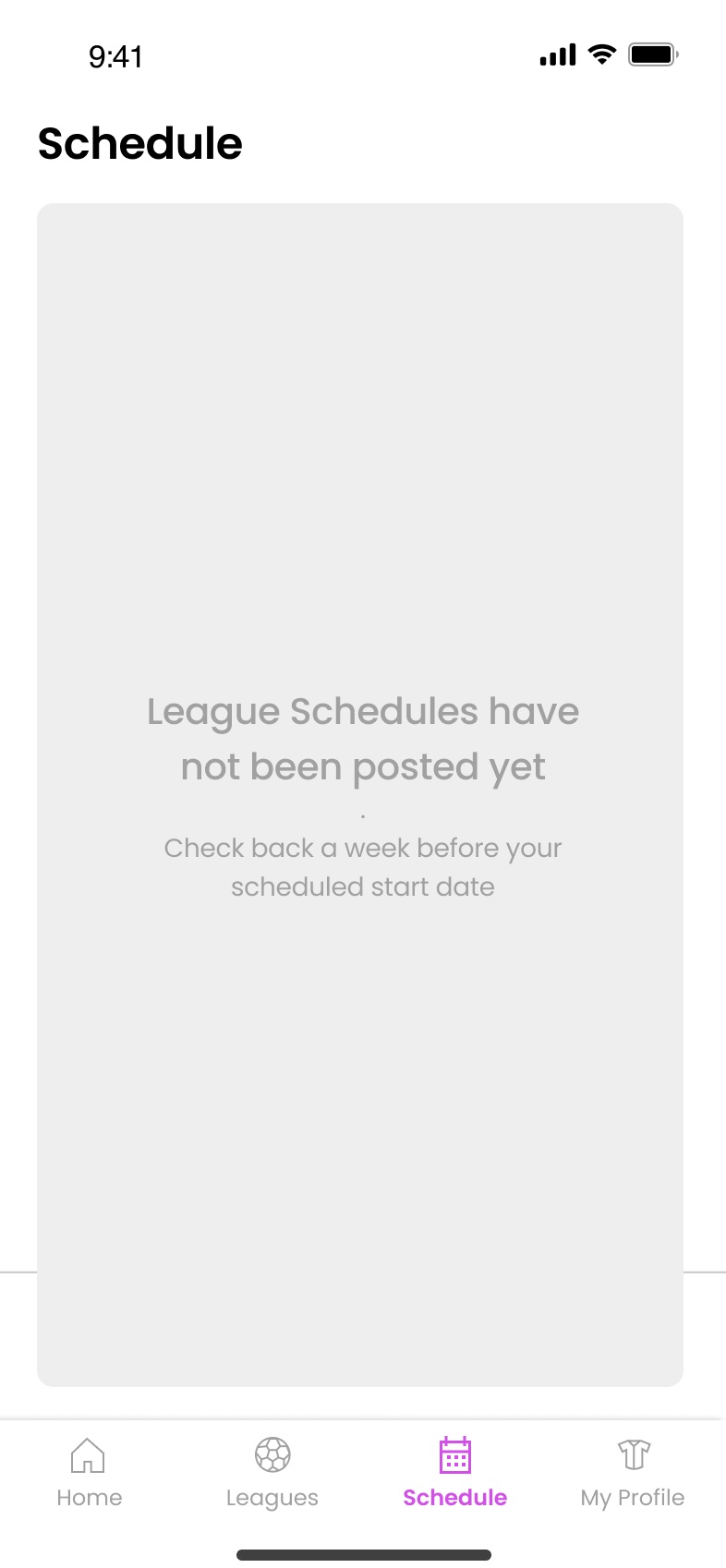
The schedule before it's posted
Schedule, not posted
The schedule across two leagues, with results
Schedule, two leagues
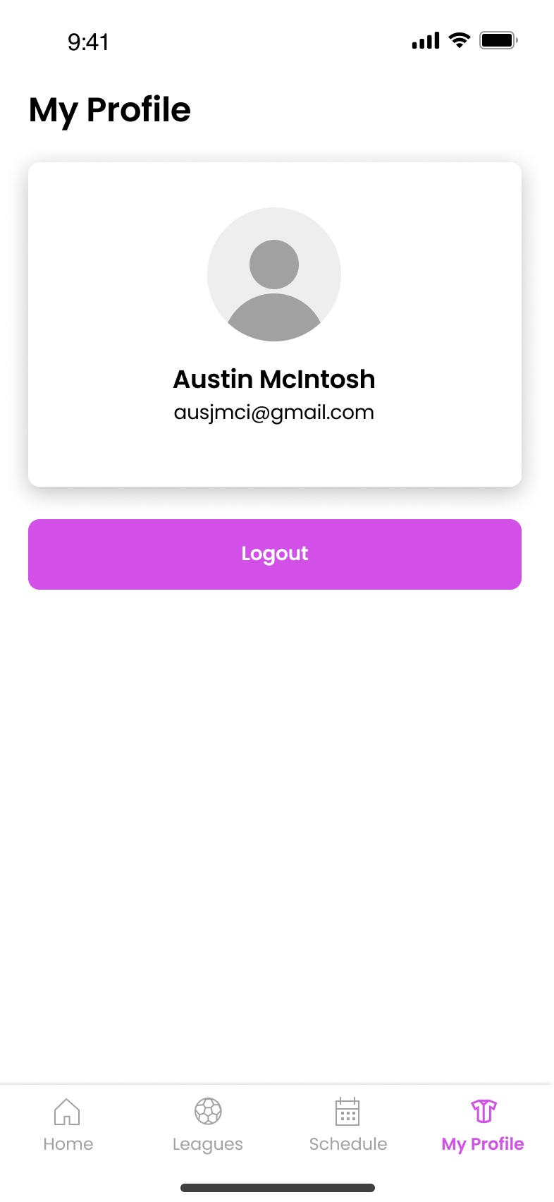
The default player profile
Default profile
A team profile with its schedule and roster
Team profile
Every state, from signed out to a full season. Hover to pause
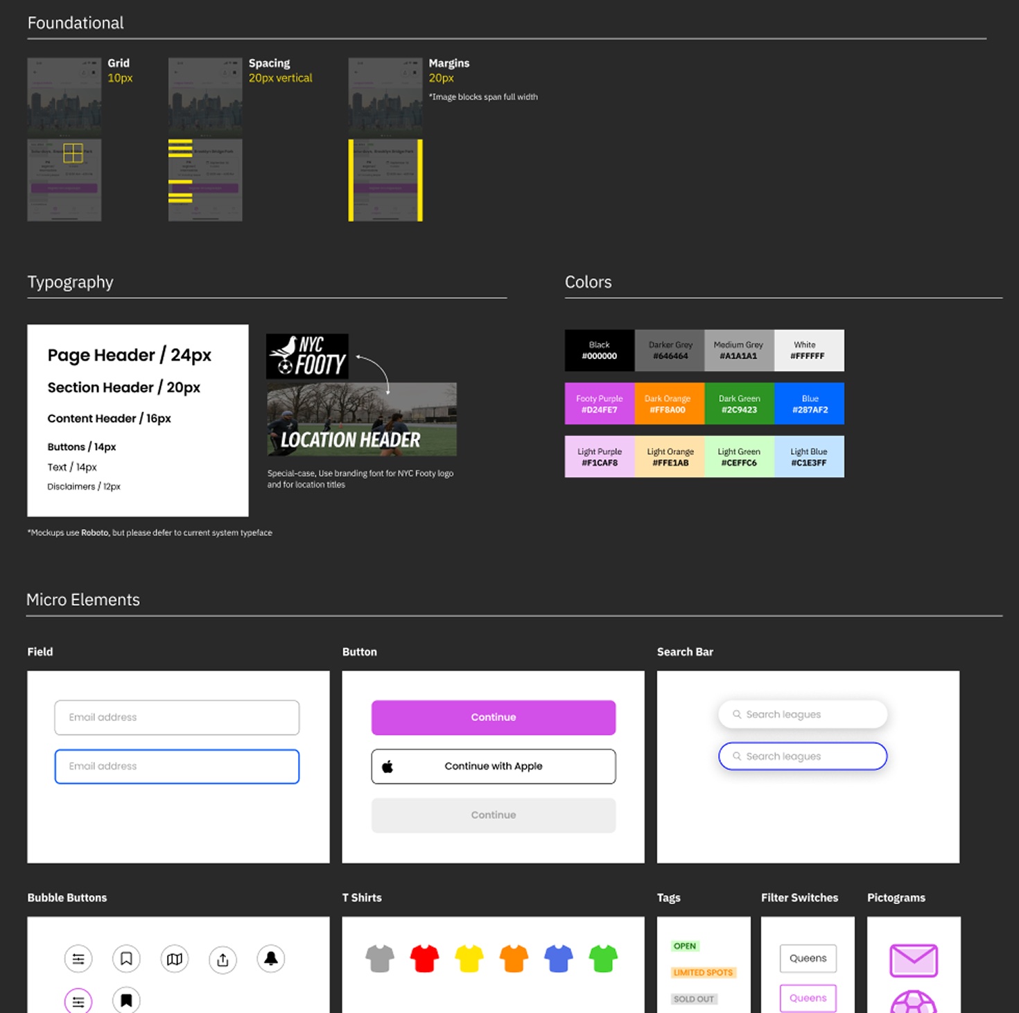
The design system: grid, spacing and margins, typography, colors, and components from fields and buttons to T-shirts, tags and pictograms
A design system for grids, type, color and components, with a dark mode for iOS

Impact & reflection

A club app of its own

I designed the app in under a month, from an audit of the first build through research, design and usability testing, then worked with the engineer through two months of build and QA. It launched a month later as NYC Footy’s first app of its own, with a design system and room to grow.

Players followed: about 20% moved from LeagueApps within 3 months, and 40% within 6. The pull back was team chat. Teammates still messaged each other on LeagueApps, so players kept one foot there, and bringing team messaging into the app is underway now.

Next, I’d bring registration into the app, so signing up for a league no longer hands players off to LeagueApps.
End of case studyBack to top ↑