

COMPASS • 2022Redesigning listing cards to support the way buyers actually want
to browse
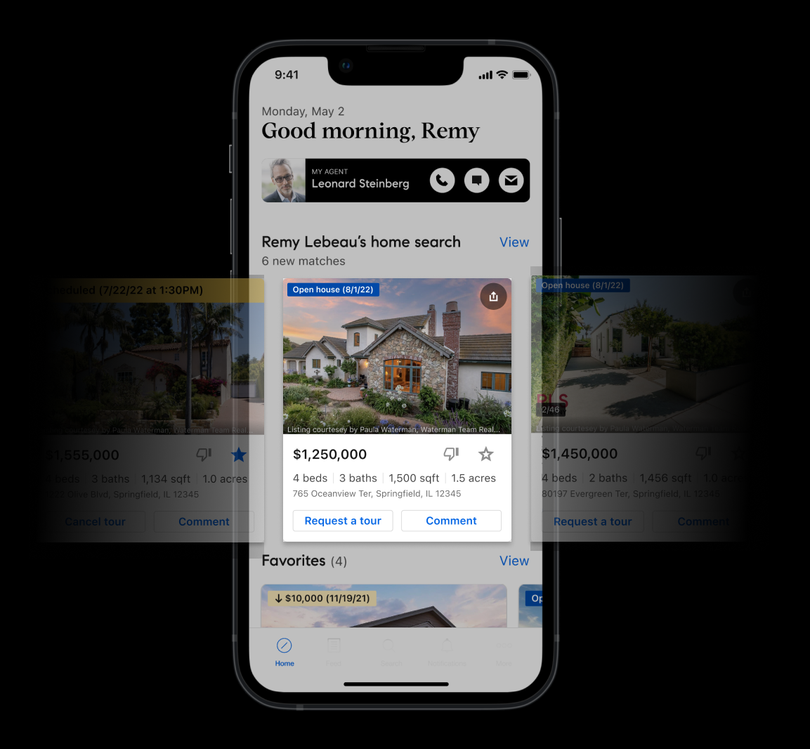
Research revealed that buyers wanted to explore photos before committing to a full listing page. Redesigned the mobile card to surface photos, favorites, and sharing upfront.
My Role
Product Designer
Tools
Figma, Usertesting.com
Key Themes
UX/UI Design, Consumer, User Research, Market Research, Usability Testing, Design Systems
Background
Listings on Compass
The Listings team works on the core component of the entire Compass consumer platform - The listing page. This is where users go to view properties they are interested in, and engage with features such as media, maps, payment calculators..
But most importantly, the listing page is the starting point to the home-buying journey. It’s where ~85% of visitors land before registering, requesting tours, messaging agents, and starting collections.
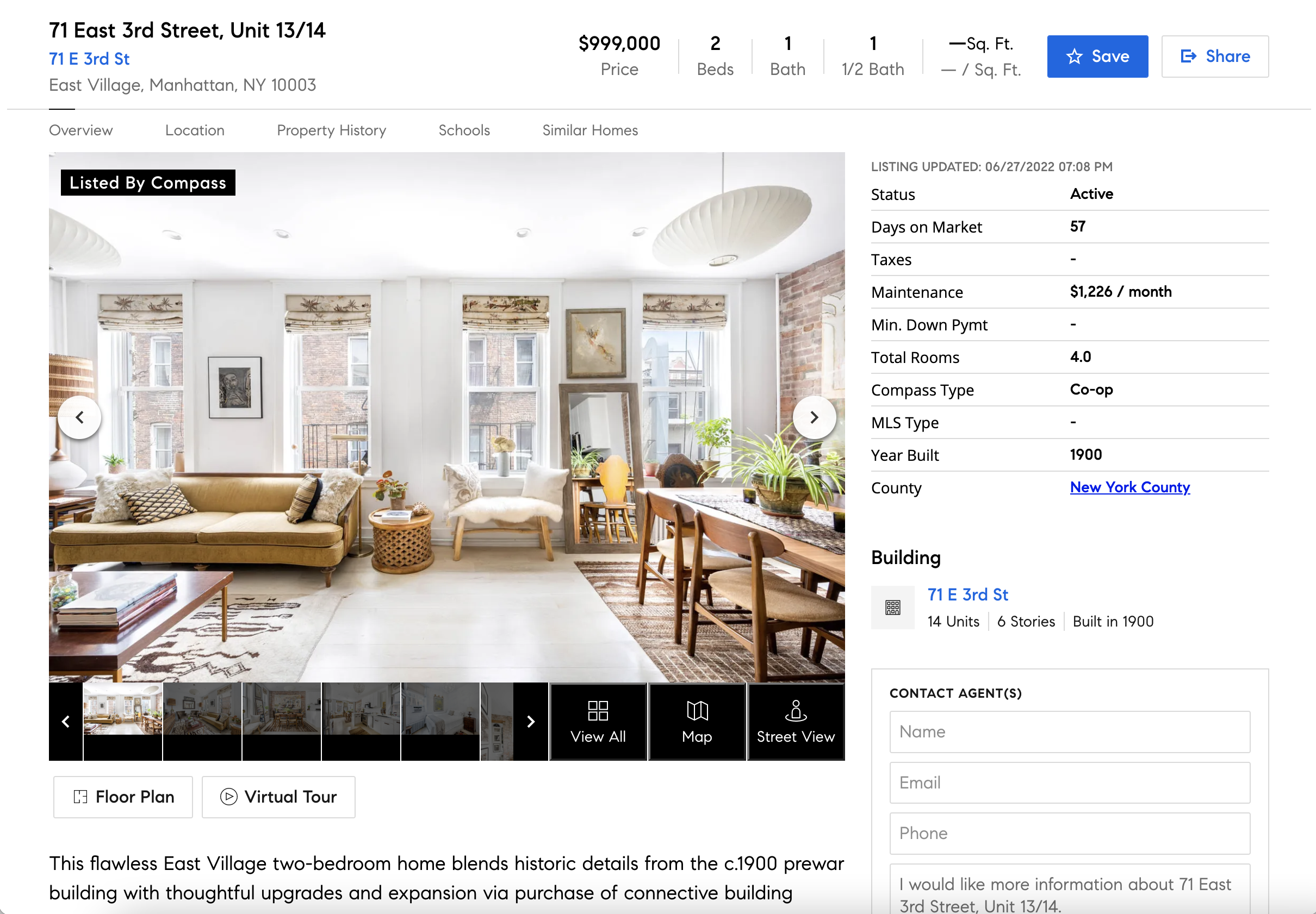
Compass consumer/client listing page
The role of “Cards”
One might argue, however, that the decision to engage with a listing page comes through the listing card, which is typically found in Search, or within a users saved Collection of properties
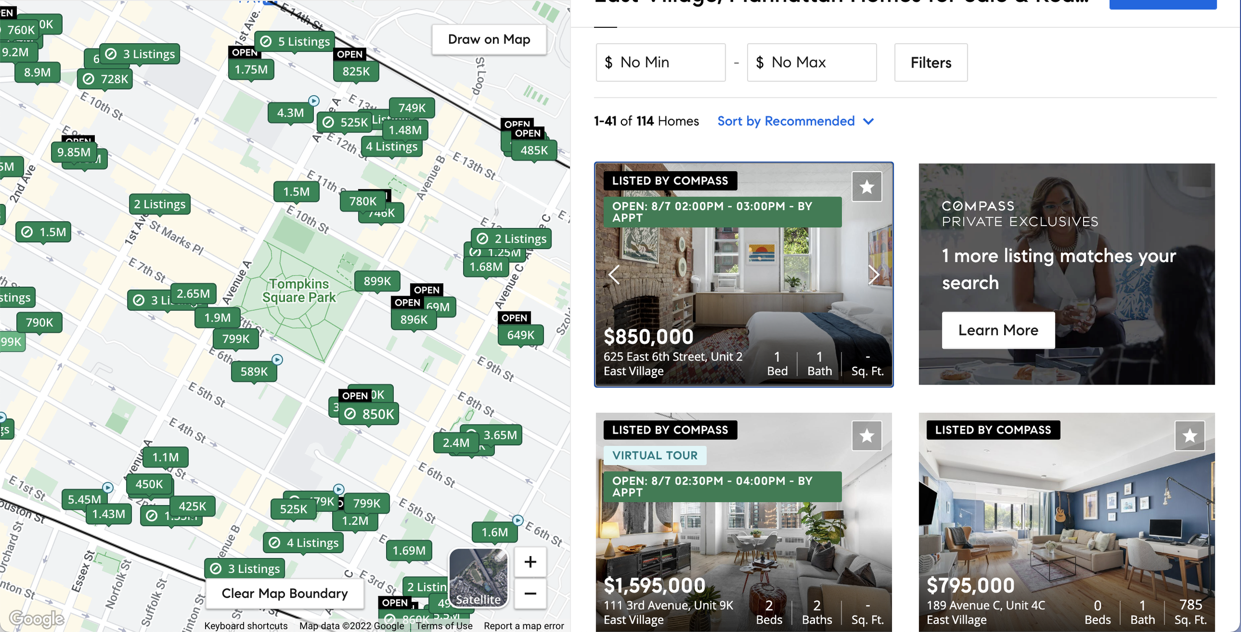
Compass ‘Search’ featuring listing cards in the result table on the right
Listing cards are essentially condensed versions of listing pages, which will show the most key pieces of information necessary for a user to determine whether or not a property meets their criteria, in addition to allowing quick actions without having to tap into a new page from Search or Collections
Areas of opportunity
On the Listings team, one of our primary goals is to connect consumers to agents by getting them to create accounts, or contact agents directly by expressing interest in a property.
During a usability test session for a separate project, we identified several usability issues with our listing cards that we went on to validate in a subsequent survey. Here, we learned that due to feature gaps and visual design of our listing cards, users preferred to use search and listings pages on competitor sites
Goal
If we redesign our listing cards to have feature parity with our competitors, and improve the visual design and information architecture, then we will see an increase in engagement with our listing pages, and ultimately increased conversion from consumer to connected clients
Process
We used an iterative design approach, encompassing multiple rounds of testing and iteration. The “final” product was a first version intended to be improved as we collect real time user data
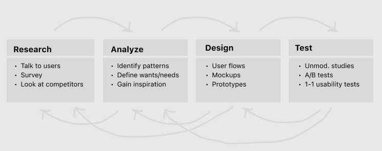
Specific UX methodology used within this project
Research
Discovery Research
In order to better understand our users’ needs, and to identify specific opportunity areas, I used usertesting.com to recruit prospective homebuyers and ask them about their experience browsing and engaging with properties on Compass versus other competitors
Key Findings
💡 Users found that Compass listing cards were less readable than our competitor card
💡 Our cards don’t offer key actions such as: “Share”, and “Dislike”
💡 Users want the ability to view photos without having to go into the listing page
(in beta on Web, missing on iOS, Android)
💡 Once users have saved listings to their Collections, they don’t want to have to tap into the listing page each time they want to request a tour or contact their agent
Competitor Research
Because we knew that our surveyed homebuyers prefer competitor cards to Compass, I did an audit of our top competitors and outlined specific patterns and feature gaps
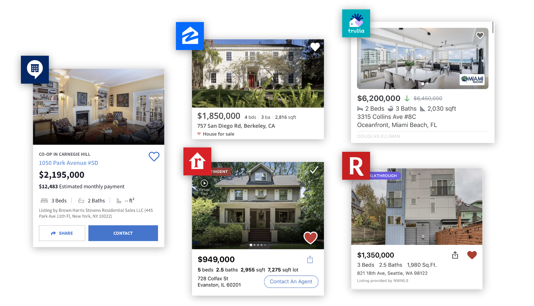
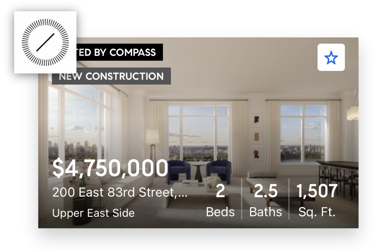
Compass vs. competitor cards on iOS
Key Findings
💡 Competitors keep text off of the image to improve readability and emphasize the property image
💡 Competitors allow for sharing and contacting directly on the card
💡 Cards typically allow for interacting with photos without having to go into the listing page
Design Goals
Fill feature gaps from competitors (Share, Contact, Interactive photo carousel)
Include new features based on user needs (Dislike, Schedule tour, Lot size field)
Clean up visual design & IA of the card to ensure better readability
Design
User flow
As a reminder, our primary goal is increase conversion from consumers to connected clients, therefore, we must design the cards to push consumers to register and more easily schedule tours
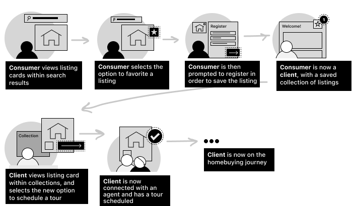
Flow from consumer search to agent connection using actions on listing cards
Concept
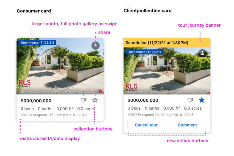
We decided to design 2 versions of the listing card to meet specific user needs at different points in the user journey
1) Consumer cards - Focused on pushing users to save listings to collections, share with others, or register if they are not yet a Compass client
2) Client cards - Found in collections once a user has already decided to favorite the listing, focused on pushing the client to schedule a tour or connect with a Compass agent
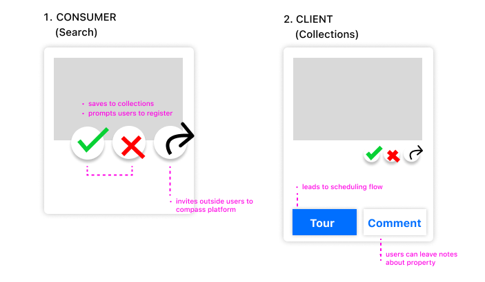
Diagram of actions on the two versions of the new listing card
The design went through multiple rounds of usability testing and iteration based on feedback. Tests were done primarily through usertesting.com where we would have participants compare/contrast two versions of card designs within a prototype
The main questions we hoped to answer through usability testing were:
1) Which design (A or B) feels more readable?
2) Which actions are most useful for you?
3) How do these cards compare to those that you’ve seen on other apps?
Evolution & testing
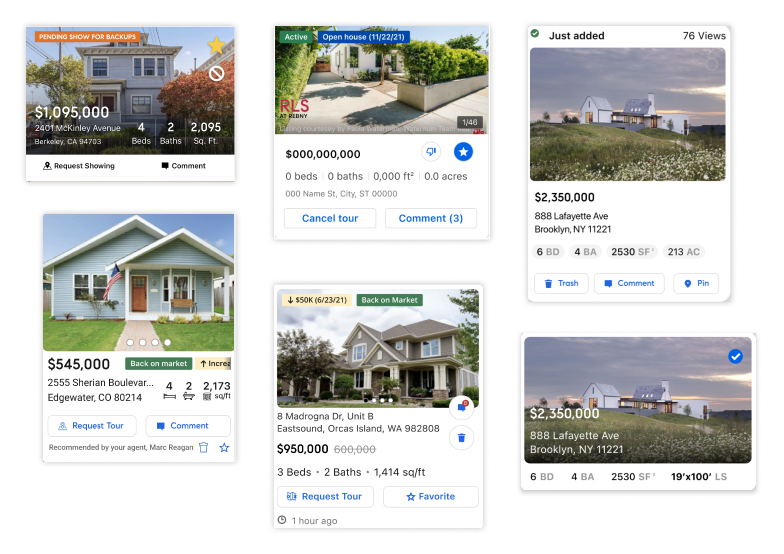
Various versions of the redesign
Learnings From Testing
💡 Users preferred cards to have a larger photo, and don’t mind if cards are larger if it means all of the information is lined up clearly
💡 Users like the ability to like and dislike, wanting “disliked” options to disappear from search and bucket into a collection
💡 Users found text to be more helpful in directing them to perform actions like “schedule tour” rather than icons
💡 Users want the ability to track tour progress after the tour is scheduled (scheduled, toured, cancelled)…
Results
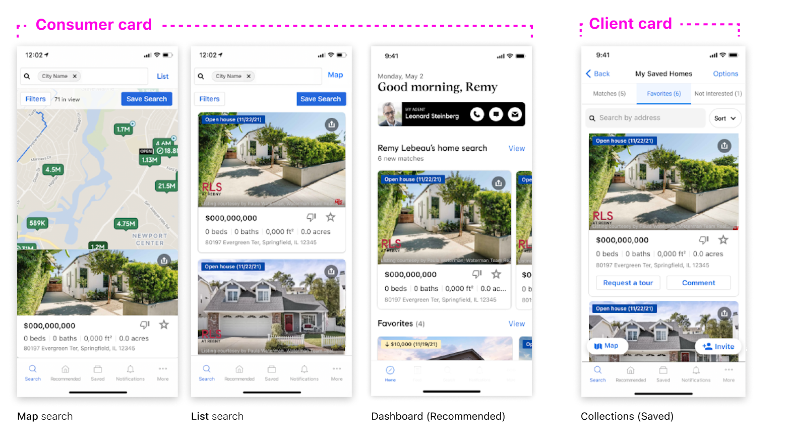
A redesgined card
After multiple rounds of testing, we successfully launched a first version of the listing cards with universally positive feedback from our clients
Within the iOS app
Actions
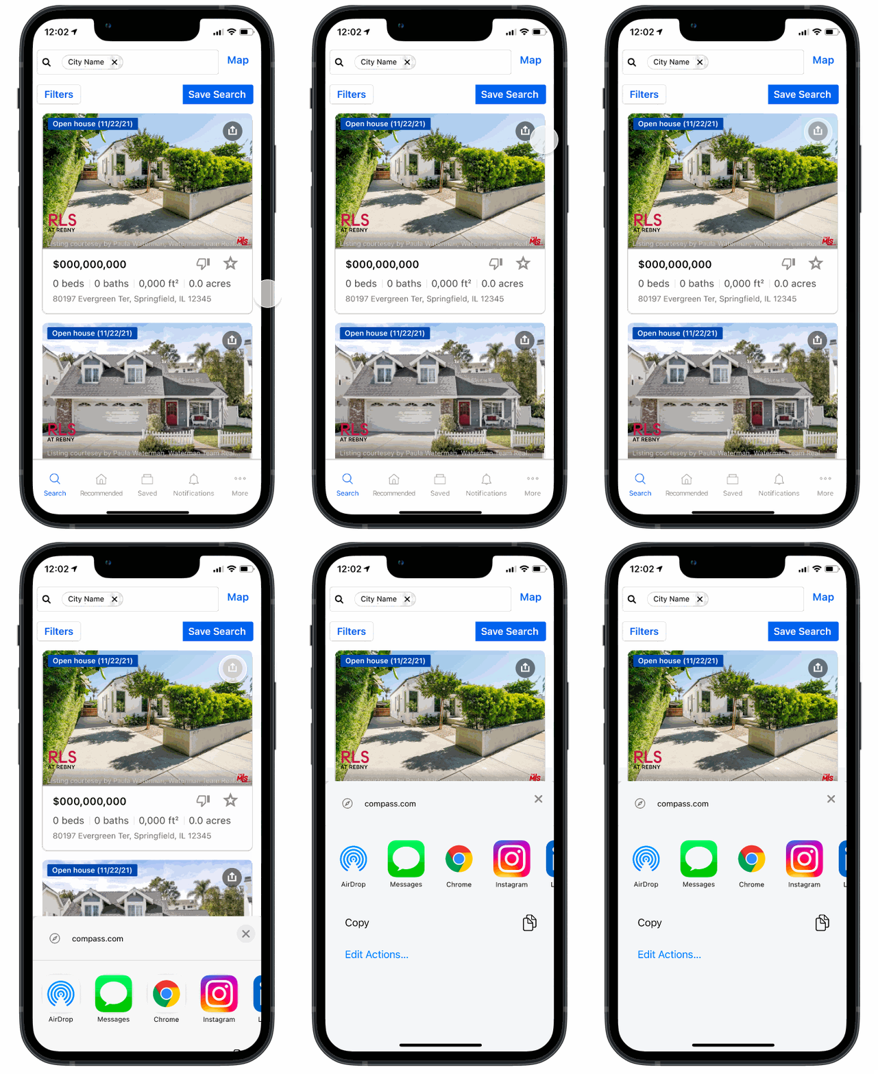
Share
Clients and consumers are now able to share listings with friends and bring new users to the Compass platform
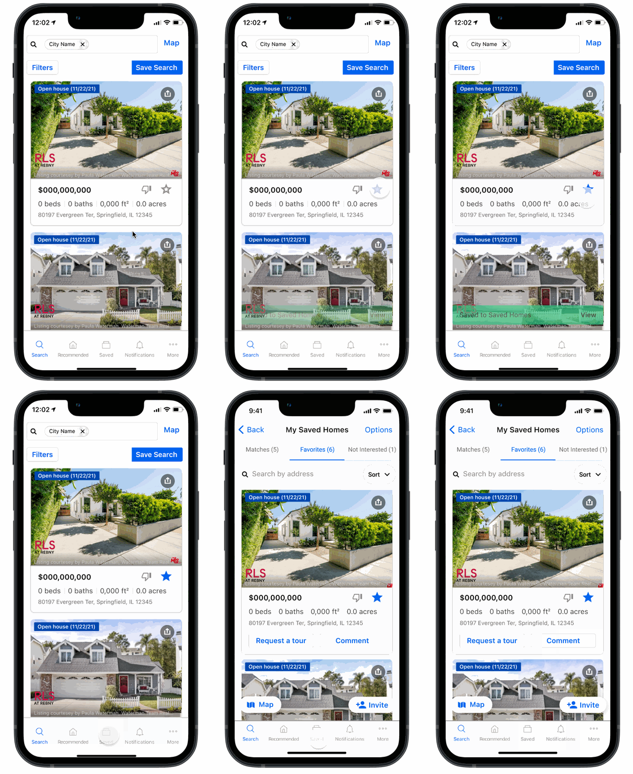
Like
Favoriting a listing card moves a listing to the user’s collections where they can then take further actions
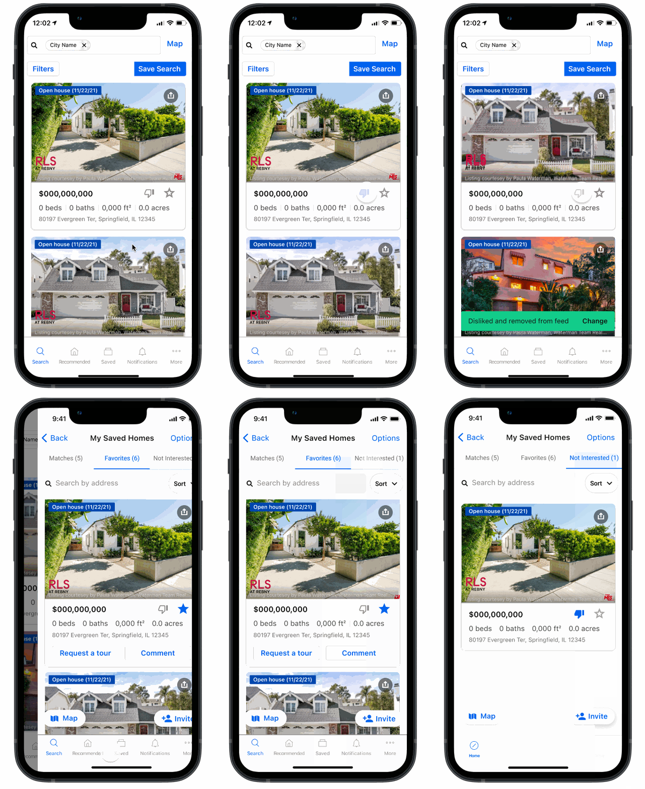
Dislike
Disliking listings removes the listing from the user’s saved search, and buckets it into a “Not-interested” collection that the user can modify anytime
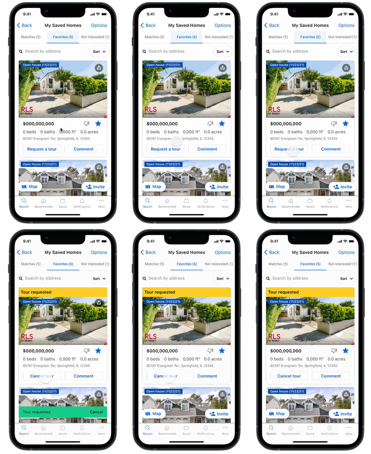
Tour
Requesting a tour sends a message to the listing agent who will work asynchronously with the user to find the right time to tour
Note: There are plans to build out an in-app scheduling flow
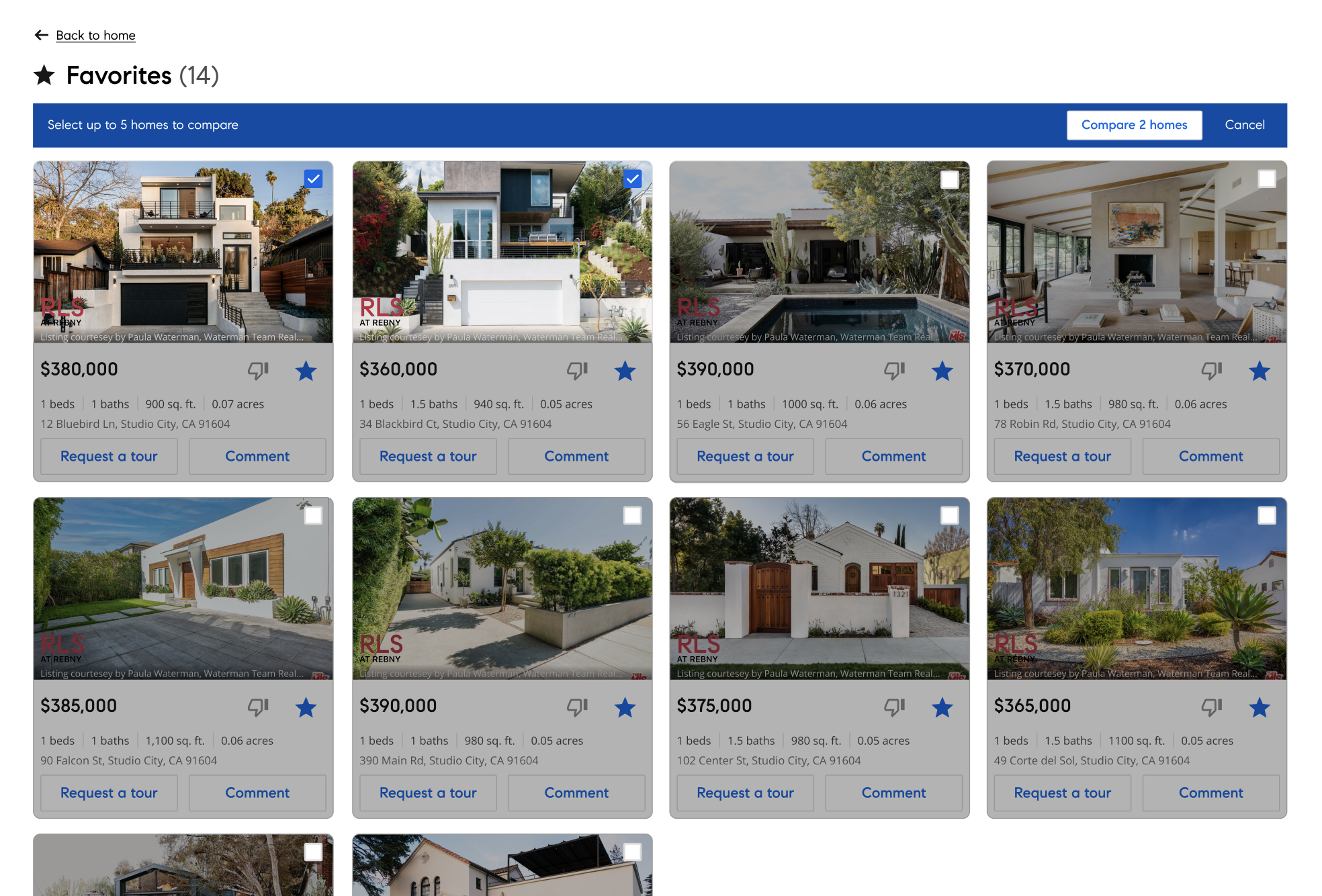
Web collections page with universal action bar
Universal actions (Web)
Within collections, users have the ability to use a universal action bar, by bulk selecting listings and performing actions all at once
For the first version, users are only able to compare homes, but there are plans to optimize the action bar to do bulk tour-requests
Universal actions (iOS) / Iteration
(After launch) we implemented universal actions within the native applications in order to allow users to more easily select listing cards and perform bulk actions
Additionally, moving all of the actions to a universal menu within the native bottom sheet cleaned up the cards and allowed users to better focus on information that was most important to them
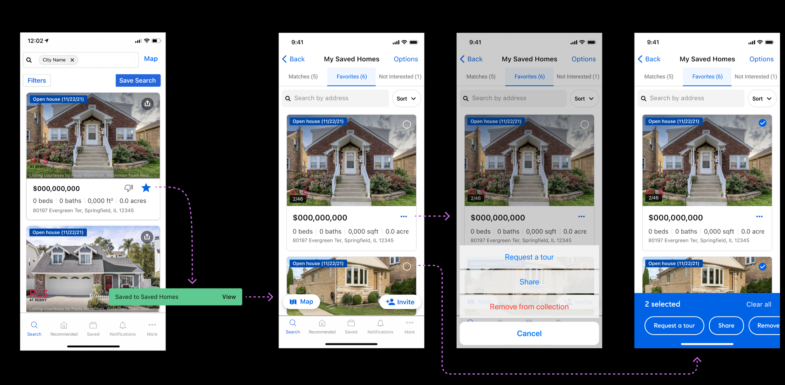
Action flow from Search to Collections
Rollout & QA
We began with building out the iOS and Android listing card and did a soft launch with our connected clients
After monitoring user data for 2 weeks, we identified some quick usability issues that were quickly addressed:
Insights
💡“Tap” interaction for the photo carousel interfered with the tap target to enter the listing page, so we switched to a swipe interaction
💡 We added a photo counter (1/10) onto the photo that would fade out after 5 seconds in order to give an affordance that users could browse photos directly onto the card
💡 We decided to truncate the address in the middle so users could always see the zip code (123 Park Av…NY 10033)
Measuring success
Our initial goal was to increase the conversion from consumers to connected clients. The way that we measured this was:
• By tracking the amount of users who created accounts from the “favorite” button
• By tracking the amount of tours scheduled from collections
During the first month of our launch on iOS, we saw an average of 18 accounts created per day from the ‘Like/Dislike’ buttons, and saw a 63% weekly increase in tour requests overall
Conclusion
Because we saw an increase in account creations and tour requests, the redesign was a success. In the future, our goal is to simplify actions on the cards within the collections page and instead encourage users to perform actions like “Tour request” and “Share” within the universal action bar