

Expanding genomic data visualization to unlock deeper scientific discovery
DNANEXUS • 2019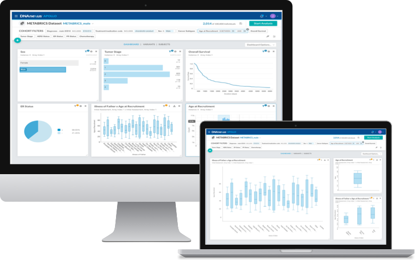
Designed new chart types for Apollo that let scientists plot categorical and numerical data side by side for the first time, turning a limited dashboard into a complete analysis tool
My Role
UI/UX Designer,
Summer Internship
Tools
Sketch, inVision, Framer.JS, Adobe Illustrator
Key Themes
Interface Design, Interaction Design, Data Visualization, User Research,
Market Research, Brand/Style Guides
Overview
A cloud-based data analysis platform that helps make serious discovery for medical advancement
DNAnexus was founded in 2009 by a team of Stanford University scientists hoping to address the need for computer infrastructure for DNA sequence analysis. In the last 10 years, DNAnexus has grown to become one of the most important tools for bioinformatic scientists wanting to make use of their data.
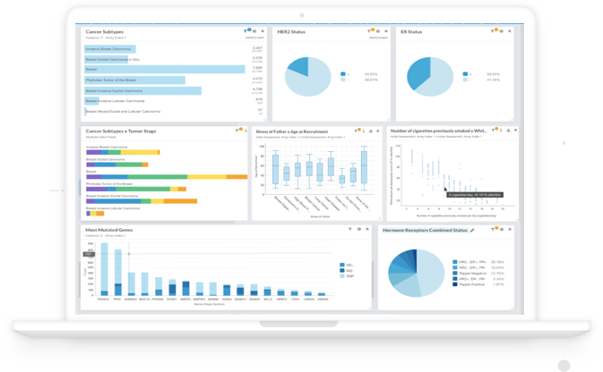
Basically, we gave scientists who study the human genome the space to store large files of DNA data and the ability to build and run analytic applications on these files. In digitally analyzing these large datasets, bioinformatic scientists are able to make discoveries faster and easier than ever before.
The user journey:
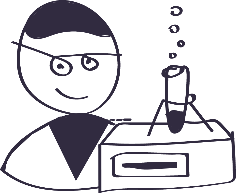
> First, a scientist takes a DNA sample and puts it into a machine

> The machine analyzes the DNA and converts it to a file
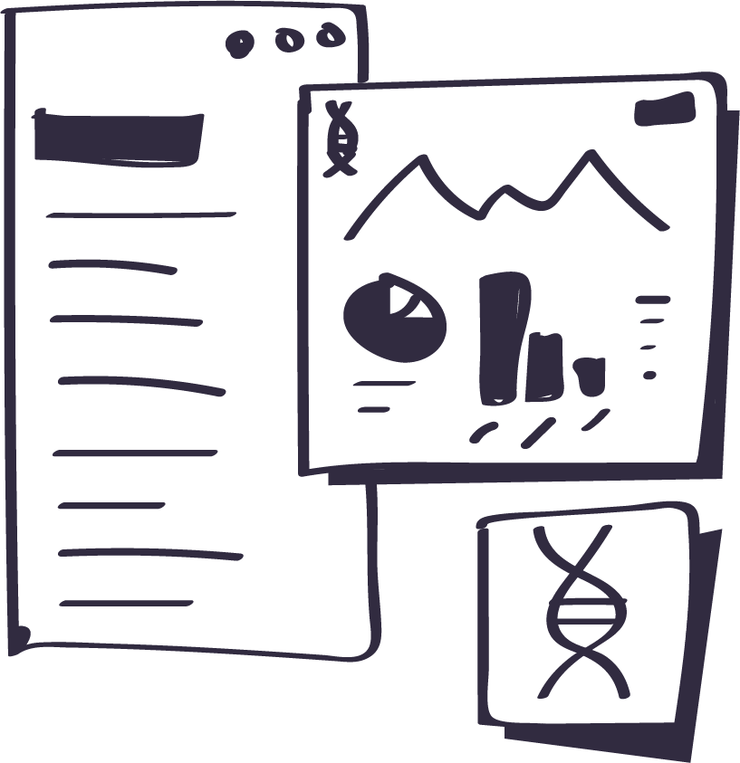
> The file is uploaded onto our platform and analyzed
> The analysis is stored and used for research purposes
Making data beautiful & useful
Recently, the product team has focused on creating an immersive data visualization platform that allows scientists to organize and present pieces of their datasets within an interactive browser of charts and graphs. A visual, interactive browser makes it easier for these scientists to notice trends and present their data across various groups.
The Problem
Our scientists are only able to make discoveries within one cohort of data, which makes limits them to only learning about a single phenotypic trait at one time. By allowing scientists to compare and contrast two different datasets, they will be able to make even more important discoveries.
The Solution
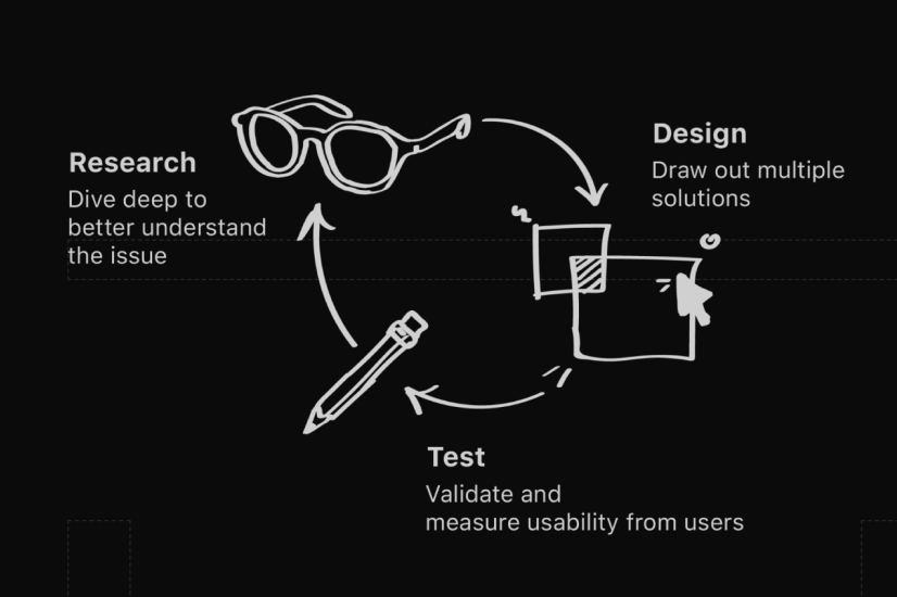
My role as a designer is to deliver solutions to issues identified through thorough research and testing. In order to come to my final design, I went through an iterative design process.
The Process
Defining our driving personas
In order to start my design process, I needed to first define the core users I was designing for. Throughout the project, I would use my personas’ needs and pain points as a baseline for my design goals.

Goal
To combine two categories of data together and view trends between them with a visualization
Pain Point
The only chart types that we support can only visualize single variables.
Research
It’s important to understand the user experience from a primary perspective
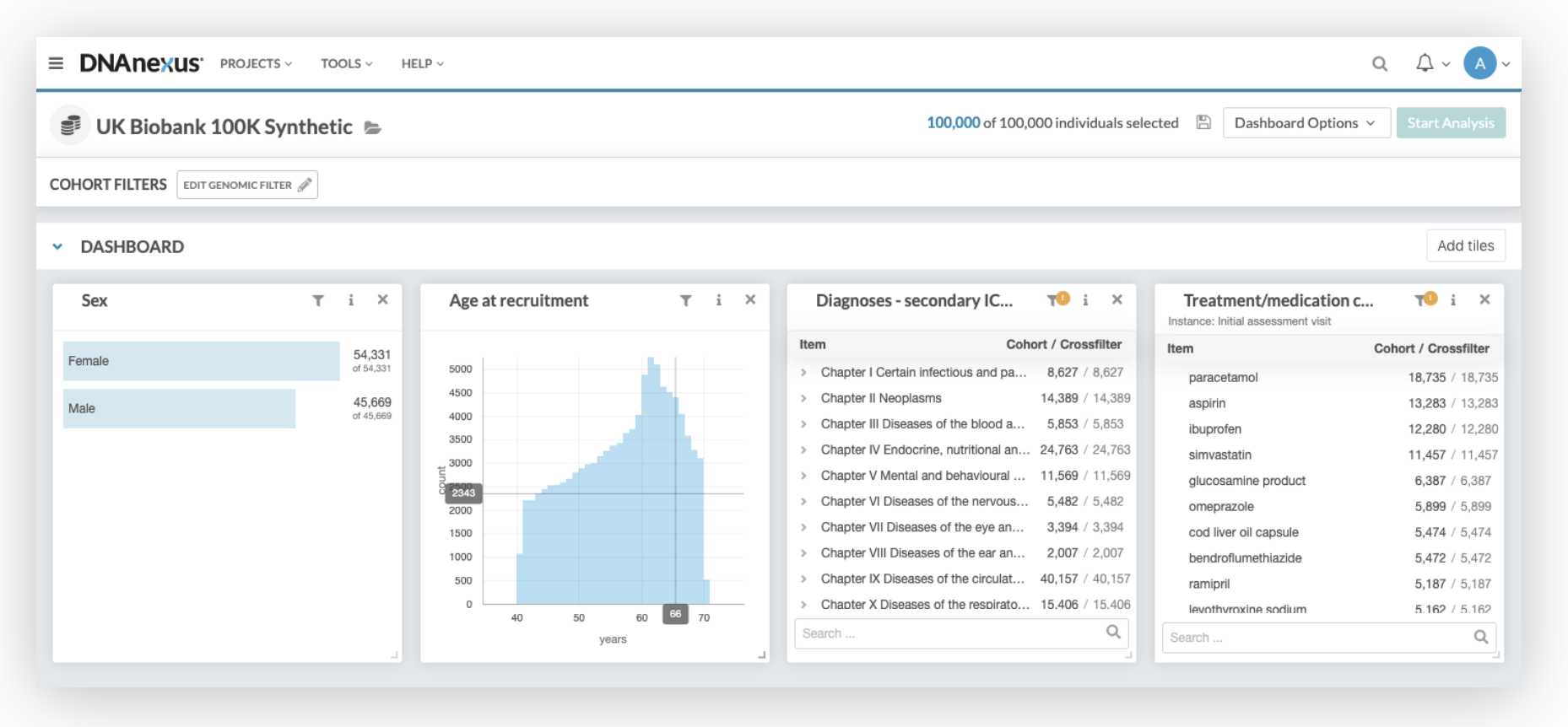
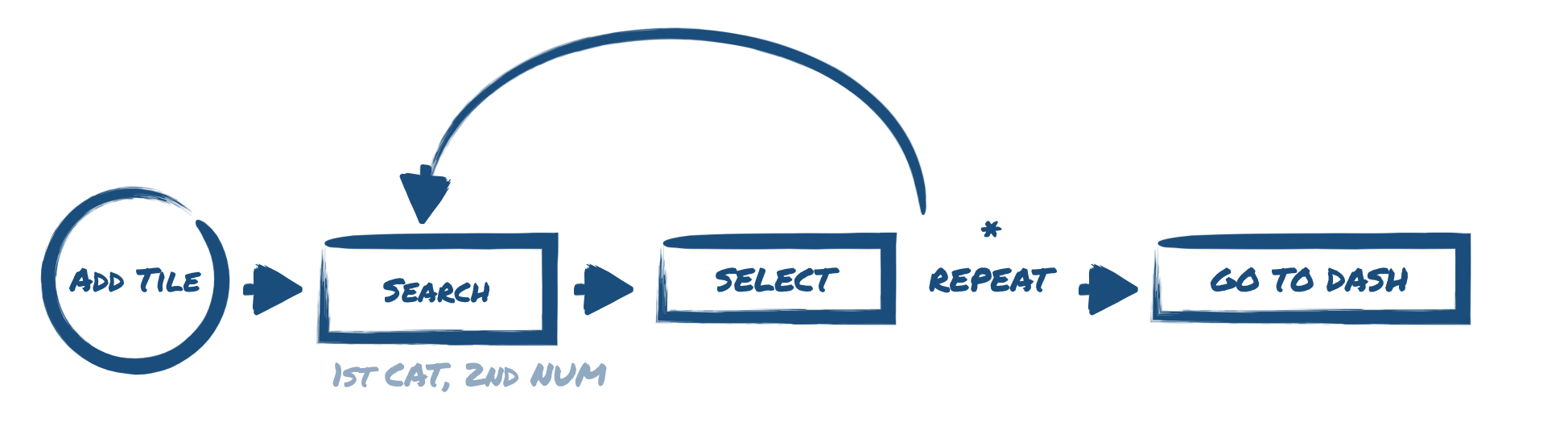
Within the current dashboard, the user is able to quickly search datasets from the database and add the tile to their interactive dashboard.
Existing chart types
Currently, our users are able to organize single variables into bar charts and tables (i.e., # of people by gender, age, diagnosis, etc.)
Existing interactions
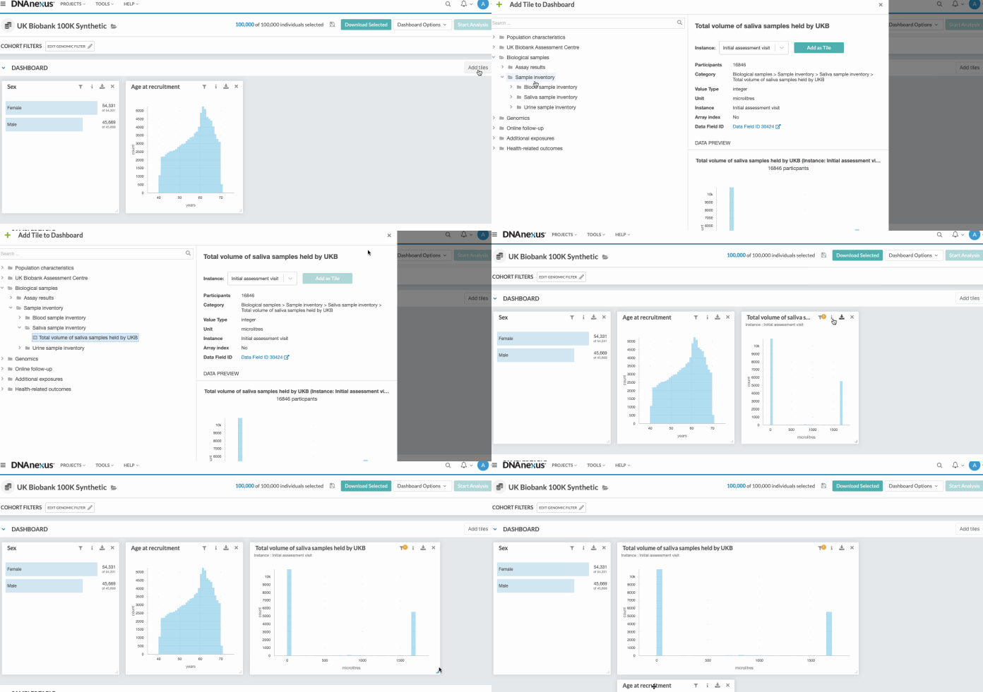
Users are able to add tiles from a side drawer and can interact with their dashboard by dragging, resizing and closely inspecting data with tool tips and filters.
The Bioinformatic Scientist
😊 Each chart utilizes hover interactions and tool tips to showcase helpful information
😊 Charts are expandable and visualizations can scale largely and legibly.
Opportunities
☹️ Chart building drawer must indicate data-type (categorical or numerical)
☹️ User should be given the option on choosing between different visualization types
Focus Areas
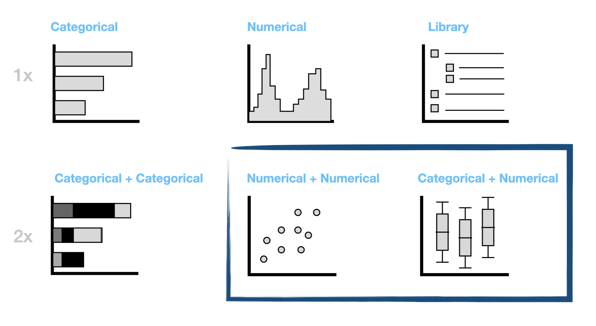
Currently, our platform supports visualizing 1 numerical dataset and 1 categorical dataset. My goal was to design two different chart types that allow for combining 2 datasets:
1. Box Plots - To combine 1 numerical dataset with 1 categorical dataset
2. Scatter Plots - To combine 2 numerical datasets.
Strengths
Gaining inspiration
In order to drive my ideation process, I wanted to first research how other data visualization platforms used by the scientific community handle combining datasets.
Box Plots (Categorical + Numerical)
The first step of my competitive research was to see how similar platforms display information within box plot charts.
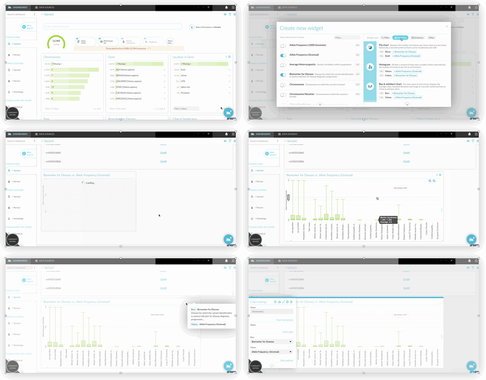
Disqover
This visualization dashboard was a great example of how to handle displaying box plots for large datasets, including informative tool tip interactions and smart labelling.
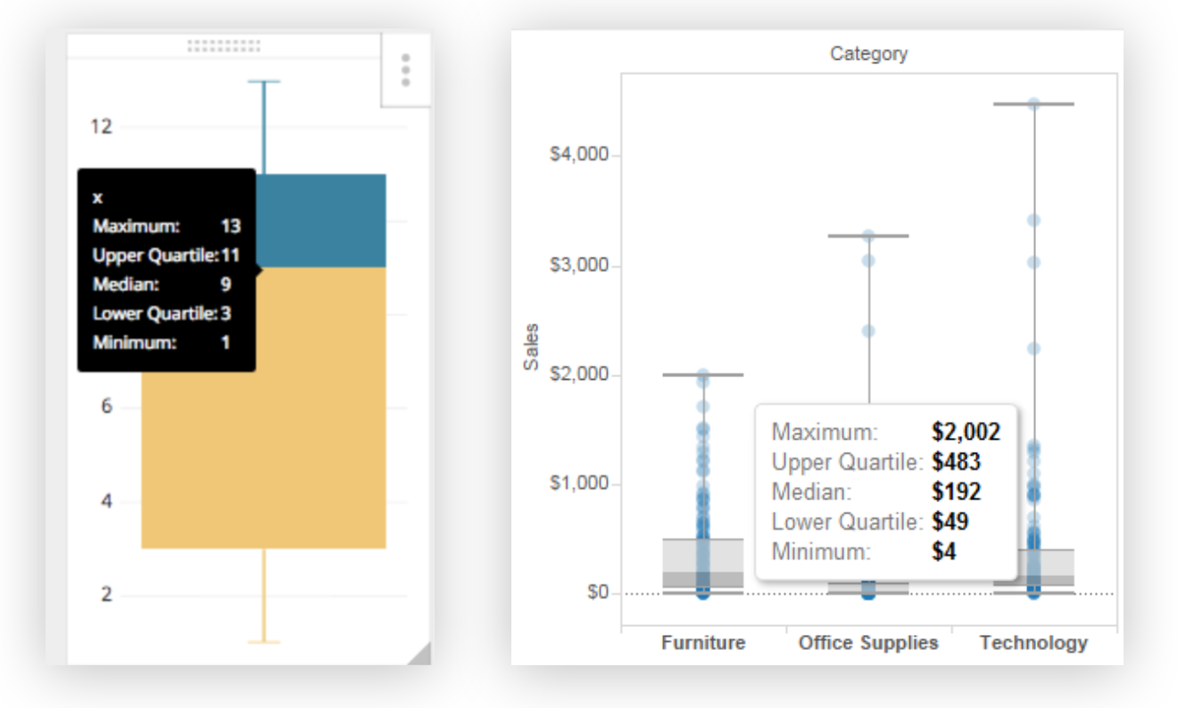
Chartio
I wanted to find a good example of how to display quartile ranges within a chart. I loved how this application highlighted the quartiles on the box plots and displayed the numbers within hover tool tips
Scatter Plots (Numerical + Numerical)
The first step of my competitive research was to see how similar platforms display information within box plot charts.
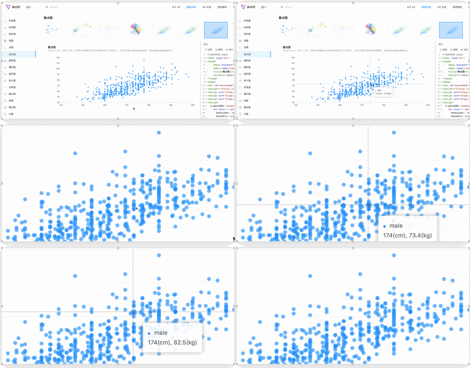
AntV
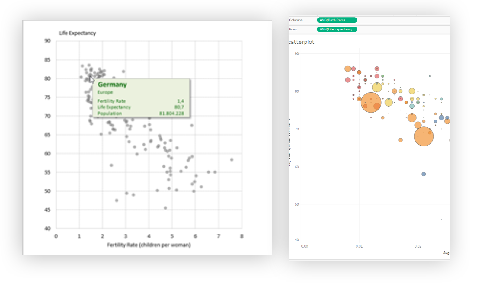
I found this sleek software that used a low opacity on each datapoint to help illustrate density when data points were grouped together. I also liked how they used cross-hairs to help guide the user.
Data Plus Science
This tool had very interesting ways of handling hover interactions that didn’t feel too intrusive. They also provided an alternative option to communicating density — altering the size of the data points in denser areas.
😊 Box Plots are best communicated with efficient hover interactions that highlight specific quartile ranges
😊 Low-opacity dots on Scatter Plot graphs will best communicate density, especially within large datasets.
Opportunities
☹️ Labels on genomic datasets can be very long and need to be displayed sensibly in a small space.
☹️ The hover interactions on both Scatter Plot examples feel “flickery” when the mouse grazes on the chart.
Strengths
Design
Putting pen to paper
Box Plots
Combining 1 Categorial with 1 Numerical dataset
After getting familiar with the flow of adding 1 dataset to the chart, I had to start my ideation process with first re-imagining the flow with 2 combined datasets.
Sketching it out
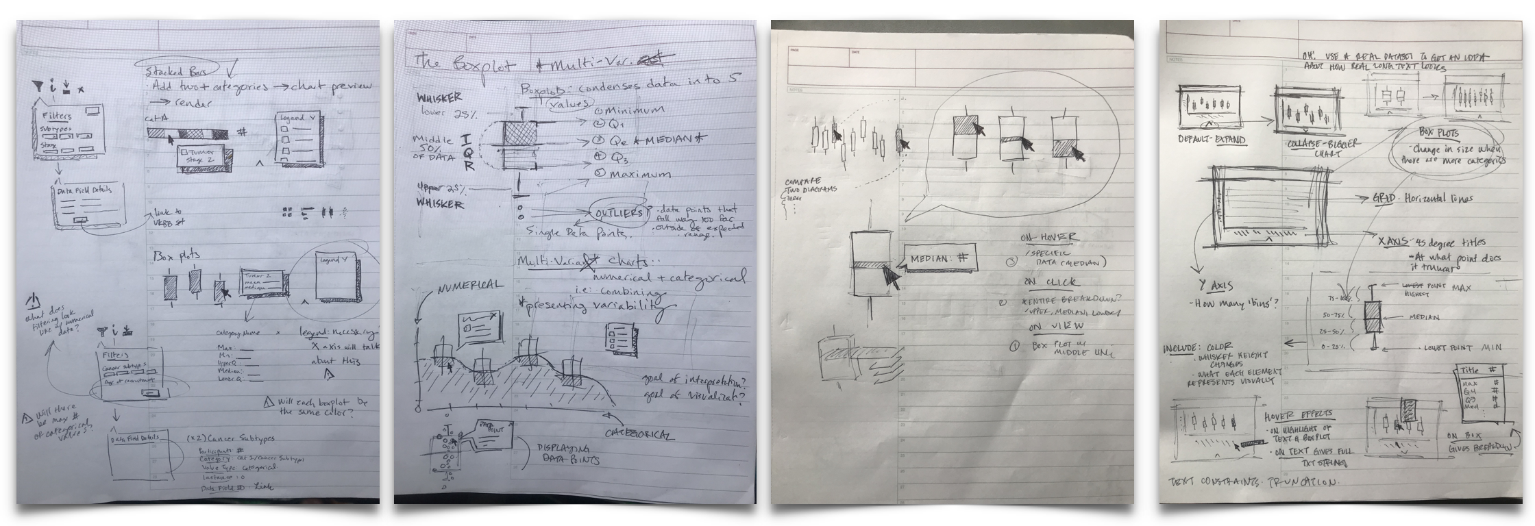
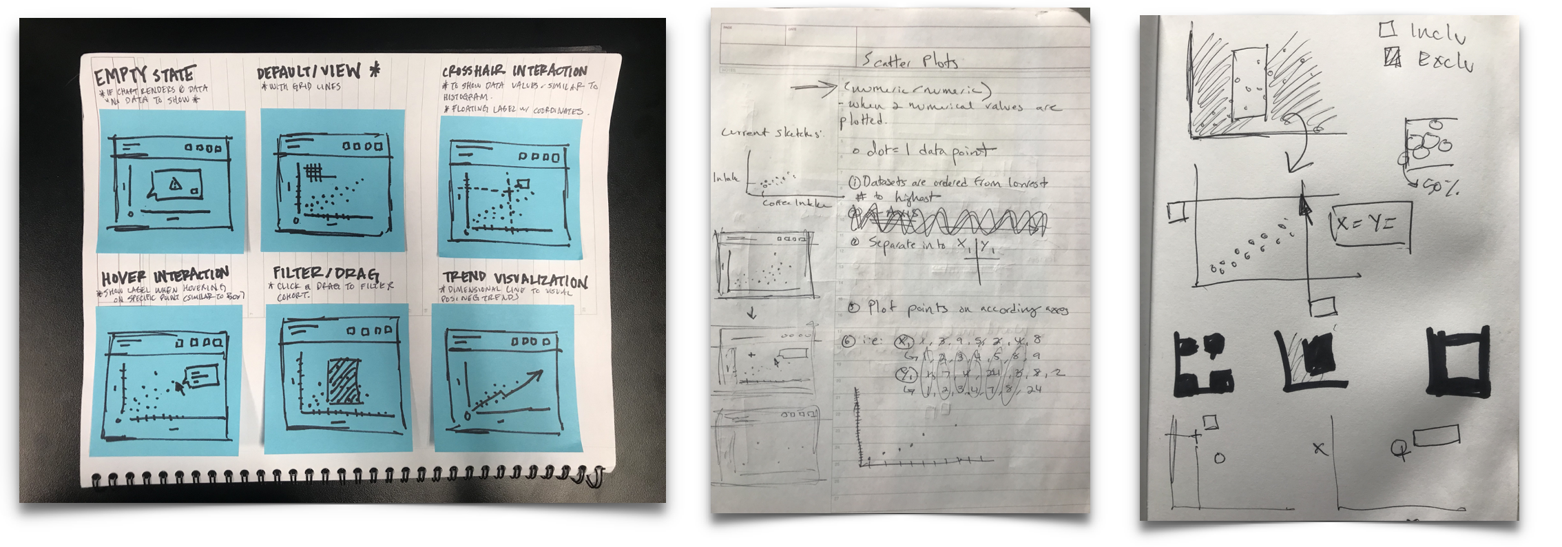
I am a believer in getting my ideas out on paper before going into the design software. I sketched out a few ideas of how I imagined box plots to look within our platform and handed it off to our in-house scientists to quickly measure which ideas were strongest.
Design progression
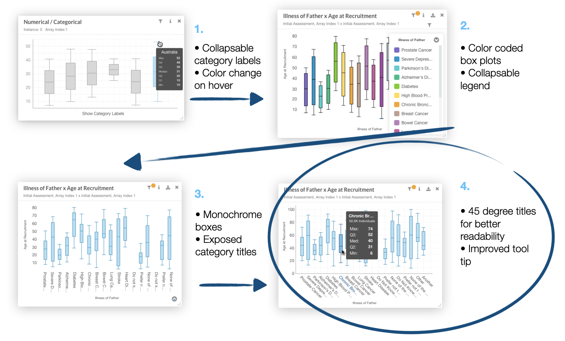
Once I refined my ideas down to a single focus area, I continued to test and refine based on feedback from the scientists and my teammates.
Scatter Plots
Combining 2 Numerical datasets
After speaking with some users, I realized that it’s very important to introduce filtering within the Scatter Plot chart. I imagined this would be done by setting ranges and seeing a visual representation of the ranges on the chart.

Sketching it out
As usual, I started out my ideation of this filtering interaction on paper, and then brought my concepts to Sketch.
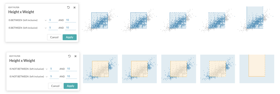
Here, I designed the chart to have all included areas within the dataset be blue, and excluded areas be orange.
Design progression
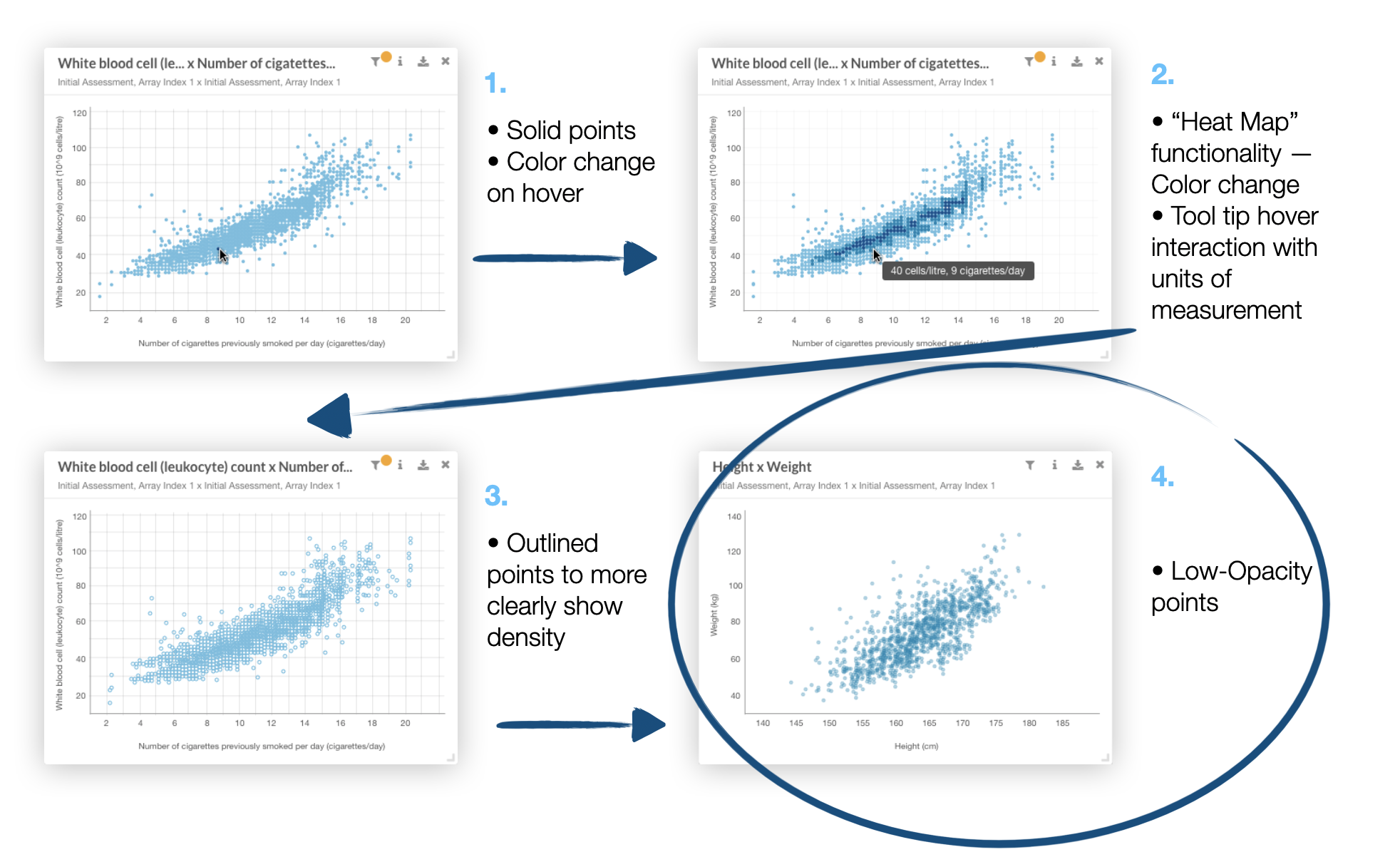
I tested out different ways of displaying the Scatter Plot points. After further comparative research and testing, I went from a “heat map” style for communicating density, to lowering the opacity on the data points.
The first draft concept
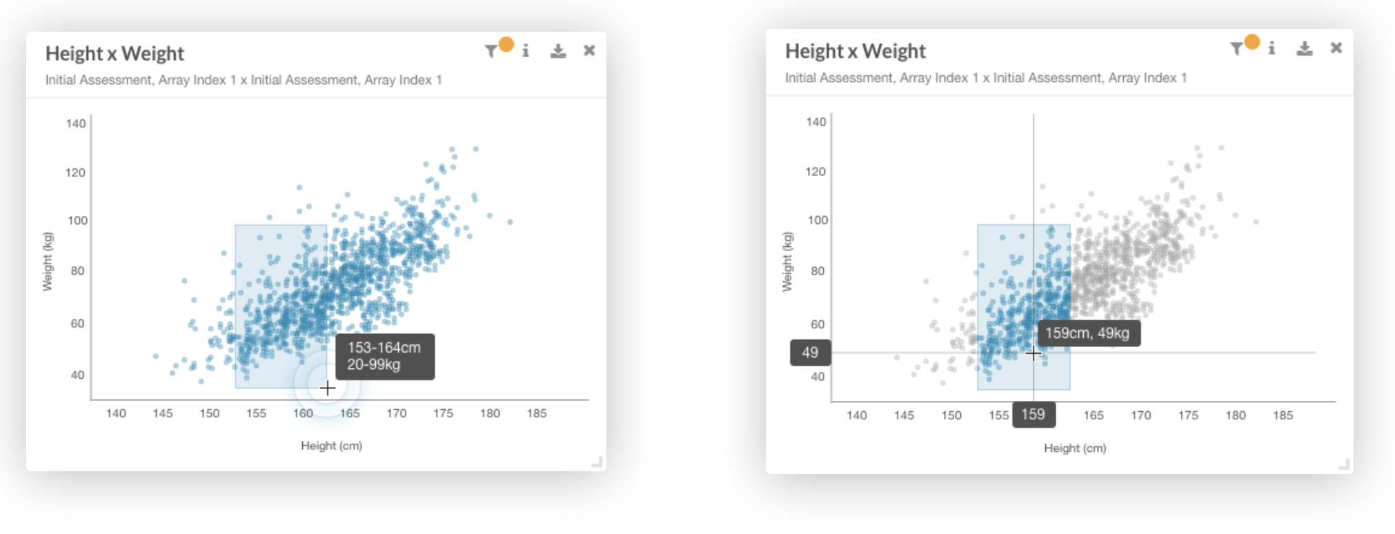
Combining the Scatter Plot design with the “brush” filtering interactions, I came up with an initial high-fidelity concept that I’d use for a last round of testing before pushing the product to development.
😊 Box Plots labels work best at 45 degree angle because they fit more characters in a small space
Opportunities
☹️ Highlight on Box Plots isn’t obvious enough, and might be more noticeable if a shadow or darker color is added
☹️ Tool tip on the Scatter Plot still feels too ”flickery” when grazing the mouse
Strengths
Design
Introducing better data discovery
After going over the insights from my initial user test, I focused on refining the hover interactions and making the text and data bigger and more accessible at first glance.
Adding a box plot
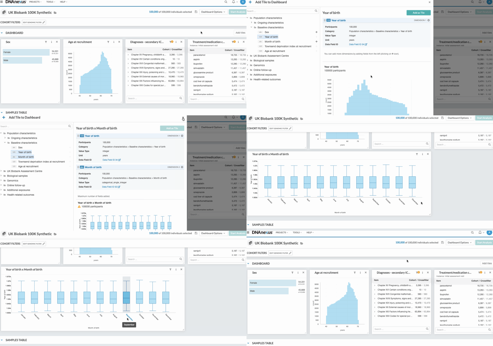
Here, the user can now “add” two datasets together within the chart-building drawer and indicate “Box Plot” as the chart type.
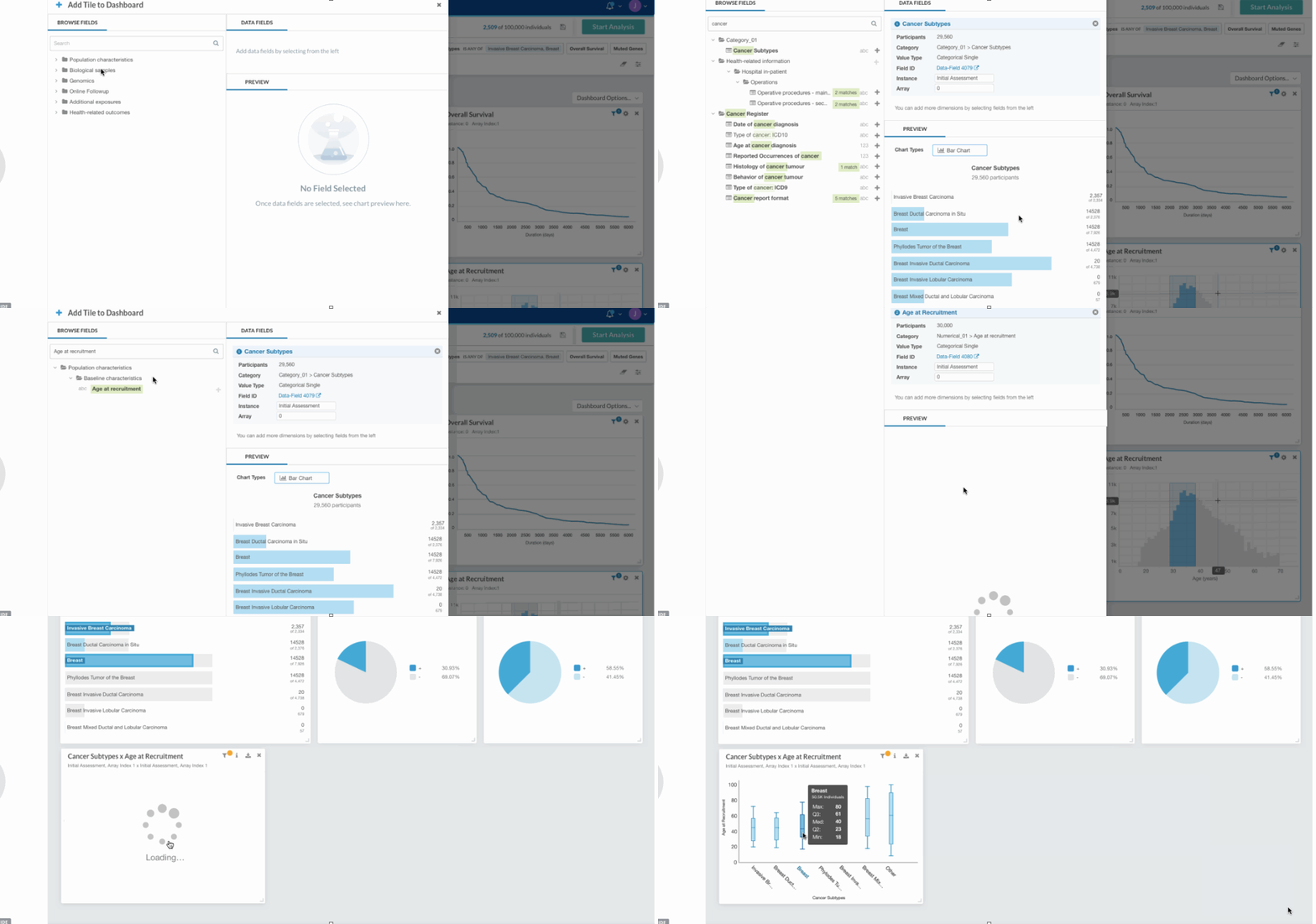
Interacting with box plots
Users are able to access detailed information by hovering on the Box Plots or their labels. Clicking on individual Box Plots give the user specific quartile range.
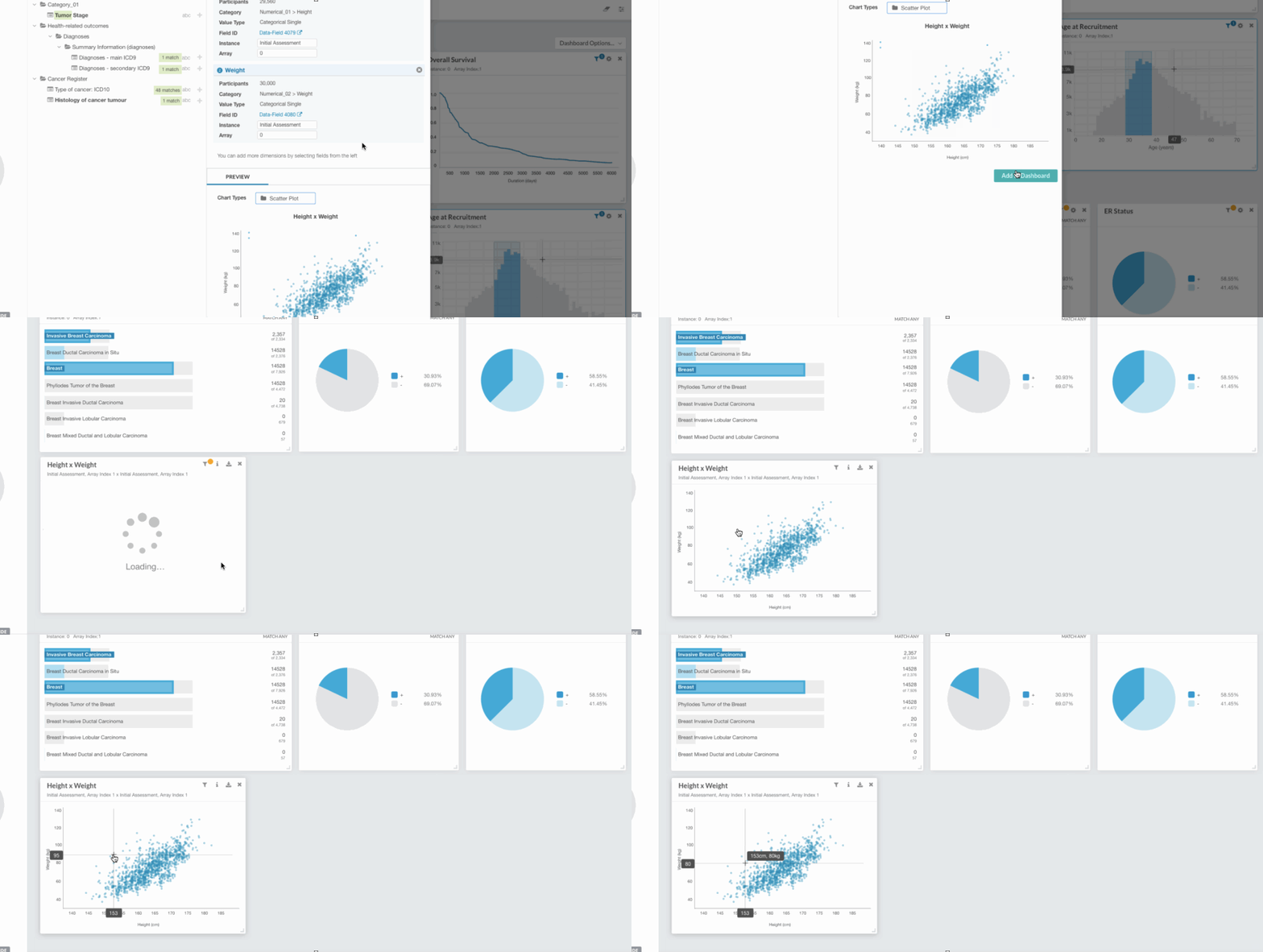
Adding and interacting with scatter plots
Instead of using a tool top to communicate the coordinates of each point, The cross-hair interaction is equally effective and doesn’t give a “flicker” feeling.
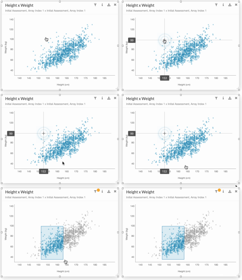
Brush filtering
Users can easily filter and focus by clicking and dragging on the chart.
Setting and reviewing ranges
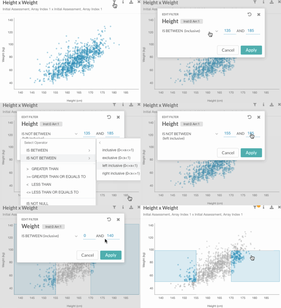
If users want to set specific ranges, they can do so in the “info” tab, and these ranges will be reflected visually within the chart.
😊 The science team at DNAnexus was thrilled with the new capability to combine two variable datasets. After I left the company, Apollo (the data visualization platform) got lots of attention and accolades from members of the bio-tech community, including UKBioBank.
Identifying Weaknesses
☹️ •After closely monitoring the performance of the Box Plots, it appeared that a lot of scientists were using the chart for datasets that were larger than initially anticipated, and a lot of the charts end up being too thin and illegible after a certain point.
Measuring Success
Reflection
Admittedly, I am not the most scientifically savvy person. Approaching this project was quite intimidating at first, but throughout my time at DNAnexus, I learned a lot about bioinformatics and believe I contributed an interesting design perspective on an unfamiliar product. I am incredibly grateful that I had a group of scientists within the company that were willing to test and give feedback on my designs. My ability to test throughout the design process assured that I would deliver a useful product.