

DOCTOR ON DEMAND • 2020Designing appointment scheduling to support long-term behavioral health care
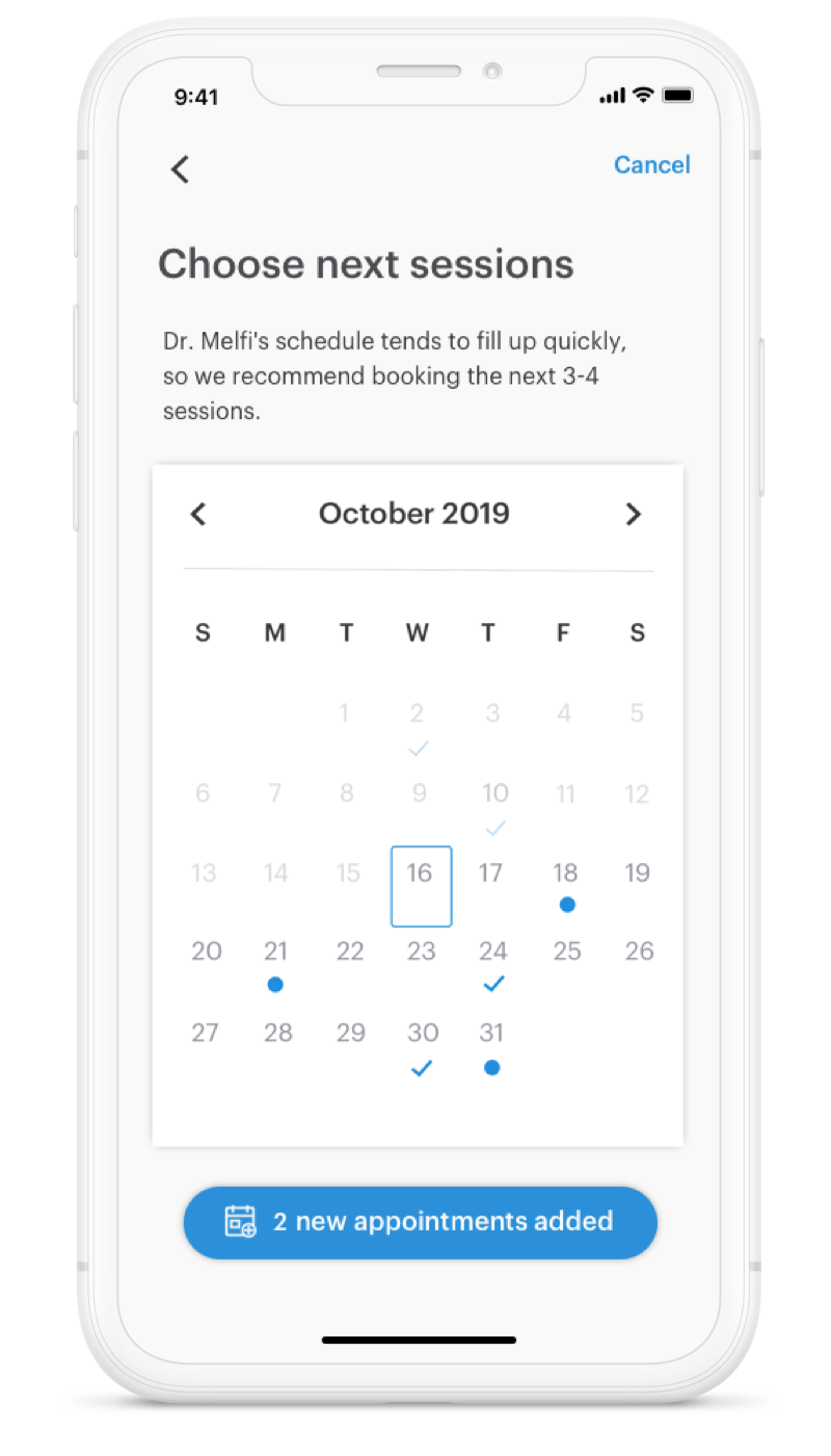
I built a scheduling flow for behavioral health patients, letting providers send requests and patients book recurring appointments, making continuity of care seamless within the app
My Role
UI/UX Designer, Mobile
Tools
Sketch, inVision, Principle, Adobe Illustrator
Key Themes
Interface Design, Interaction Design, User Research,
Market Research, Animation, Front-End Development
Overview
On a mission to improve the world’s health through compassionate care and innovation
In the 8 years since its launch, Doctor On Demand has grown to become one of the most renowned practices in telemedicine, covering full mind and body care via video throughout over a million visits. What sets us apart is our convenience, quality, and consistency in care.
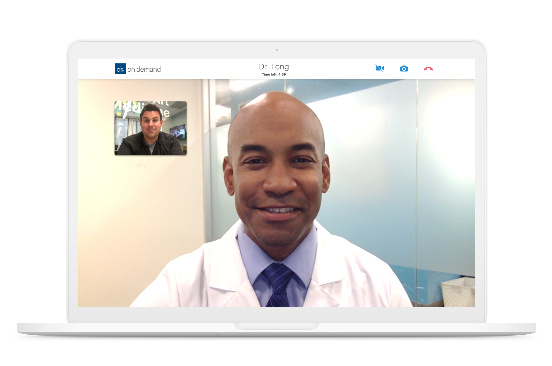
The idea is simple, we create an Electronic Medical Record (EMR) platform for our physicians to collect medical records, send prescriptions, and interact directly with patients at any time. Then, we provide an app for patients to schedule appointments, visit with doctors, and record important information about their medical visits.
Overview
> First, skip the crowded, dangerous hospital environment.
> Download the app and input your insurance information

> Get connected to a board-certified doctor
in minutes
> Receive prescription refills, referrals and excuse notes, 24/7
Putting Behavioral Health in the Primary Care space
One of the main focuses recently has been on expanding the Behavioral Health platform, including hiring hundreds of licensed providers, and making sure patients are able to build trusting relationships with their providers through regular, quality care.
The Problem
One of the main focuses recently has been on expanding the Behavioral Health platform, including hiring hundreds of licensed providers, and making sure patients are able to build trusting relationships with their providers through regular, quality care.
The Solution
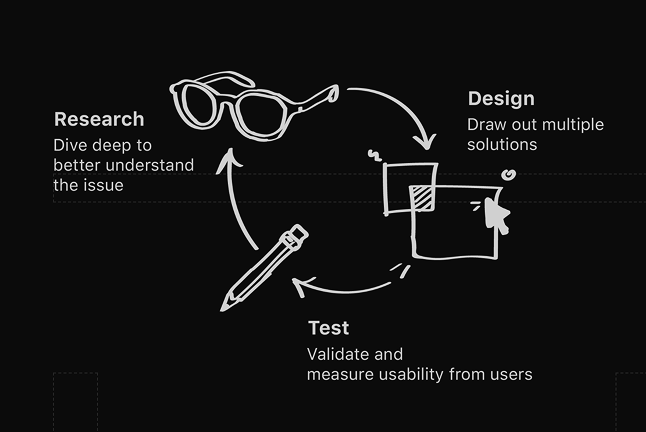
My role as a designer is to deliver solutions to issues identified through thorough research and testing. In order to come to my final design, I went through an iterative design process.
The Process
Defining our driving personas
In order to start my design process, I needed to first define the core users I was designing for. Throughout the project, I would use my personas’ needs and pain points as a baseline for my design goals.


The Patient
Goal
To complete a full course of treatment for conditions such as depression and anxiety.
Pain point
Can only schedule one appointment at a time.

The Provider
Goal
To put the patient on a treatment plan, spanning 6-10 sessions.
Pain point
Sessions are scheduled sporadically by patient receiving treatment.
Research
Looking at the current experience
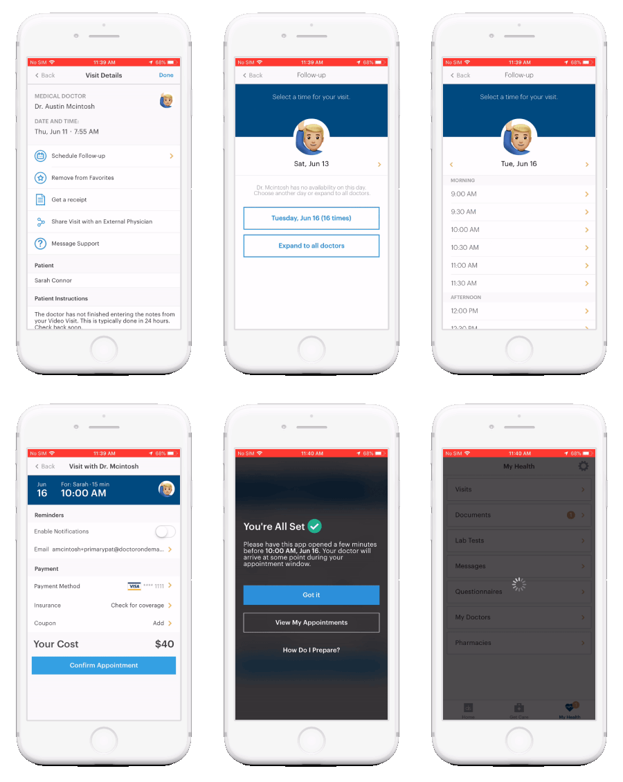
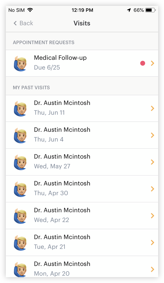
I thought it was important to first familiarize myself with the existing scheduling flow in order to understand how our patients are using the service and to determine specific areas of opportunity.
Appointment list
Providers can prompt users to schedule with “appointment requests” and suggested times.
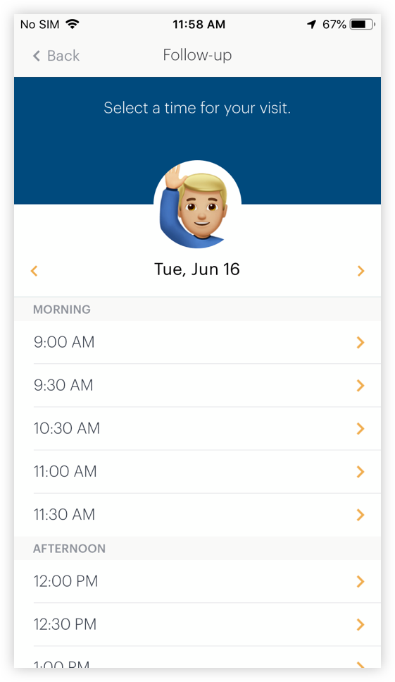
Scheduling
When selecting an appointment time, Users need to scroll through and select from the provier’s availability.
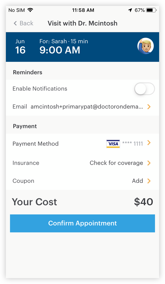
Confirmation
The patient is given a summary of details and pricing, in addition to an option for text reminders.
Strengths
☺ “List” page is clear and provides a lot of information at first glance.
☺ “Appointment request” from provider is helpful and encourages the user to initiate scheduling.
Opportunitires
☹ Lots of long lists for patients to scroll through and select from.
☹ Confirmation doesn’t do anything to encourage the user to “go back” or schedule another session.

Patient Interview
I first monitored Mixpanel to identify poor conversion patterns, then used these metrics as guiding topics for user interviews.
Provider Interview
I met with our Chief Medical Director and a few staff physicians to understand how we could better encourage patients to book full courses of treatment.
Talking with real users and stakeholders
Once I was familiar with the platform, I decided to look for insights from the people who use the platform daily. Understanding the experience from the user’s perspective is key to identifying specific strengths and areas of opportunity.
Strengths
☺ Patients like the ability to see the provider’s full availability
Opportunities
☹ If patients want to schedule another appointment, they have to go back to their appointment list and start the process over.
☹ The long list of appointment times is a lot to scroll through.
Understanding the market & gathering inspiration
After talking to some users, I wanted to see how our competitors were handling multi-appointment scheduling, in addition to seeing how other apps use calendars to display availability and appointment information.
Food Delivery apps had the right idea
I learned quickly that a lot of our competitors didn’t handle multiple appointment booking on their applications, so I looked to food delivery apps like GrubHub and DoorDash to see how they allow users to “batch” items before checking out.
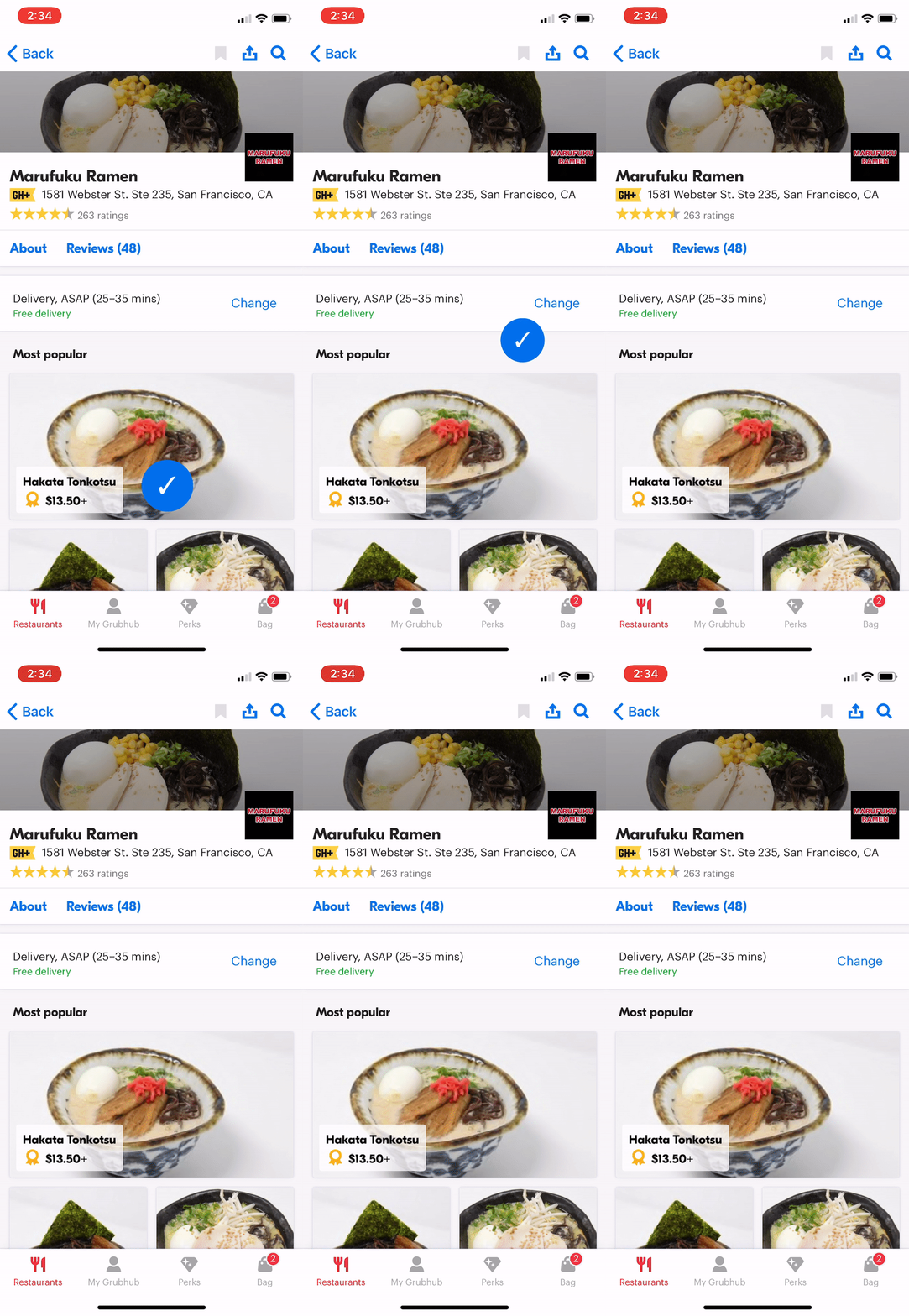
GrubHub “Cart” interaction
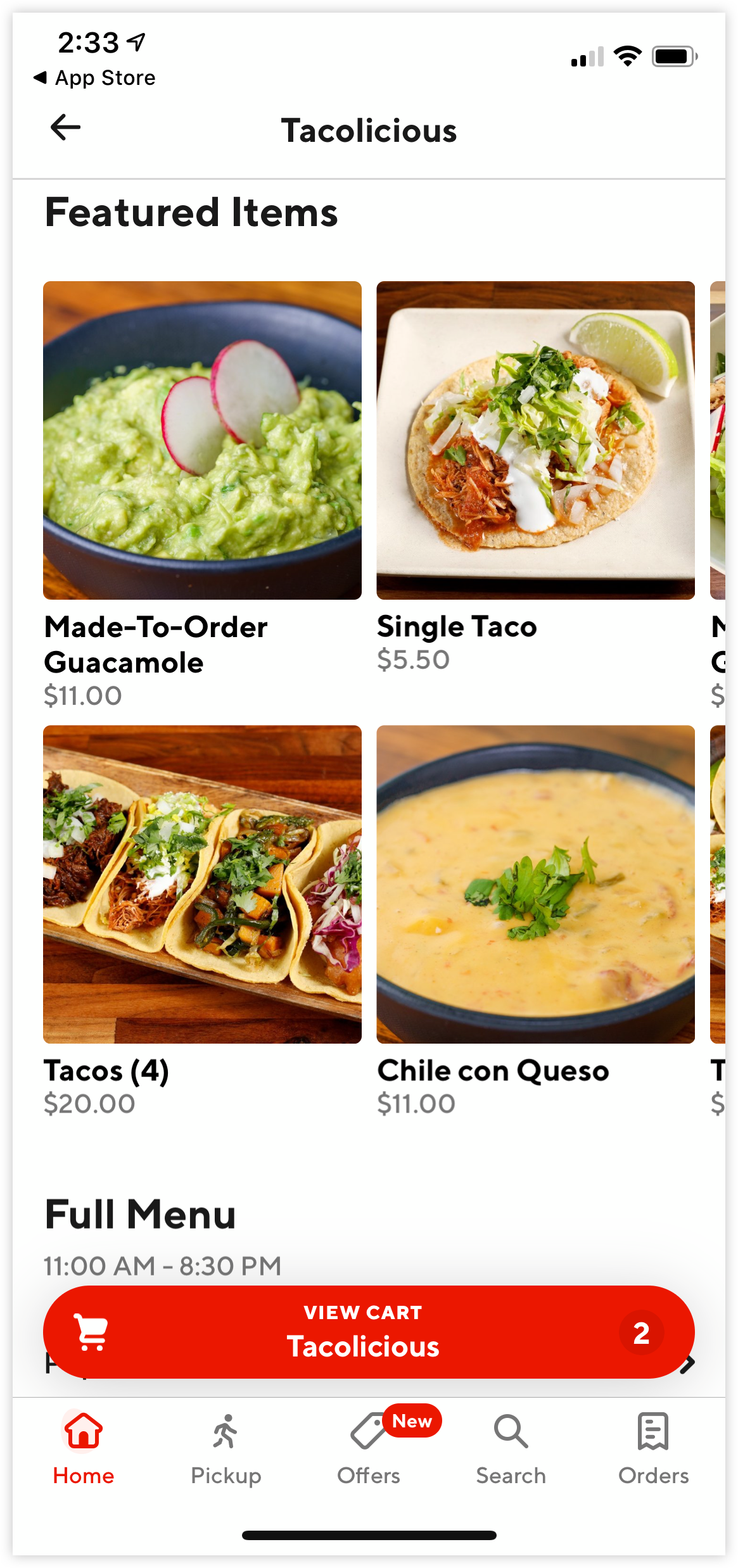
DoorDash floating button
An informative calendar UI
Another part of my research involved looking at the various ways that calendars display information, which I found to be helpful if we want to easily show availability or indicate if an appointment has already been scheduled.
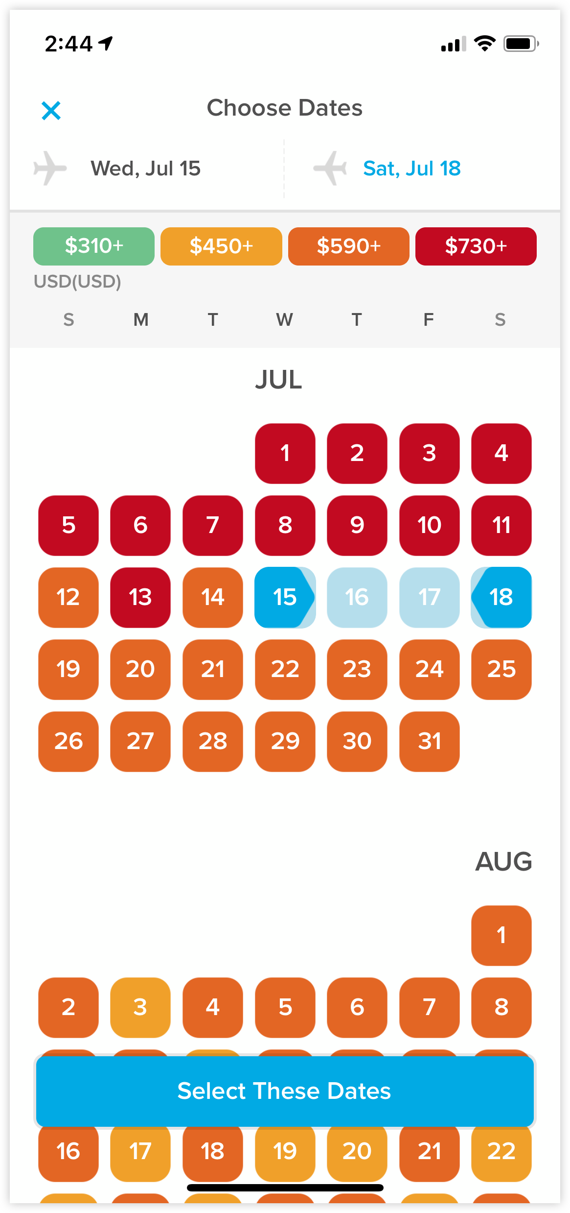
Hopper calendar UI
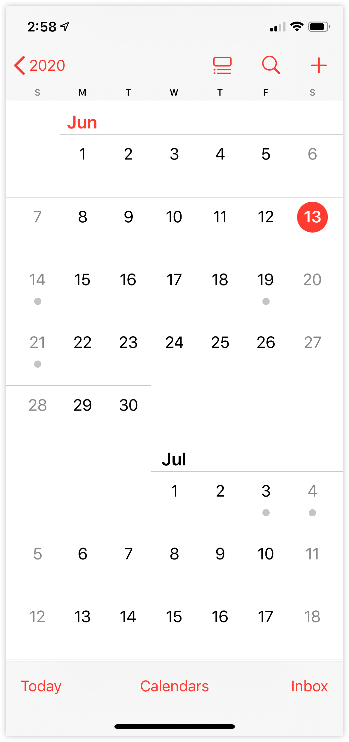
iOS Calendar UI
Strengths
☺ GrubHub & DoorDash do an excellent job “batching” items in your order while you continue to shop, with helpful floating buttons and animations.
☺ Lots of calendar apps use iconography to communicate if there is availability, or if the user has an appointment scheduled which can help the user browse quickly.
Opportunities
☹ The iconography on the iOS app isn’t very detailed at first glance, and it could be better if the calendar displayed descriptive information without having the user “click” into it.
Design
Defining the core pieces for a
better user experience
After gathering insights from my research, I decided to lay out a few key areas of focus to drive my ideation process.
Focus Areas
> Create a beautiful new calendar UI

> Display provider availability and upcoming appointments
> Add an affordance that users can “checkout” after selecting appointments.

> Give all upcoming appointment information at the confirmation screen
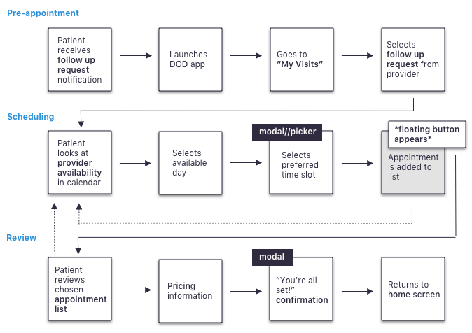
Mapping out the user flow
I find it useful to start the ideation process with thinking about the experience from a high-level. Before creating the screens, I like to define each step our user must take to accomplish their goal of scheduling a follow-up-appointment.
The happy path:
Putting pen to paper
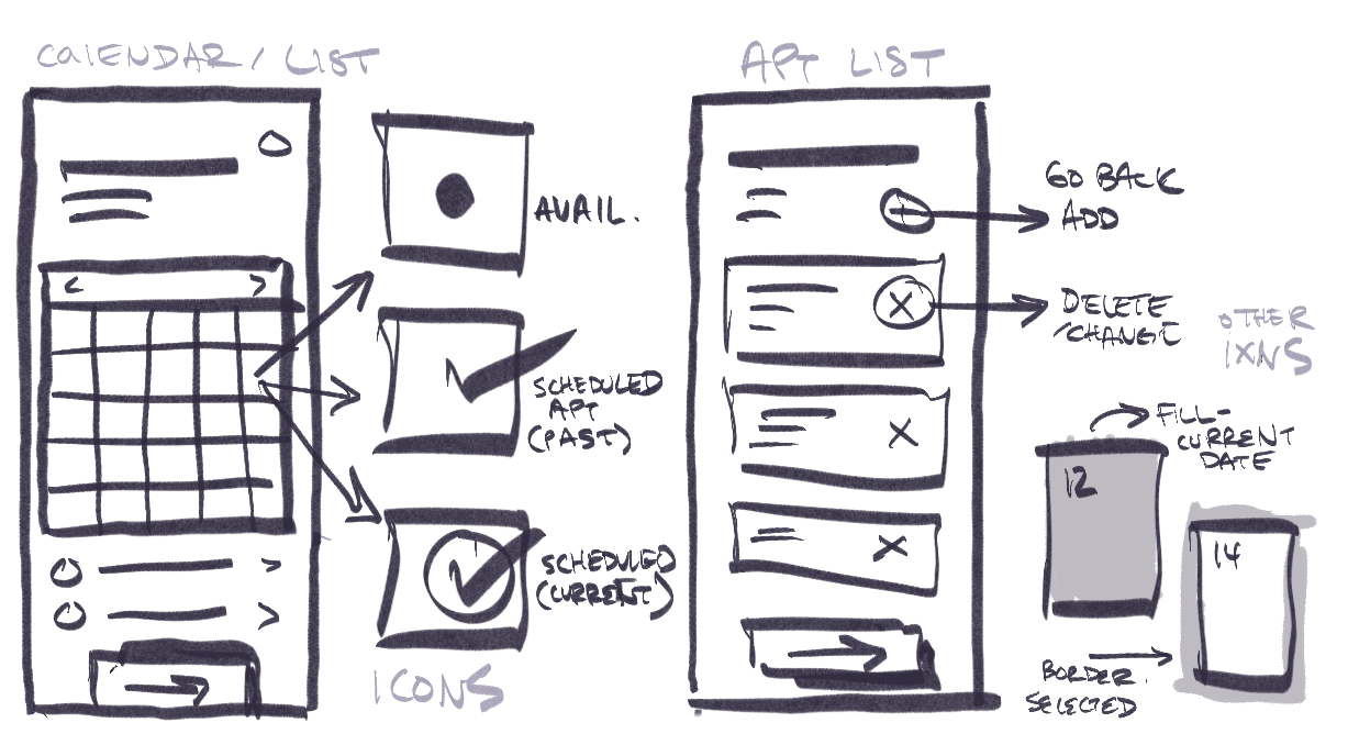
I find sketching to be a useful way of quickly conceptualizing and validating ideas. After I defined the steps through the user flow, I sketched out what each step could look like from a user’s perspective.
Introducing animation
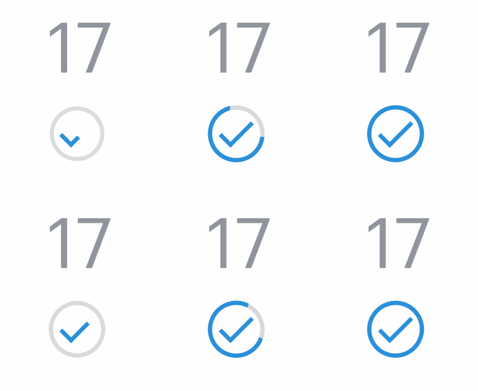
If I wanted a compelling experience like GrubHub and DoorDash, I’d have to consider the role animation would play within these static screens. I used Principle to create some animations to test with my first prototype.


Testing initial wireframes
After I started to mock up each screen in a higher fidelity, I wired up a clickable prototype that I would then hand off to a few users in order to measure usability and to flag any potential issues or edge cases early on.
When handing off the prototype, I gave each user the task of scheduling 2 follow-up appointments and paid close attention to the following areas:
• How easily the user is able to find available appointments.
• How the user interacts with the various iconography on the calendar.
• If the user is able to easily edit or remove the selected appointments
Test notes:
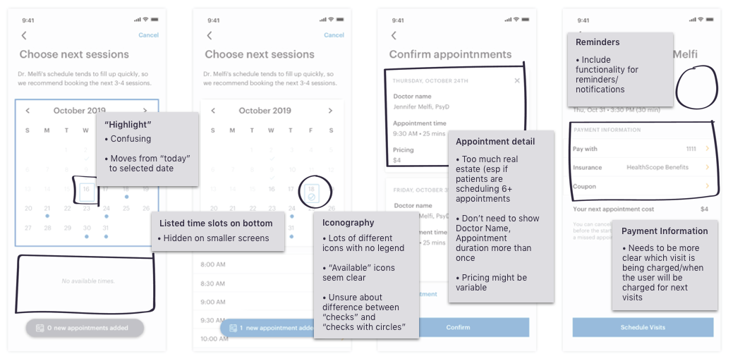
Strengths
☺ The button makes it clear that the user can schedule multiple appointments.
Opportunities
☹ Time “list” isn’t visible on smaller screens, especially when the calendar spans more than 5 lines.
☹ Too many different icons, it’s hard to tell what they all mean
☹ Pricing is confusing and its difficult to determine when the patient is charged for which appointment
Results
Delivering a better user experience for patients and providers alike
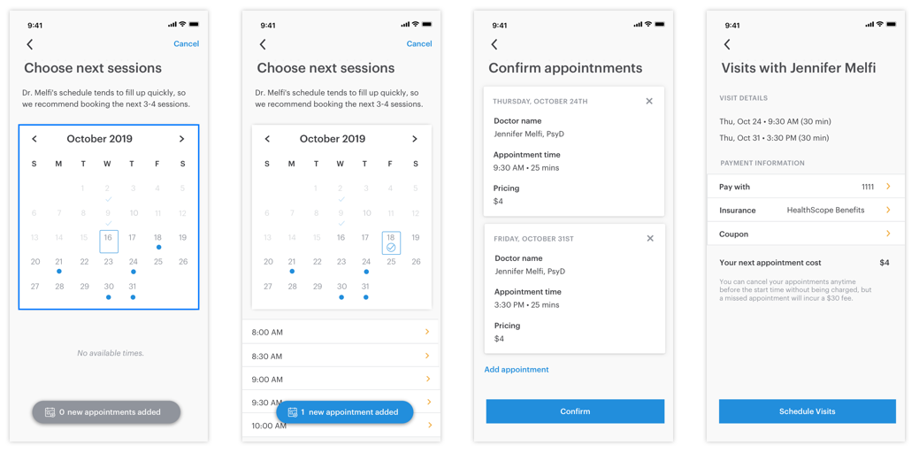
After going over the insights from my initial user test, I focused on refining the interaction patterns within the calendar and simplifying the review pages to keep the user focused on finishing the flow quickly and easily.
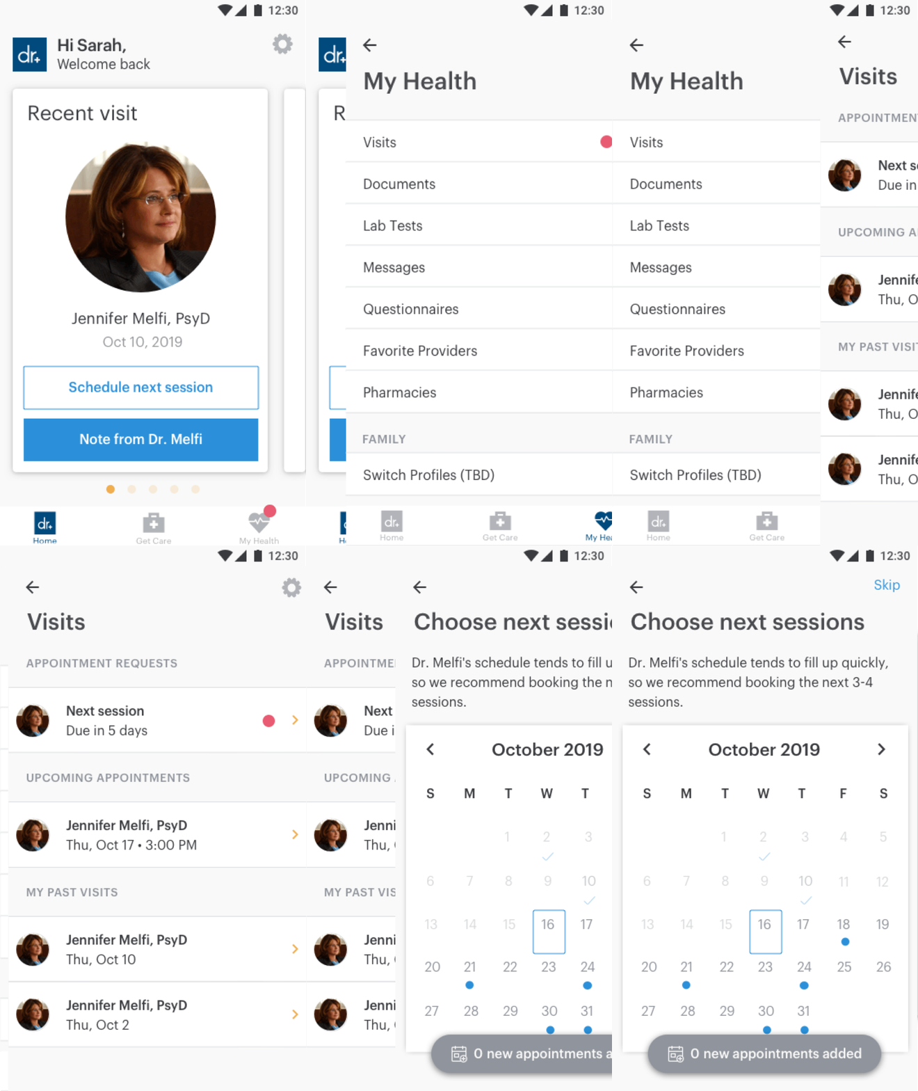
Provider-initiated follow up request
In addition to scheduling follow up visits within their “visits” panel, Providers are now able to submit requests, making it easier to remind patients to schedule appointments.
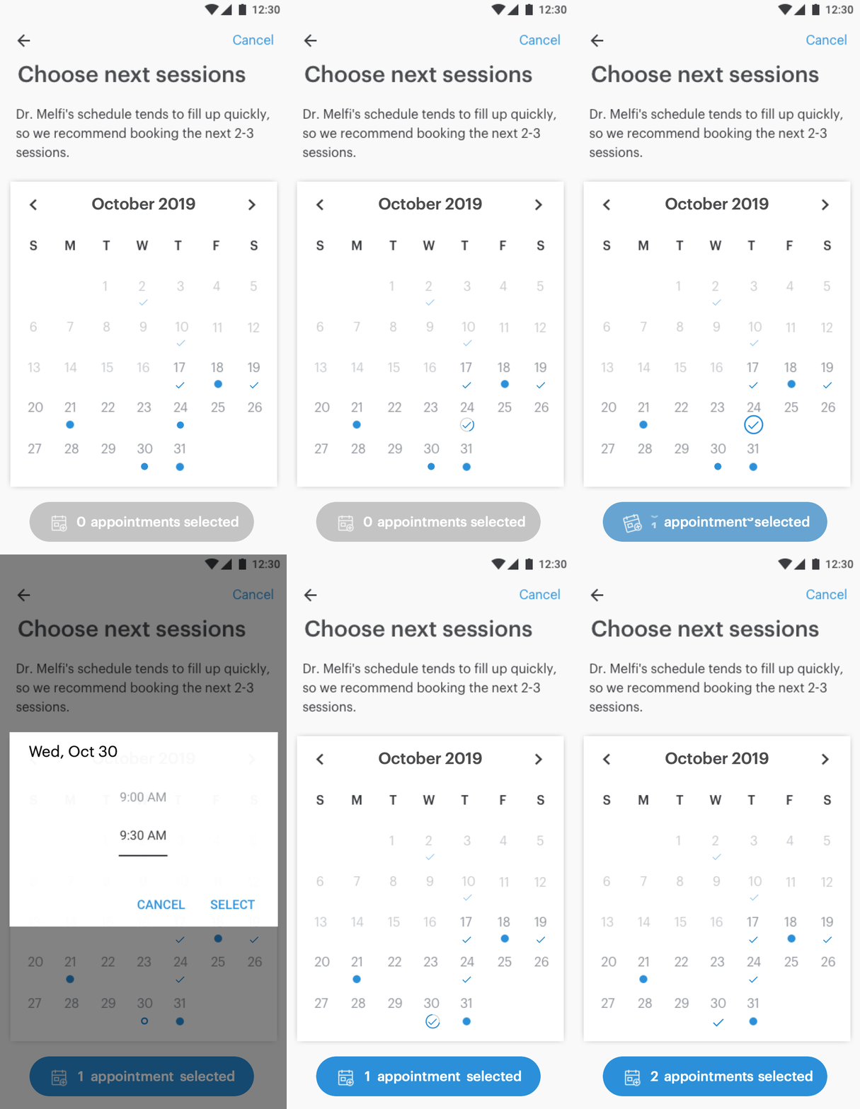
Selecting Appointments
I replaced the list of appointment slots with a picker which gives the calendar more space to clearly communicate provider availability.
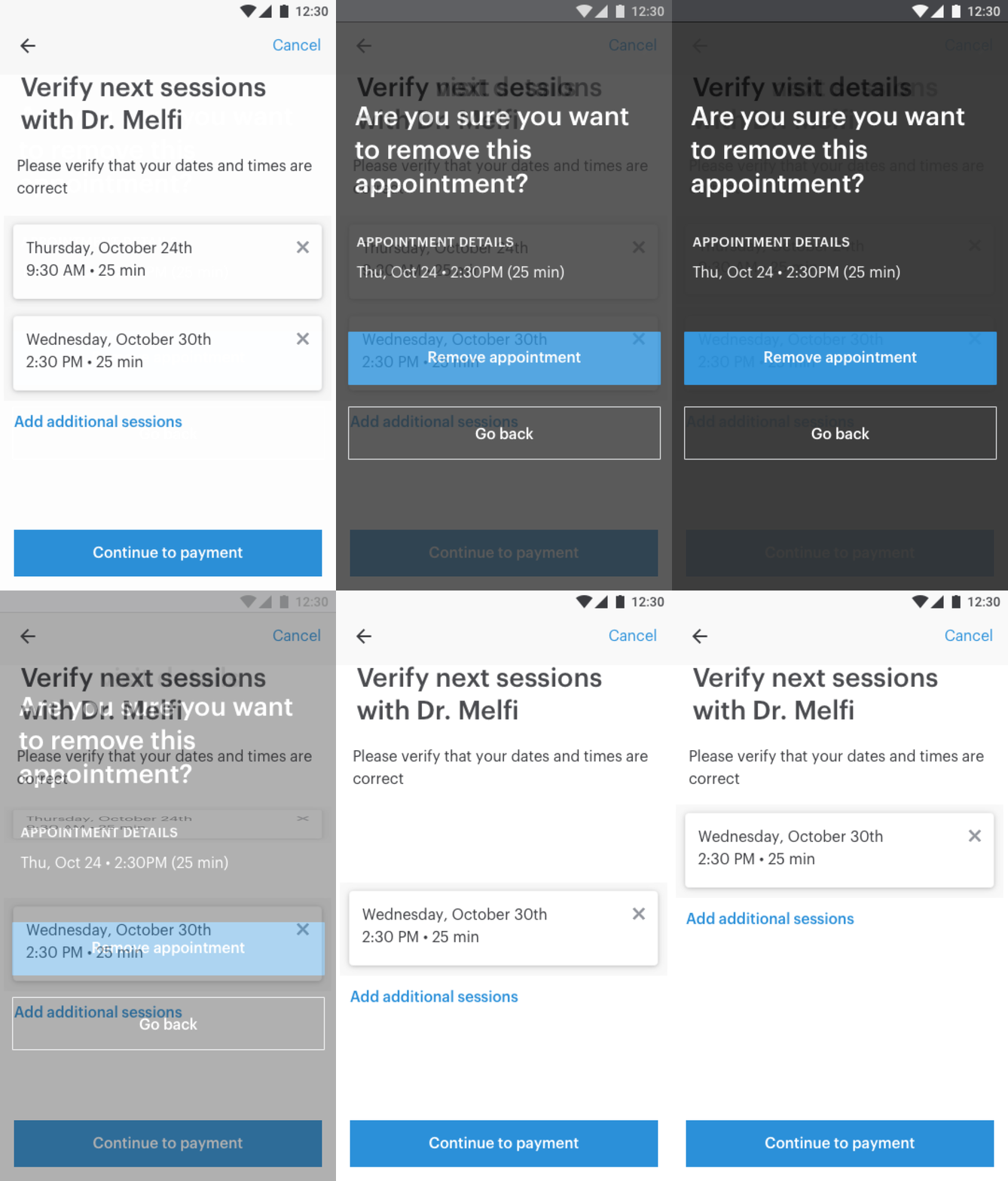
Reviewing and making changes
I wanted to make sure the review page communicated the details about each appointment simply and clearly.
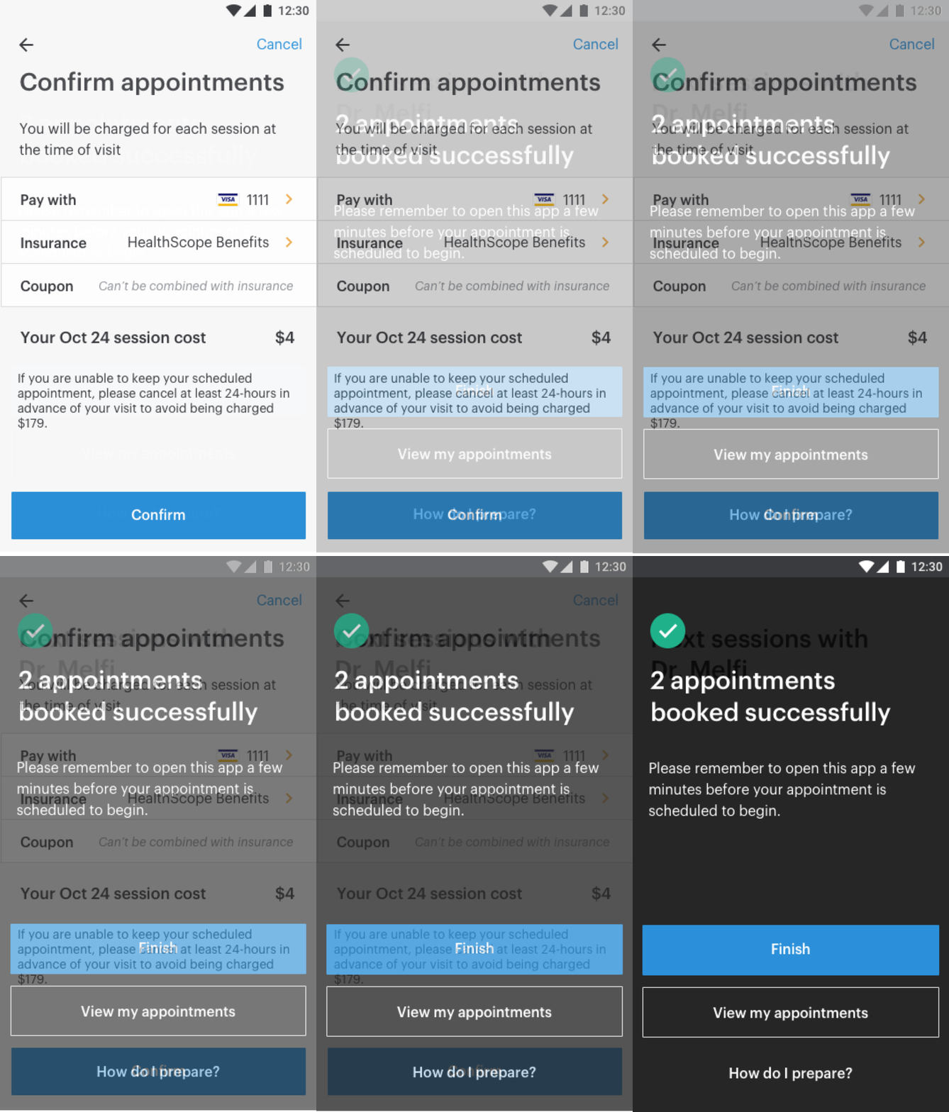
Payment/Checkout
I wanted to add an additional confirmation page that better described the payment process, and give them the option to update payment and insurance information.
Measuring Success
☺ • Nearly half of all behavioral health patients scheduling a follow-up visit scheduled their next 2 sessions within the first month of launch.
☺ • I received feedback personally from one provider who said that they are “confident that, with the new ease of scheduling, patients are being seen more consistently.”
Identifying Areas of Improvement
☹ • Less than 10% of patients were scheduling more than 2 follow-up visits and zero patients scheduled 3 or more follow-up visits within the first month after launch.
Reflection
After close monitoring of the feature, my product manager and I noticed that patients weren’t scheduling more than 2-3 follow up visits, where ideally, we would like our patients to be scheduling 5-6 follow-up visits. We suspected that this might be due to our providers not updating their availability. Therefore, the next steps to this project will be to create a way for providers to more easily add time slots to their availability.