Back to work

Doctor On Demand · Case study

Patient App Redesign

Redesigned the patient app for long-term primary care, bringing visits, prescriptions, health tracking, and messaging under one design system.

Role
Product Designer
Team
1 designer
Timeline
2020 — 2021
Platform
iOS, Android
7patient journeys redesigned end to end, from sign-up to ongoing care
1stFigma design system at Doctor On Demand, built for this redesign
2first design hires I helped recruit: a design leader and a researcher

The problem

From urgent care to a doctor for life

Doctor On Demand was shifting from on-demand urgent care to everyday primary care: a regular doctor, plus the tools to stay healthy between visits. But the app was built for one-off video visits.

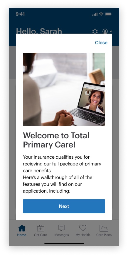
We designed for patients like Sarah: early 40s, working full time, caring for her kids, and managing hypertension and anxiety. She wants a regular provider for herself and her child she can see from home, and help lowering her blood pressure and managing her anxiety.

Key decisions

One system before seven journeys

Start with a design system

What we learned
Seven journeys, one designer, and an app that had grown screen by screen. Without shared parts, every flow would drift.
What I did
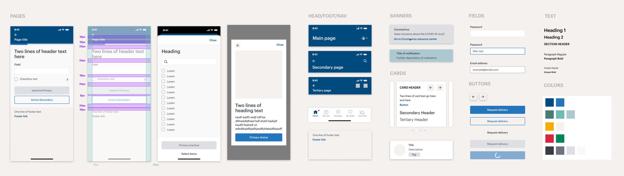
Built the company’s first Figma design system before the screens, from our brand guidelines and Apple’s Human Interface Guidelines.
The design system: page templates with spacing, headers and navigation, banners, cards, fields, buttons, type and colour
The system: pages, navigation, banners, cards, fields, buttons, type and colour

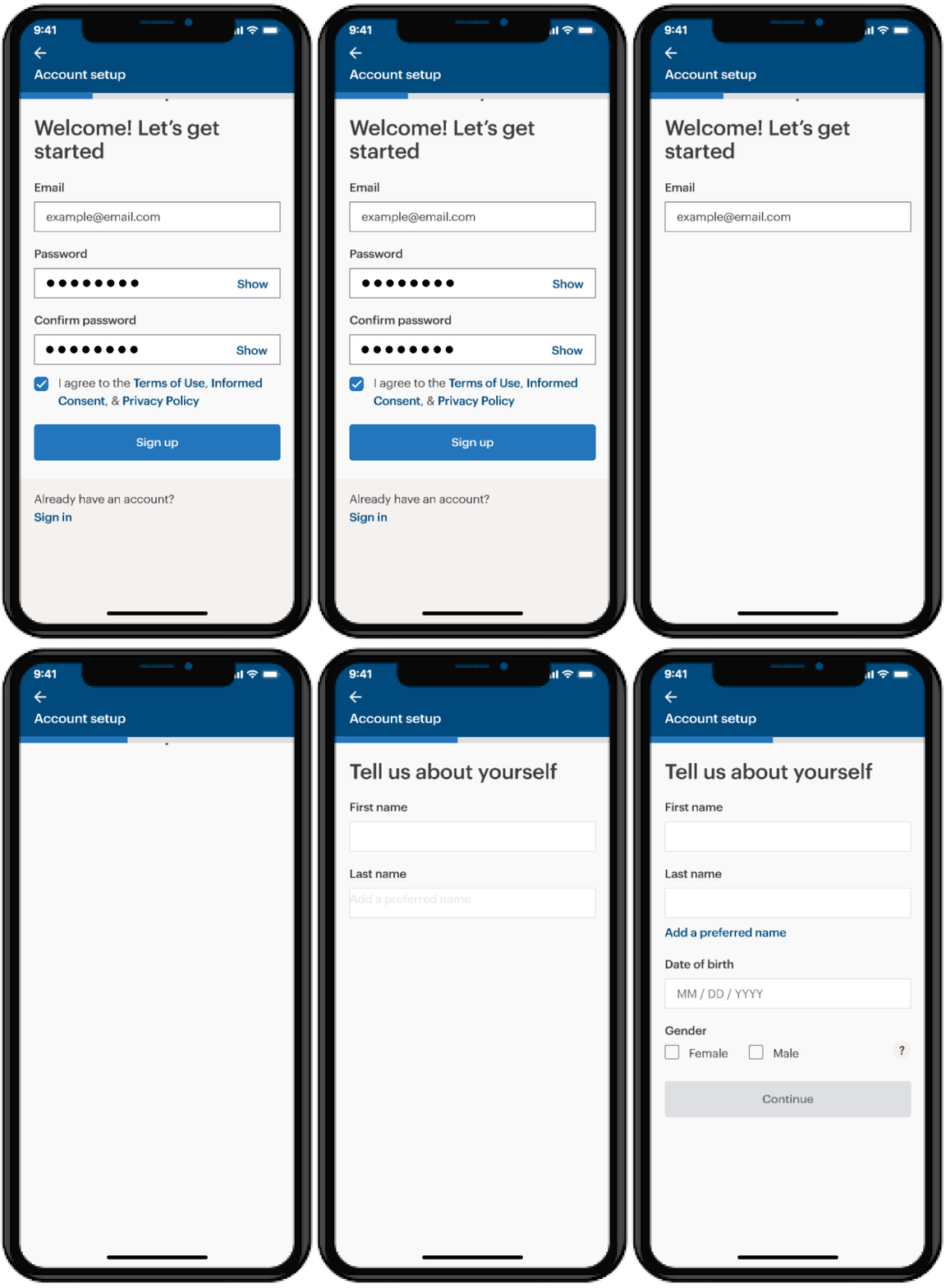
Onboarding, one friendly step at a time

What we learned
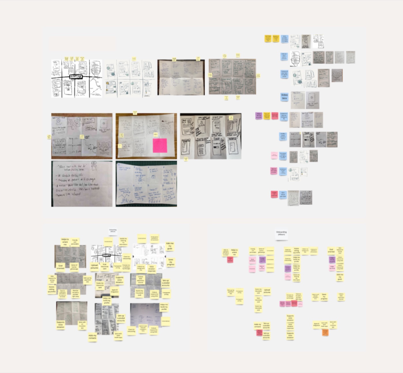
Focus groups and competitors like One Medical and Teladoc showed that long intake forms overwhelm, while step-by-step flows with progress feel quick.
What I did
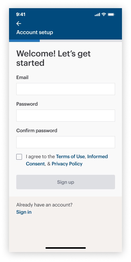
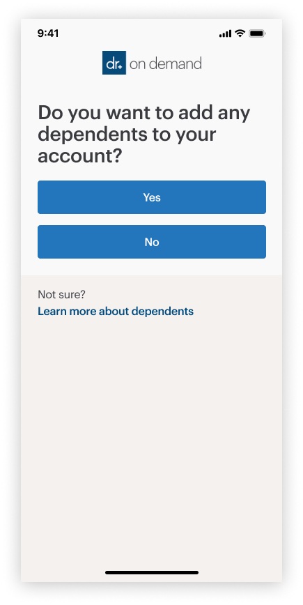
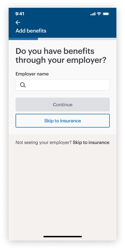
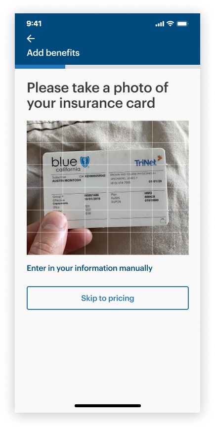
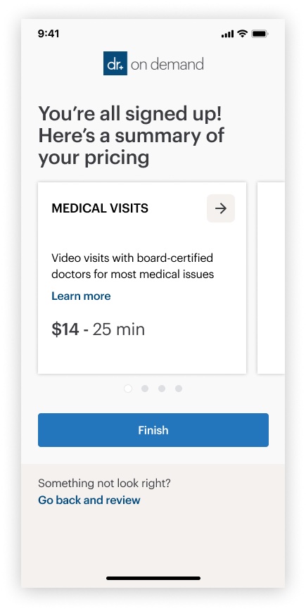
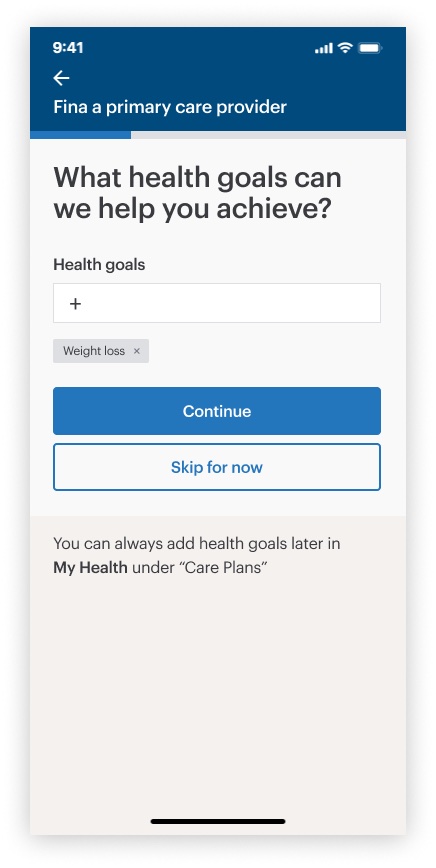
One question per screen, a progress bar, a camera scan for the insurance card, and a pricing summary before anyone pays.
A Miro board of focus group sketches and sticky notes, grouped by theme
Synthesizing the focus groups in Miro

Choosing a doctor should feel personal

What we learned
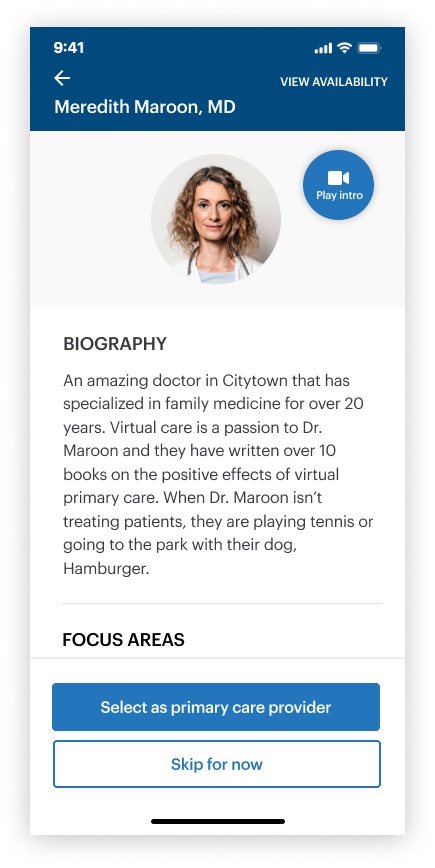
A doctor for life is a big choice. Patients wanted to know who they’d see first, the way Zocdoc profiles let them.
What I did
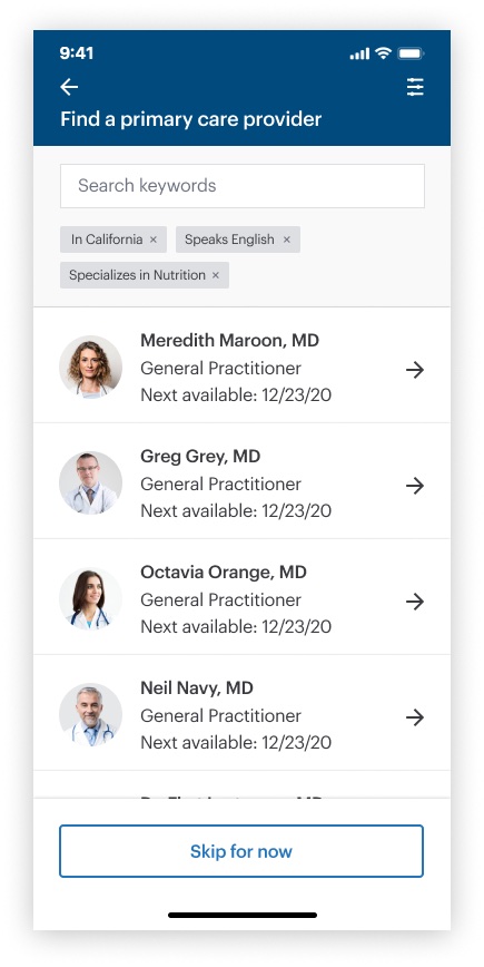
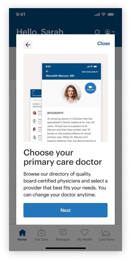
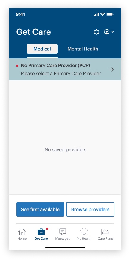
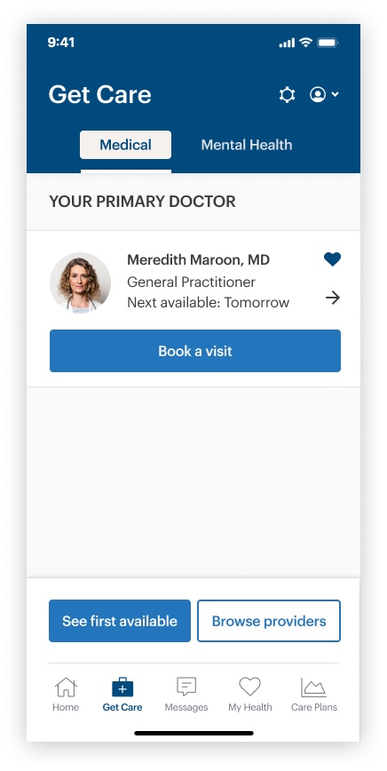
Filters by personal preference, bios with experience and specialties, and a short video introduction from each provider.

The solution

Seven journeys, one app

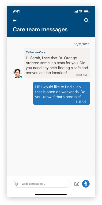
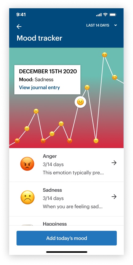
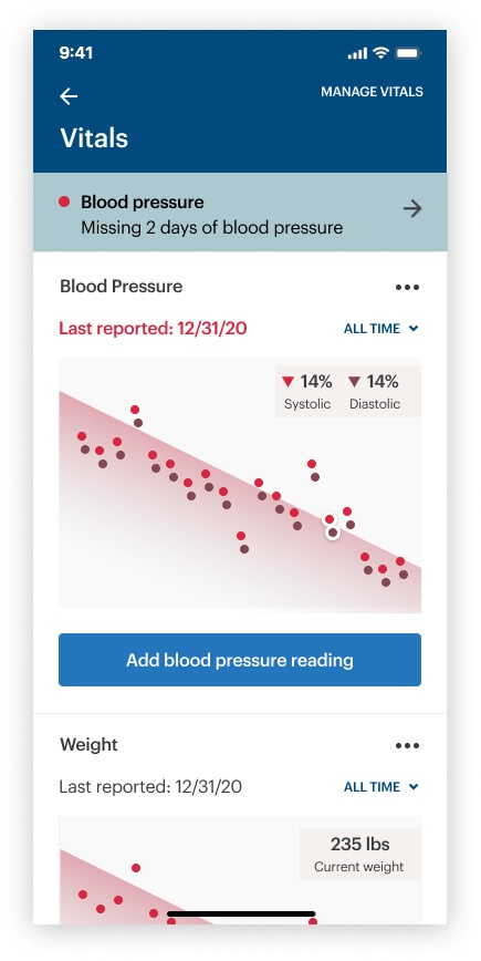
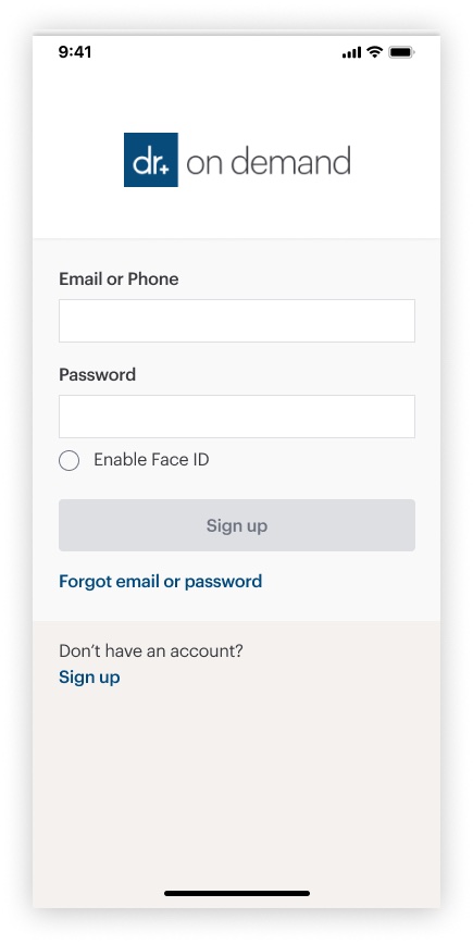
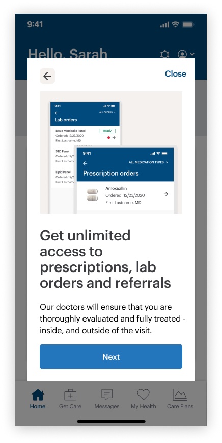
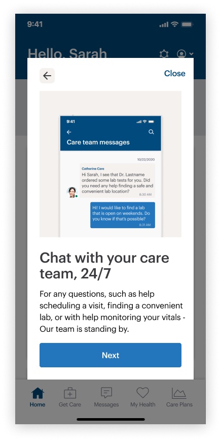
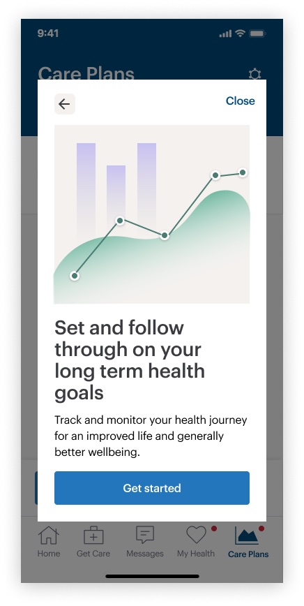
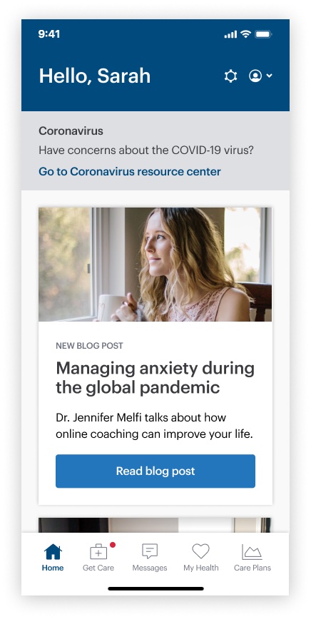
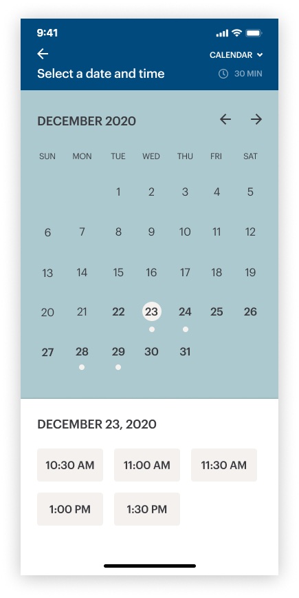
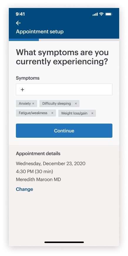
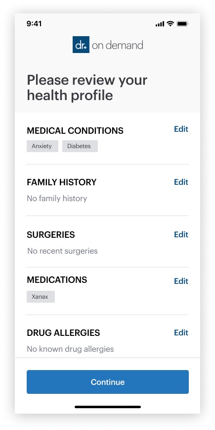
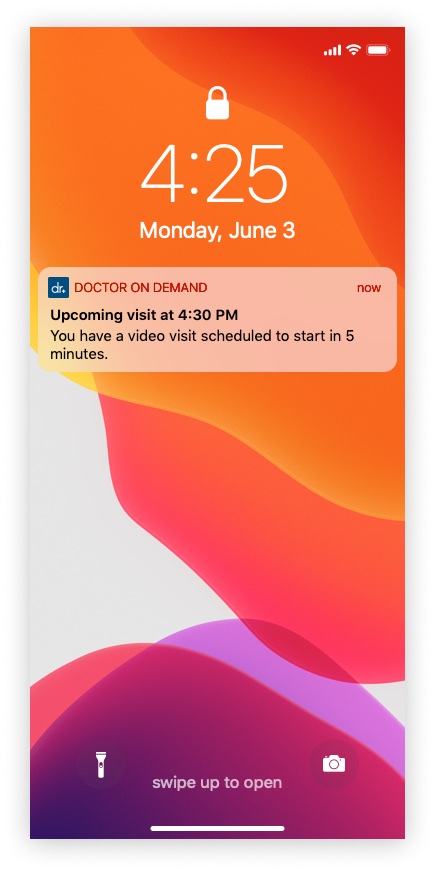
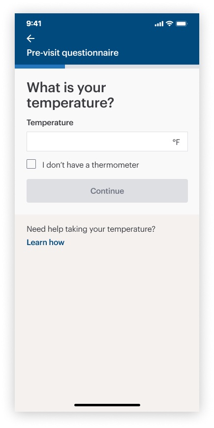
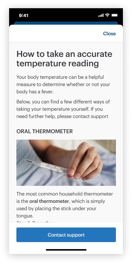
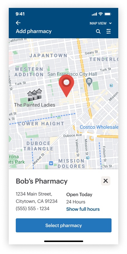
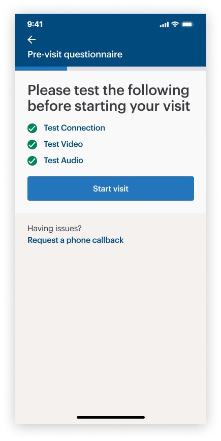
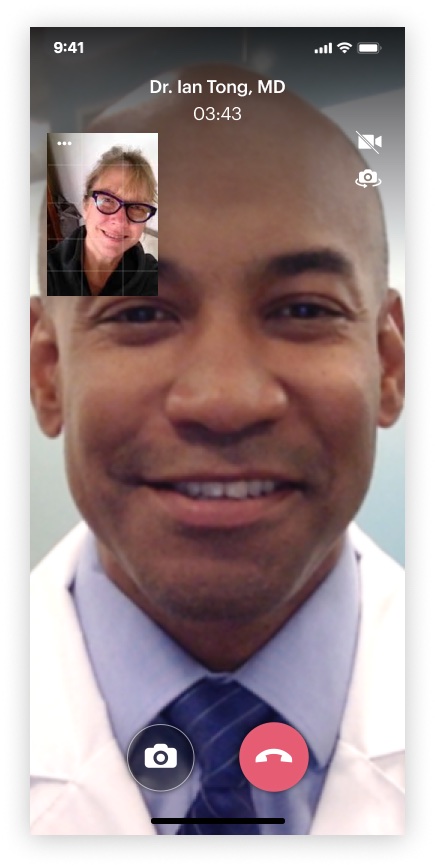
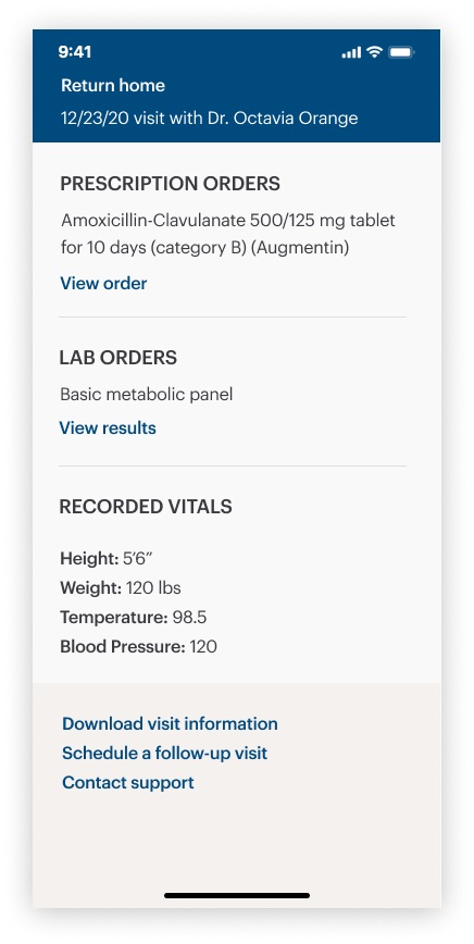
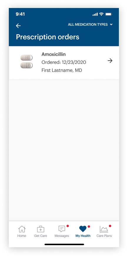
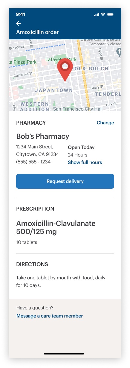
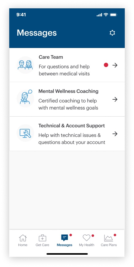
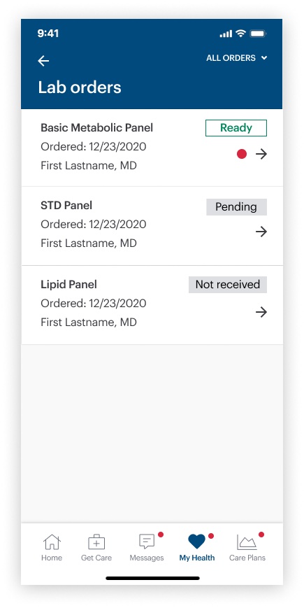
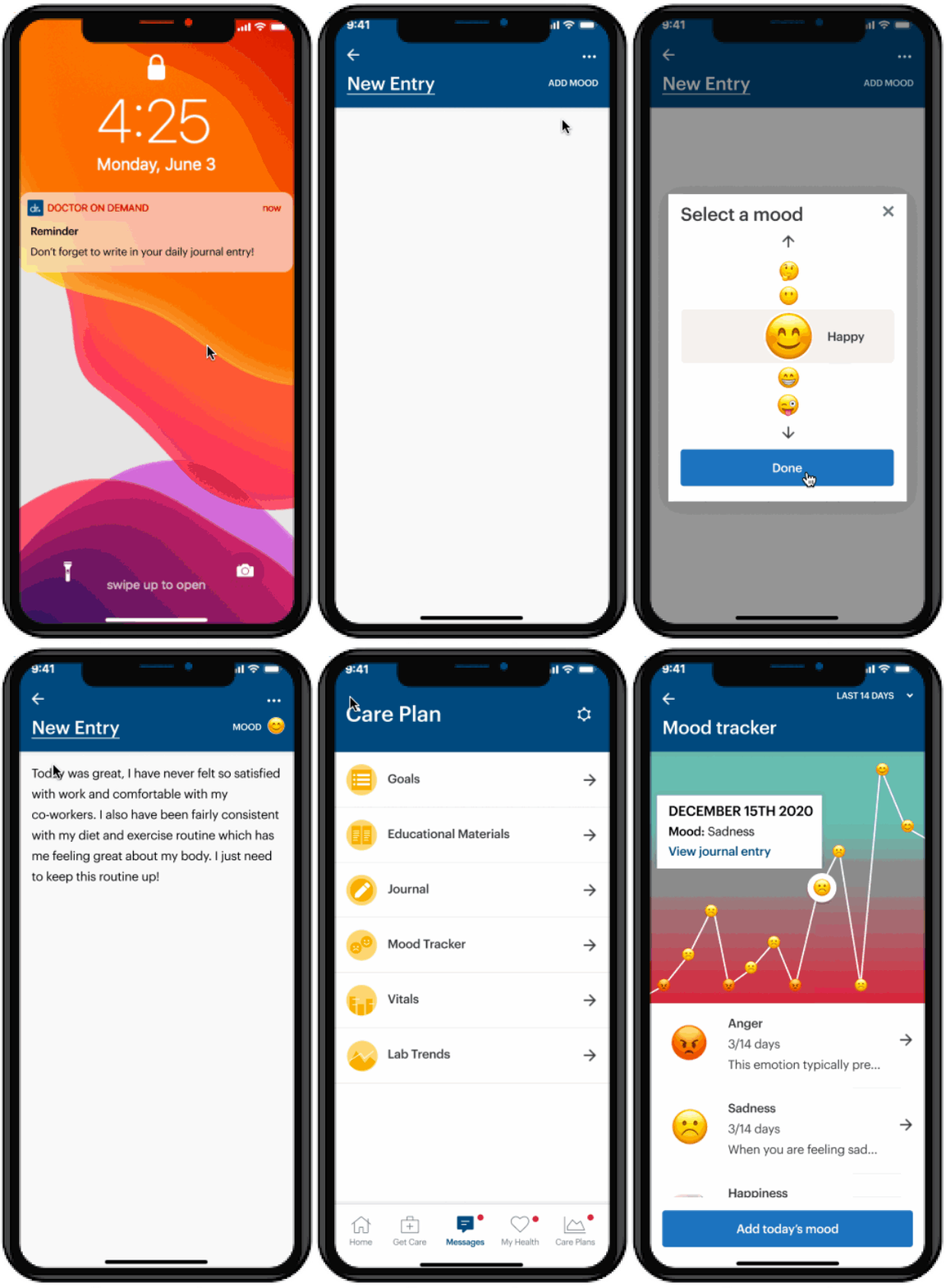
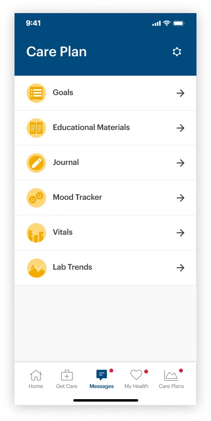
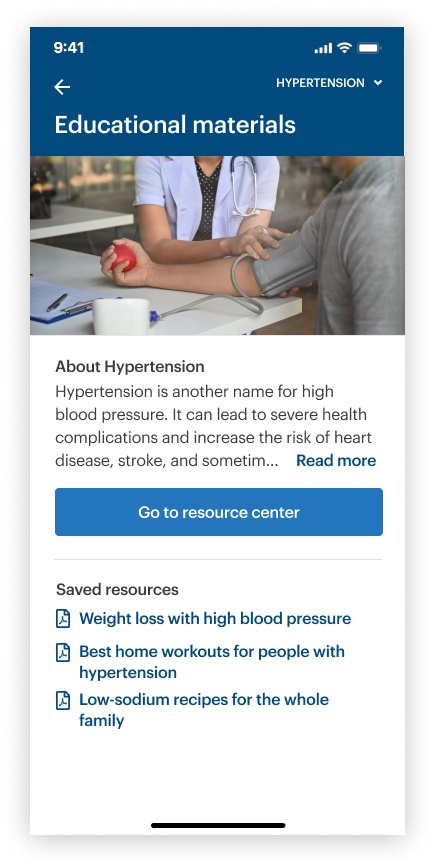
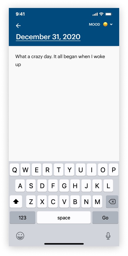
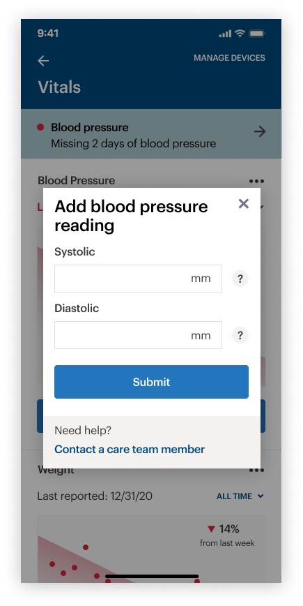
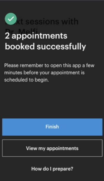
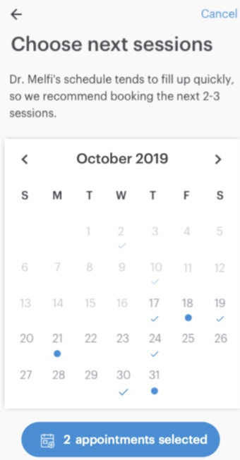
Each journey starts from what patients needed. Pick one to see its screens, led by the feature in action.

Impact & reflection

A first design system, and a design team

The redesign never shipped. It was in development when Doctor On Demand merged with Grand Rounds (now Included Health), and the new company set it aside. What lasted was the foundation: its design system became the company’s first, the base for the work that followed. It also made the case for a bigger design team: I helped recruit Doctor On Demand’s first design leader and researcher.

Looking back, I started from scratch when I didn’t need to. I’d build on the current app instead, start with research into what patients already liked, and carry Doctor On Demand’s design language forward, so the redesign read as an evolution rather than a new app.
End of case studyBack to top ↑