

Reimagining the
patient app
as an end-to-end primary care experience
DOCTOR ON DEMAND • 2021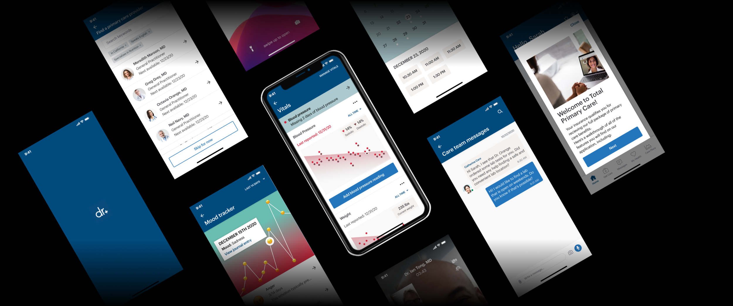
I redesigned Doctor on Demand to support long-term health relationships. Brought video visits, prescription management, health tracking, and care team messaging together under a new design system.
My Role
Product Designer, Mobile
Tools
Figma, inVision, Principle, Adobe Illustrator
Key Themes
Interface Design, Interaction Design, User Research, Market Research, Animation,
Front-End Development
Overview
What is Virtual Primary Care?
Over the last year, Doctor On Demand has shifted its focus from providing on-demand urgent care services, to offering everyday care that helps patients accomplish their goals and live generally happier, healthier lives.
Goals
• Create an onboarding process that easily collects relevant information while informing users of our products and services
• Empower patients to find and schedule visits with providers that best meet their needs
• Provide tools that encourage users to engage with our care team members and regularly work on their health goals - from managing high blood pressure, to anxiety
User Profile

Sarah
• Early 40’s
• Works full time and takes care of children
• Has pre-existing medical conditions (Hypertension, Anxiety)
User Needs
To find a regular care provider for herself and her child that she can see from the safety of home
Goals
• To lower her blood pressure
• To better manage her anxiety
Research
Brainstorm
The first step of the redesign was to organize focus groups to determine specific focus areas, and come up with ideas to better improve our in-app experience.
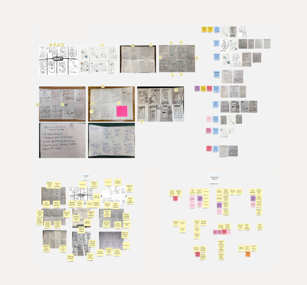
We used Miro, a digital whiteboarding tool to synthesize insights from the focus groups.
Inspiration
When looking for inspiration, I like to look at the competition and lay out the elements that I find interesting, in order to drive my own design decisions.
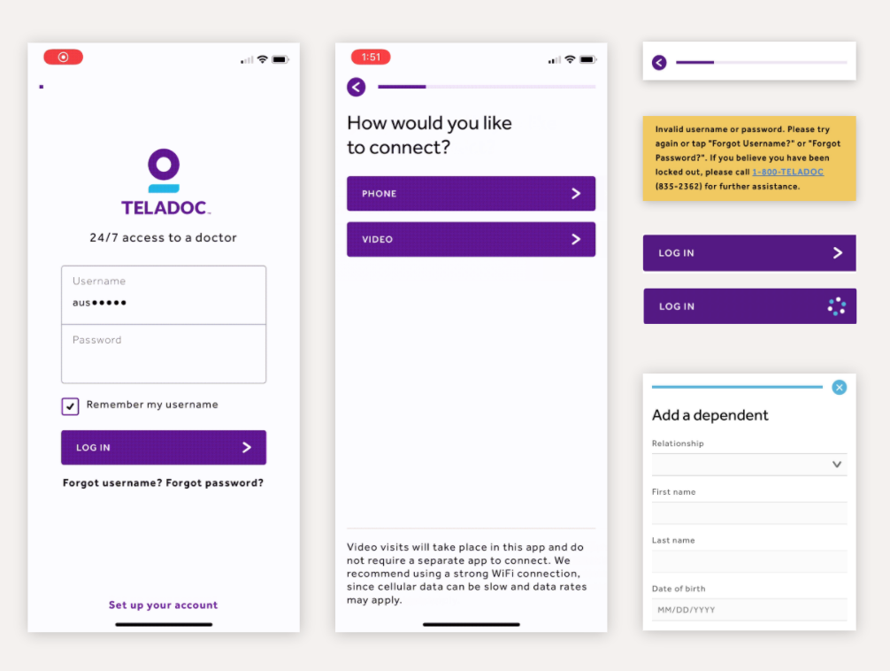
Teladoc
• Satisfying use of animation
• Progress bars/friendly helpful messaging to flow users through
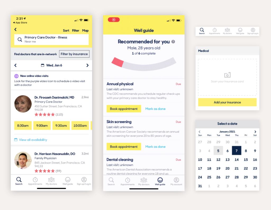
ZocDoc
• Great structure in provider profiles &
appointment lists
• “Wellness guide” for health tracking
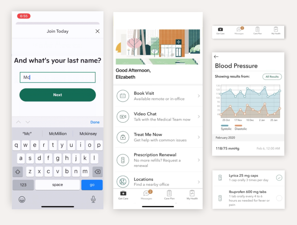
One Medical
• Step-by-step onboarding & intake (lessens user cognitive load)
• Simple navigation
• Use of iconography/illustration for graphic communication
Design System
I like to start my design process by laying out a system of reusable components. This makes sure the design patterns are simple and consistent throughout the app experience.
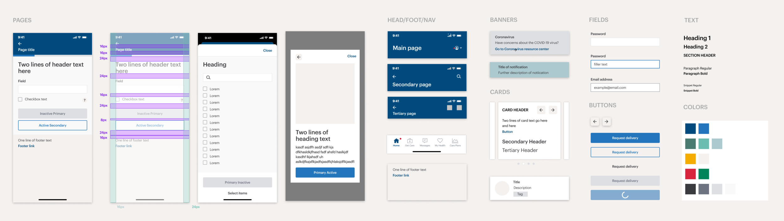
I created each element, referencing our brand identity guidelines and the Apple HIG (Human Interface Guidelines).
Designs
Onboarding & account setup
User needs
• To effortlessly provide all necessary medical information
• To get an overview of services offered and pricing details
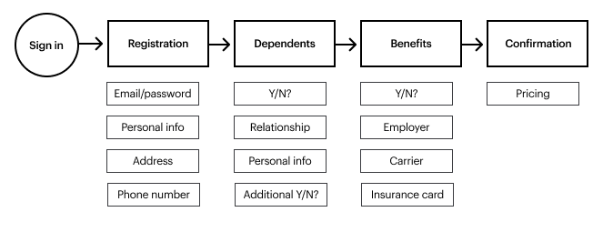
User flow
Wireframes
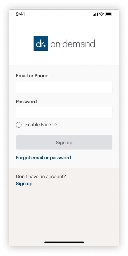
Sign in
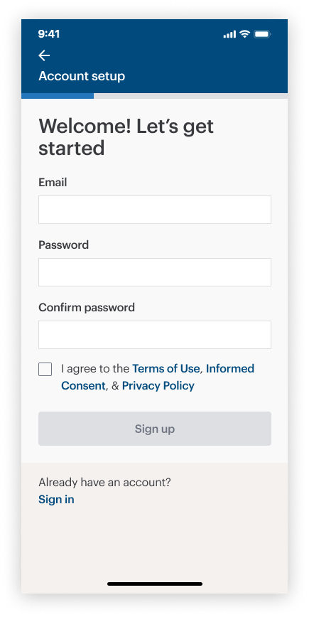
Create an account
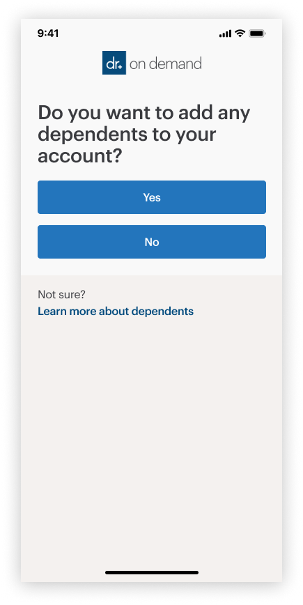
Add dependents
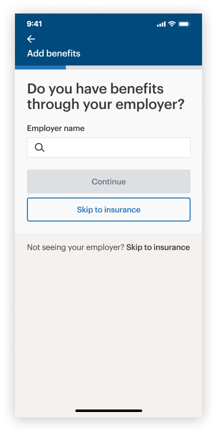
Add employer benefits
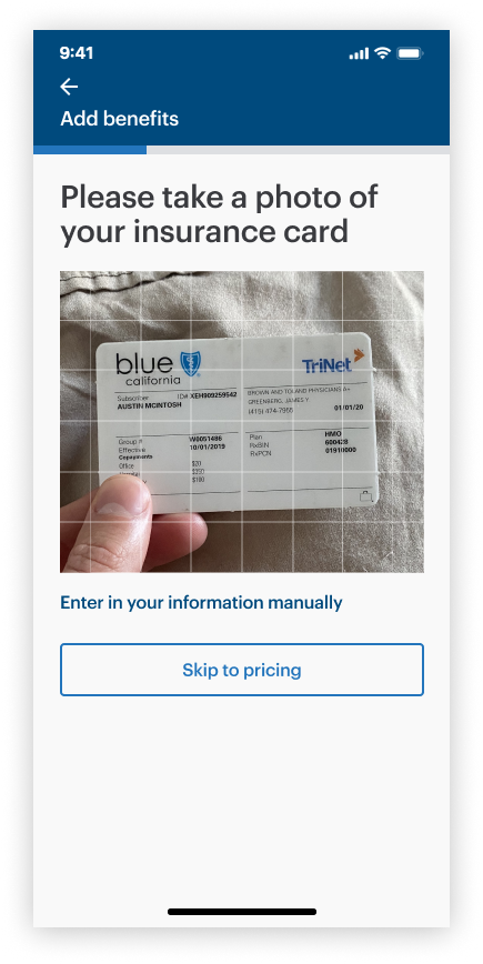
OCR card reader
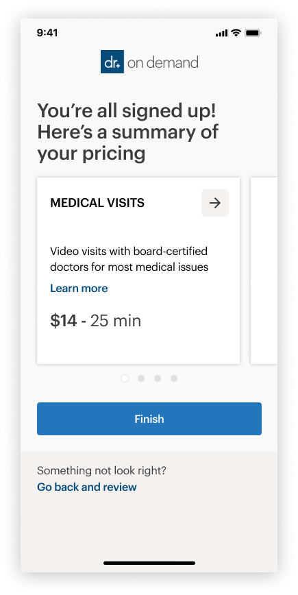
Pricing summary
Feature-in-action
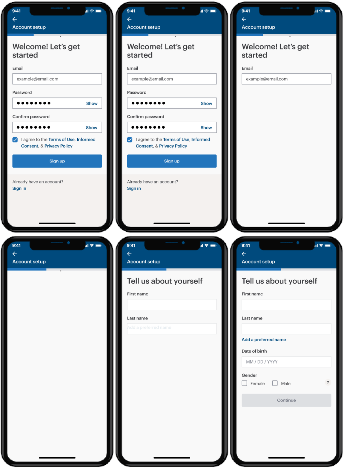
Account setup
• Uses animation to assure the user of the success of their actions
• Includes a progress bar to set expectations of how long the intake process will be
• Friendly language, step-by-step to reduce cognitive load
Welcome to Total Virtual Care
User needs
• To learn how to navigate the application
• To learn how using each feature benefits their physical & mental wellness
User flow
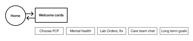
Wireframes
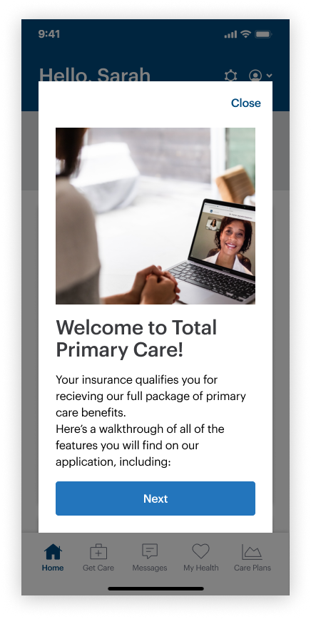
Intro modal
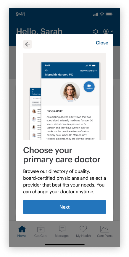
Custom PCP selection
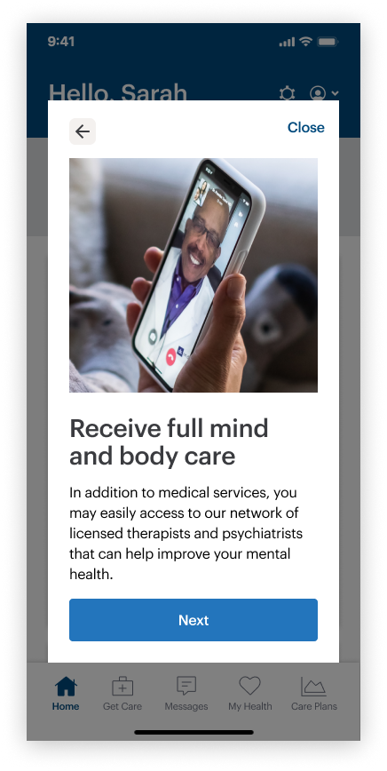
Physical & mental care
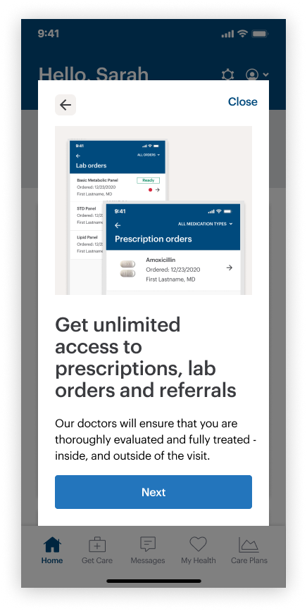
Labs, orders, referrals..
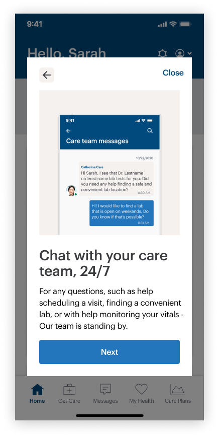
24/7 messaging
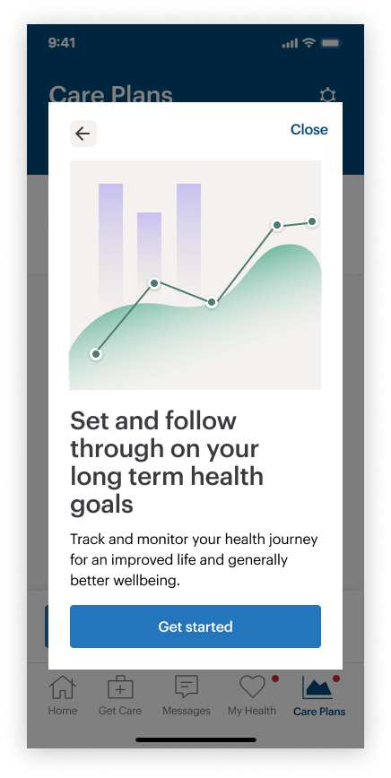
Ongoing health tracking
Feature-in-action
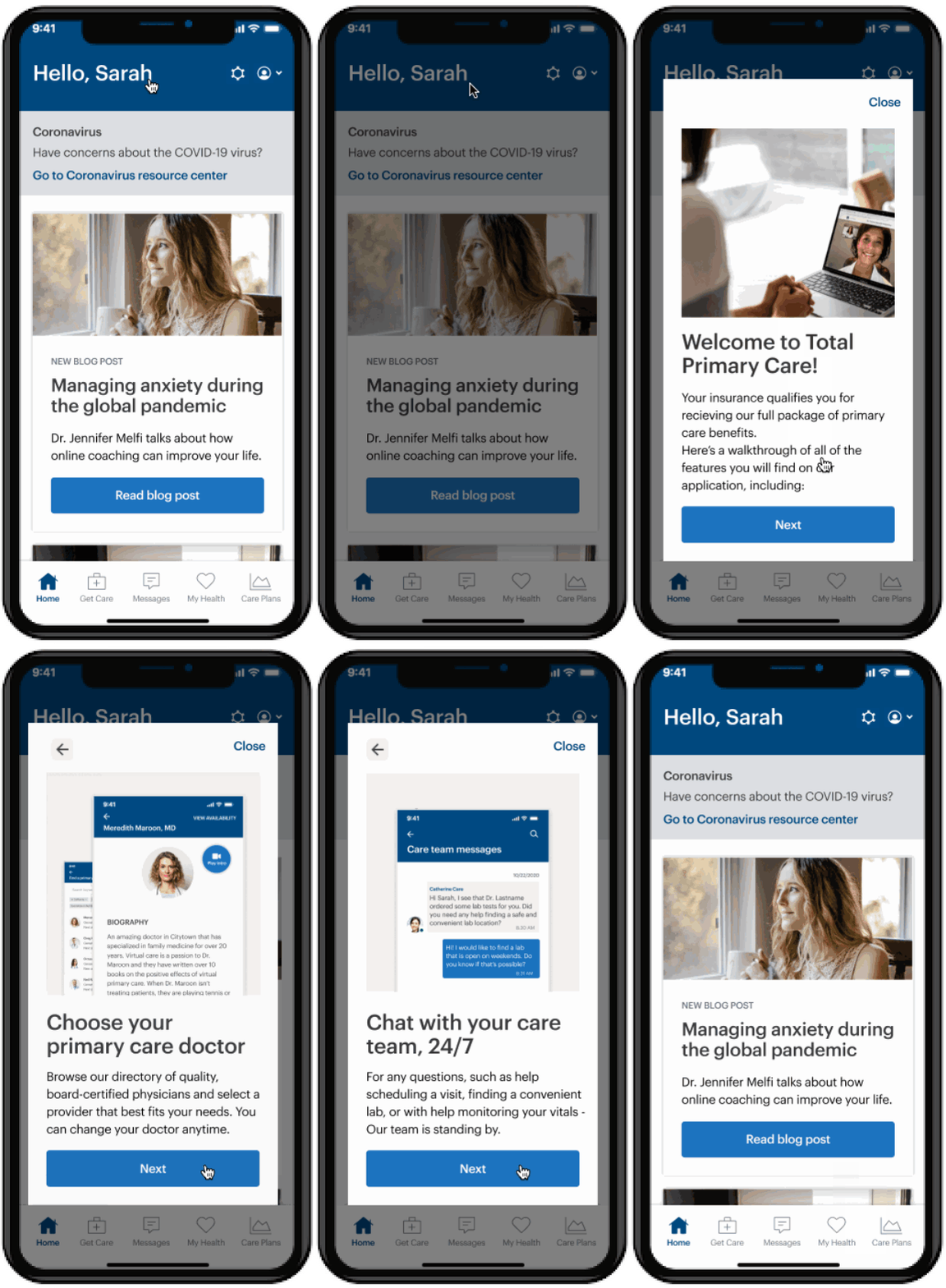
Tutorial cards
• Introduces the user to the application
• Highlights the important features
• Gives some insight on how to use each feature through photos and videos
Selecting a Primary Care Provider
User needs
• To find a provider that meets their personal preferences and care needs
• To learn about the backgr & qualifications of the provider before choosing
User Flow
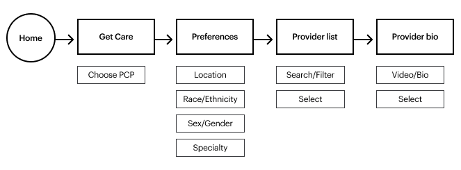
Wireframes
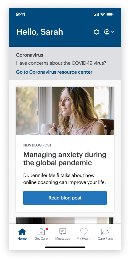
Home
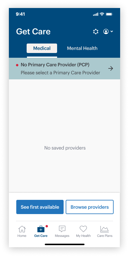
“Get care” screen
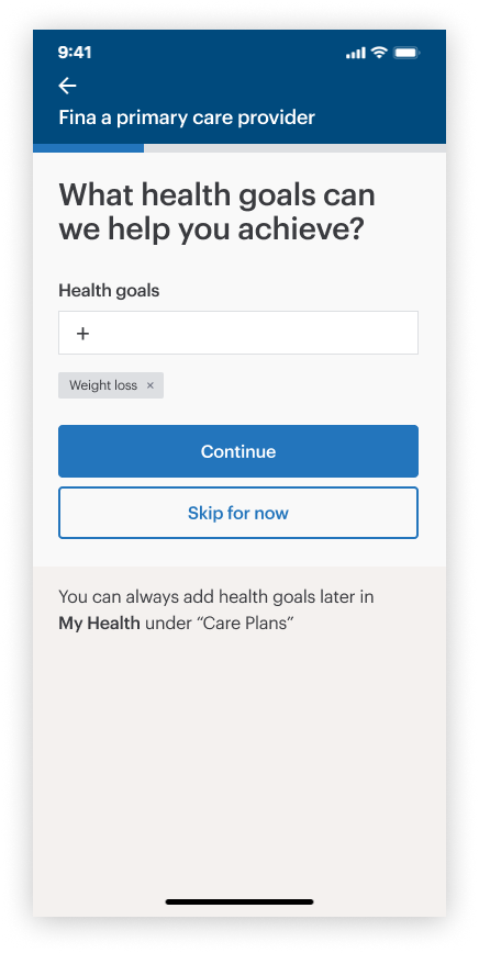
Filling in health profile
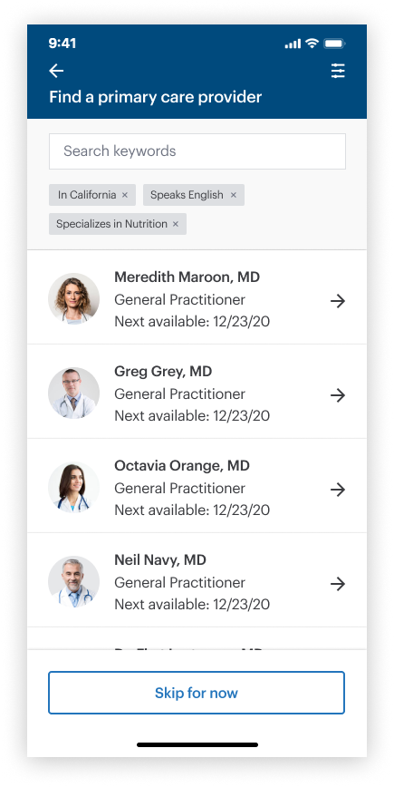
Provider list
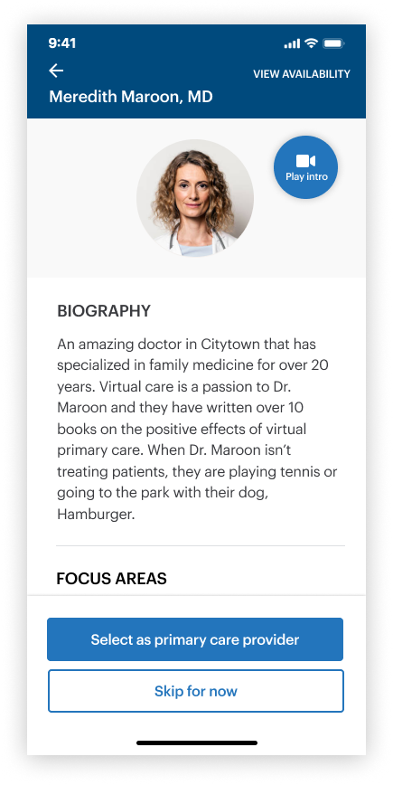
Provider bio
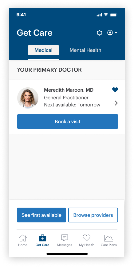
“Get care” screen (updated)
Feature-in-action
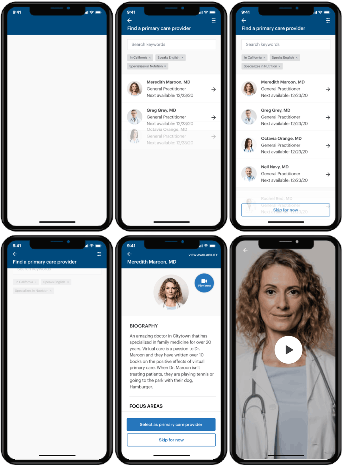
Provider selection
• Allows users to filter through providers by personal preference
• Displays the provider’s biography, including experience, credentials and specialties
• Includes a “video introduction,” giving a more personalized look at each provider
Scheduling a visit
User needs
• To quickly find the right provider that can treat their issue
• To have the options to either a provider immediately, or book a visit for a future time, depending on the urgency
User flow
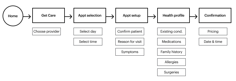
Wireframes
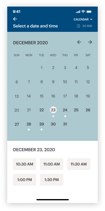
Appointment calendar
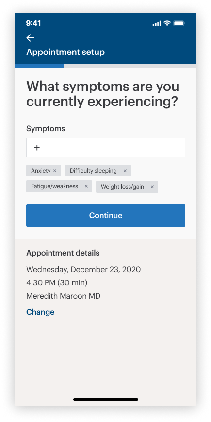
Setup
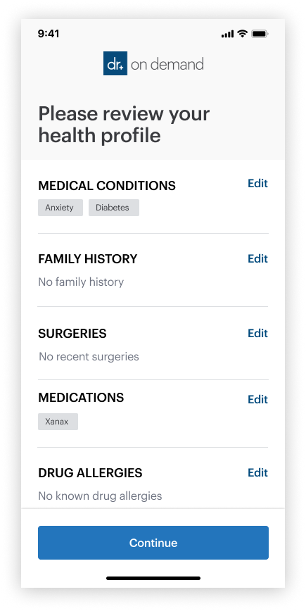
Review health profile
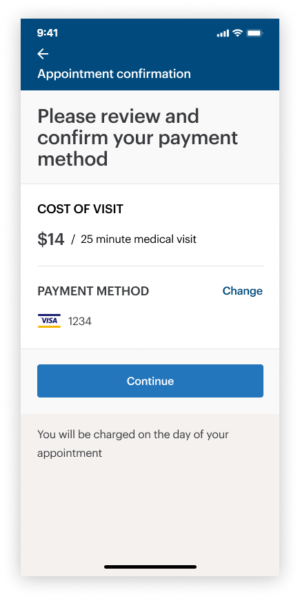
Payment confirmation
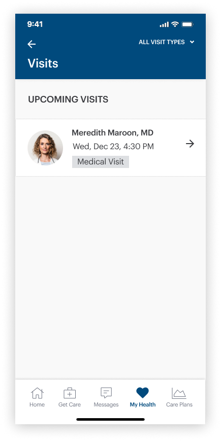
Visit list
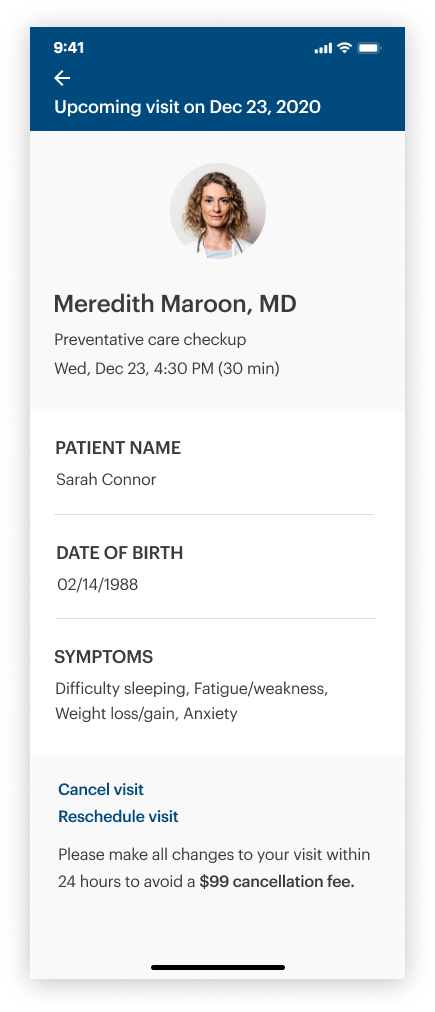
Upcoming visit detail
Feature-in-action
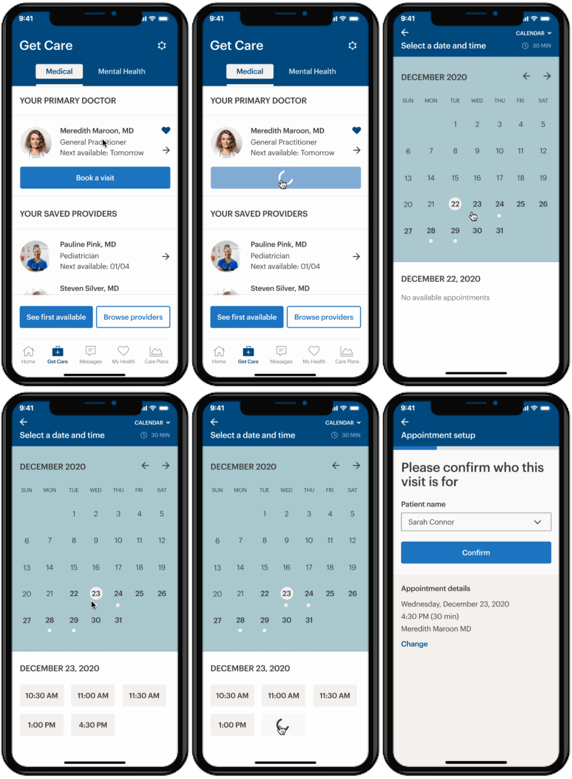
Appointment selection
• “Get care” screen highlights the PCP’s next available appointment, and gives the patient quick alternative options based on their preferences
• Calendar displays available days and time slots for a quick “two-tap” decision process
• Gives the user the option to schedule the visit for a custodian/dependent
Having a video visit
User needs
• A way to enter in their vital information correctly, with clear instructions
• The ability to select their own preferred pharmacy
• A video-UI that feels similar to facetime, where the user can easily manage the camera, microphone, and abort the call
User flow
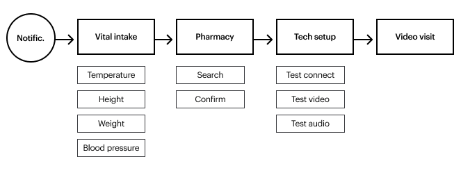
Wireframes
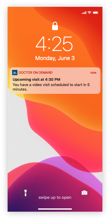
Notification
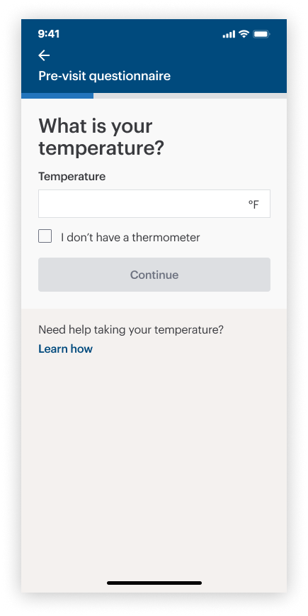
Temperature check
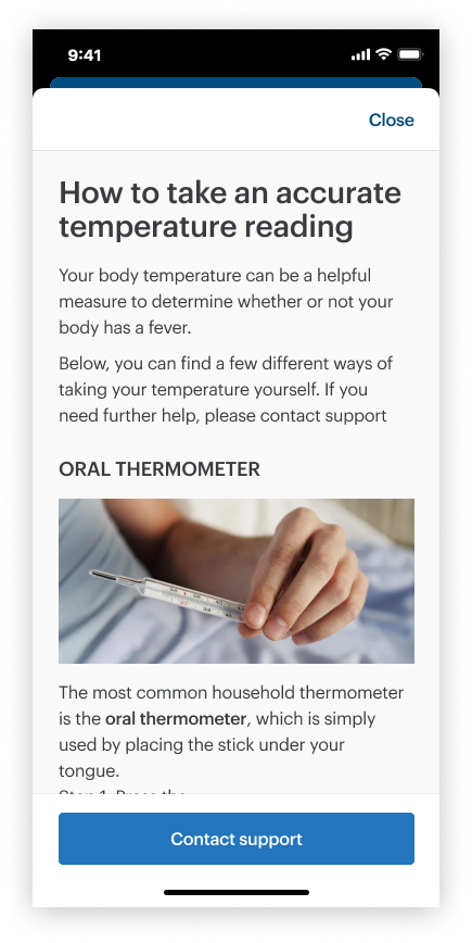
“How-to” modal
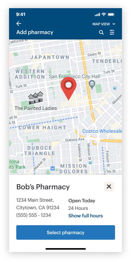
Pharmacy selection
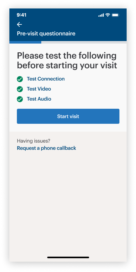
Pre-visit tech check
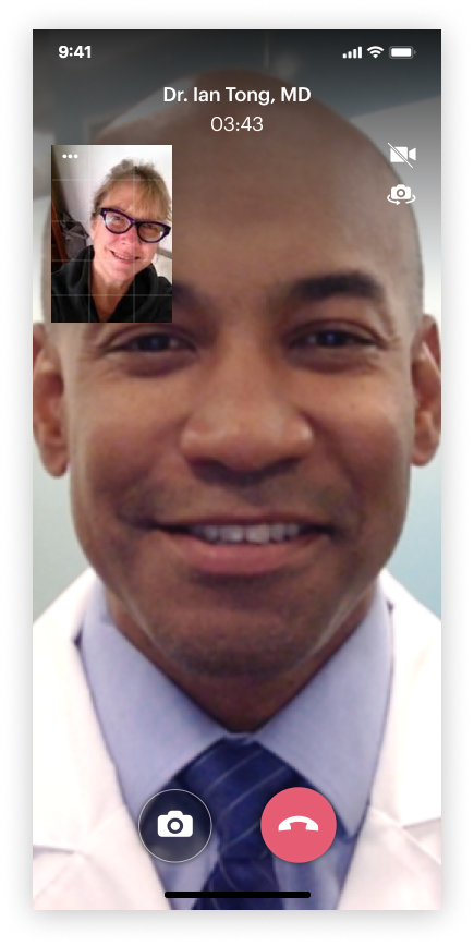
Video visit
Feature-in-action
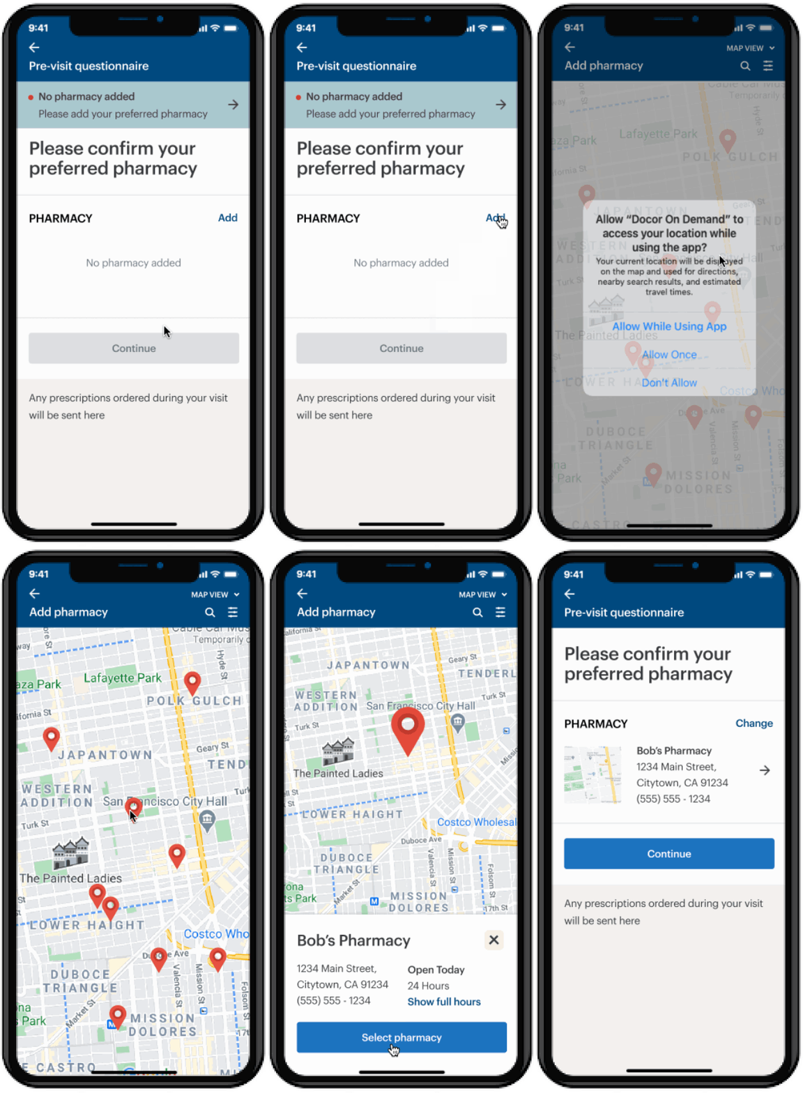
Selecting a preferred pharmacy
• Gives a map view, and a list view sorted by distance
• Provides information about the pharmacy, such as address and hours
• Allows the user to filter pharmacy by hours or delivery capability
After the visit
User needs
• To have a full record of the visit, including diagnosis and orders
• To have a place where they can receive lab results in a way that is readable and user-friendly
• To have a portal to instant message with nurses and care coordinators in case they need help between visits
User flow
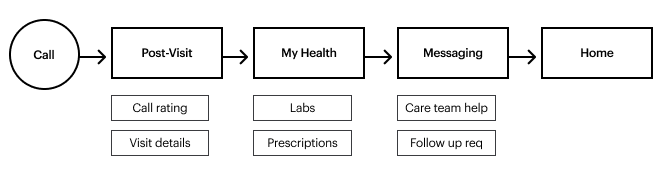
Wireframes
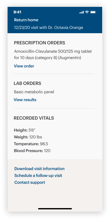
Post-visit detail
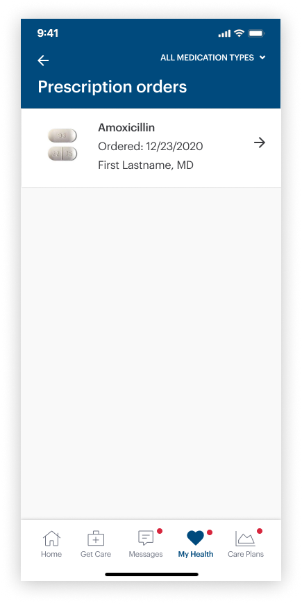
Prescription list
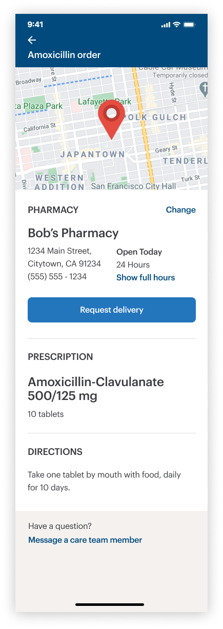
Prescription detail
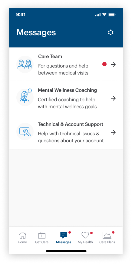
Message hub
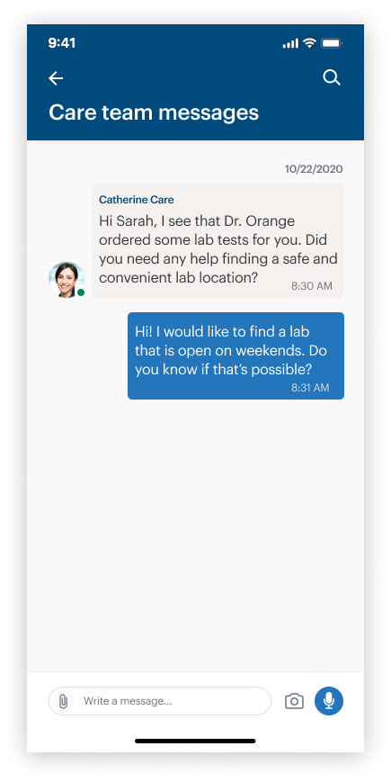
Chat thread
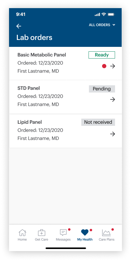
Lab order list
Feature-in-action
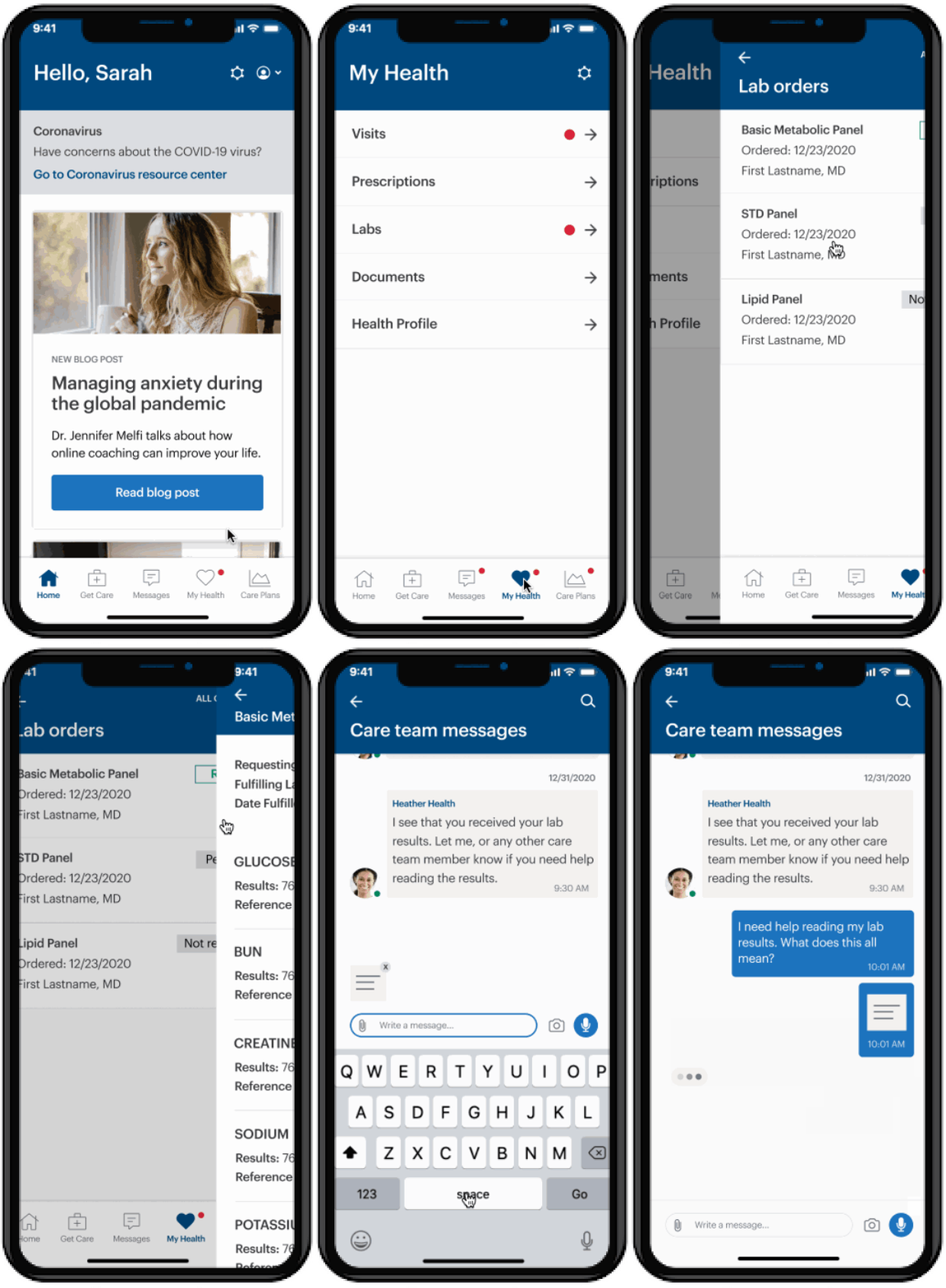
Receiving lab results
• Includes tags that communicate if a lab order is ready, pending, or not yet received
• Displayed in a way that is user-friendly, rather than scientific and clinical
• Allows users to paste directly into chat with care team members, in case the user has questions
Ongoing care & care plans
User needs
• To have a place to read important information about their conditions
• To track and monitor important vital information, such as blood pressure readings, or lab results over time
• To have mental health tools, such as journals and mood trackers that can help patients identify patterns and behaviors
User flow

Wireframes
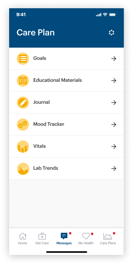
Care Plan homepage
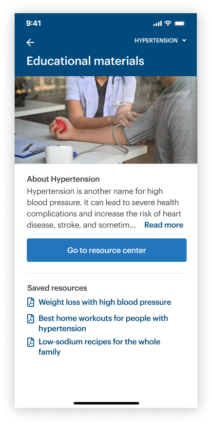
Education
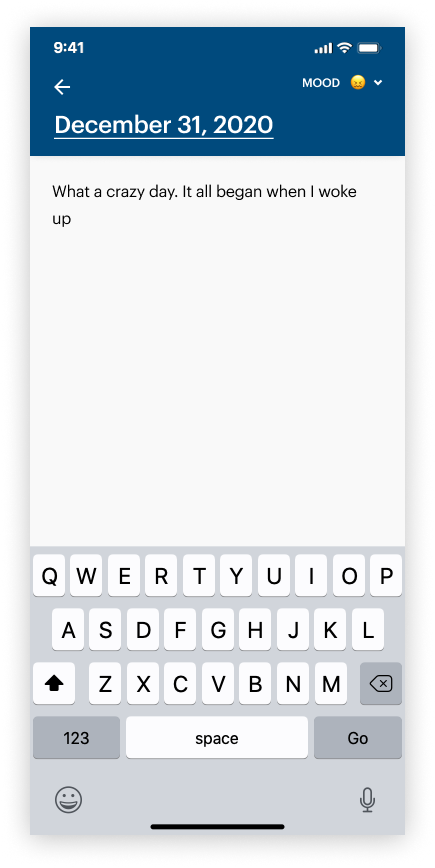
Daily journal
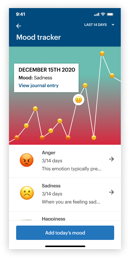
Mood tracker
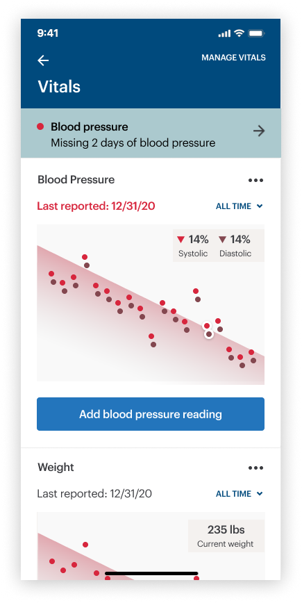
Vital tracker
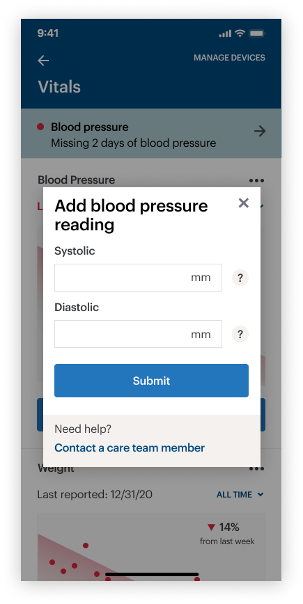
Add vital data
Feature-in-action
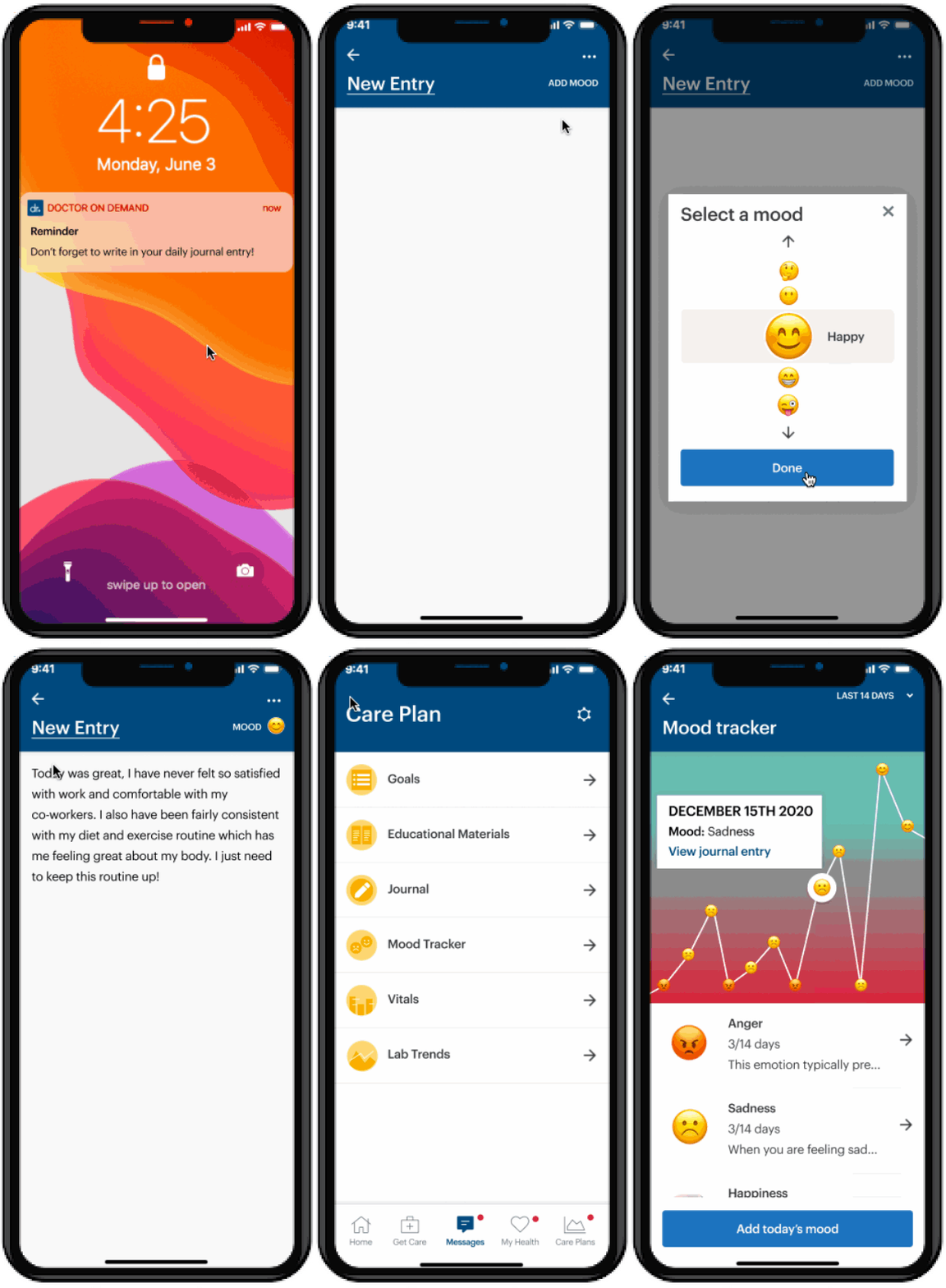
Creating a journal entry
• Allows users to attach a “mood” to each entry, or a title/topic
• Users can track their moods over time and review journal entries attached to them
• Journal entries can be shared with behavioral health counselors during sessions for talking points
Conclusion / Measuring success
TBD! Under construction